Hey Everyone!
Just a really quick update here to give you an exclusive SNEAK PEAK of the new AndySowards.com Redesign! Last time I redesigned the site, I just ‘Re aligned’ the site. But this time its a complete overhaul, so I hope you are as excited as I am about it!
Brand New Twitter BG – @AndySowards
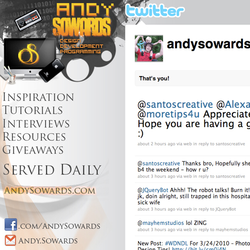
So the first thing I have done is went ahead and made my new Twitter Background to reflect the new design
So while you won’t see exactly what the new site is going to look like, You will get a taste for the new direction it is going in.
So please let me know what your thoughts on the new look of the twitter background are, I would love to hear them.
Comparison – Old vs. New
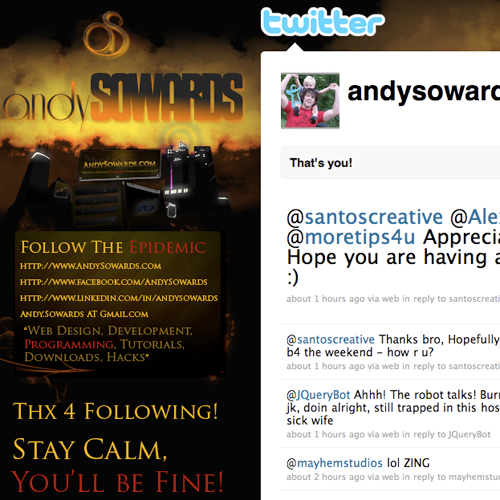
What is a new Twitter BG without a comparison of the old one? Well here is the old one.
And now… Without further suspense.
The Brand Spanking New @AndySowards Twitter Background!
Ta-da!
What do you think? Like I said the new AndySowards.com redesign is going to be very exciting.
My main reason for change is that I am getting tired of the dark look of the current design, and want to brighten things up a bit 
The site is going to be cleaner, faster, easier to use, and above all, more useful and interactive.
Never fear, #WDNDL’s are here to stay 
I hope you guys enjoyed this Sneak Peak! Stay Tuned to find out when the actual NEW AndySowards.com is going to be launched!
Thanks for all the loyal support and friendship everyone! I appreciate you all!
Leave your comments, suggestions, and whatever else you want in the comments below 



Hey Andy,
the sneak peak is looking good. Bright is good!
The nintendo gamepad is sweet, bring backs memories ;D
Cheers from Germany
Simon
Its very nice, Andy!
I am really waiting for the new version of this blog….
This is cool. Mine is @cooljaz124
Andy its mad tight. I like how you implemented the video game elements and added that old school 8-bit touch to the design.
Thanks yo! Yeah I wanted to go back and focus on the things that I love, like video games and the binary 101010 behind it represents the programming aspect. I hope to make some javascript video games as well this year
I really like the light background on the new design much better. Looks cleaner and more inviting. Hope as is going well man. Cheers!
Thanks Lee, Appreciate it! Yeah im ready for a nice clean and simple design
Great, but I have question, what do you do with your old designs?
Suggestion try donating them to new Blogger’s
Never thought about donating designs to new bloggers, I typically just stick them in my portfolio – Maybe I’ll release a theme to download that is similar
That Would be great