We did a brewing company branding post a while back – not everyone is into alchohol – but everyone loves a nice cup of coffee! Today we have put together some of the best coffee company branding & package design we have seen lately. However, This list isn’t limited to coffee companies but also epic Coffee Machine Design – since a lot of smaller coffee companies use these machines in their business – can’t leave out the epic concept design on some of these bad boys :). There is also a super epic coffee concept at the end of this post I think you will enjoy :).
Before we dig in too deep – Lets see what our buddy wikipedia has to say about coffee and its origins
Coffee is a brewed beverage with a bitter, acidic flavor prepared from the roasted seeds of the coffee plant. The beans are found in coffee cherries, which grow on trees cultivated in over 70 countries, primarily in equatorial Latin America, Southeast Asia, South Asia and Africa. Green (unroasted) coffee is one of the most traded agricultural commodities in the world. Coffee can have a stimulating effect on humans due to its caffeine content. It is one of the most-consumed beverages in the world.
Coffee has played a crucial role in many societies. The energizing effect of the coffee bean plant is thought to have been discovered in the northeast region of Ethiopia, and the cultivation of coffee first expanded in the Arab world. The earliest credible evidence of coffee drinking appears in the middle of the 15th century, in the Sufi shrines of Yemen in southern Arabia. From the Muslim world, coffee spread to India, Italy, then to the rest of Europe, to Indonesia, and to the Americas. In East Africa and Yemen, it was used in religious ceremonies. As a result, the Ethiopian Church banned its secular consumption, a ban in effect until the reign of Emperor Menelik II of Ethiopia. It was banned in Ottoman Turkey during the 17th century for political reasons, and was associated with rebellious political activities in Europe.
Looks like people have been addicted to this little drink for quite some time now!
Ok now start crushing up your beans – and get the drip going (ok that sounded bad – you know what I mean, get your coffee cup ready!) and get inspired by these java giants of Branding Design Inspiration! I hope it inspires you on your latest creative endeavors, a brochure printing project, for branding or package design, or any type of design! Enjoy!
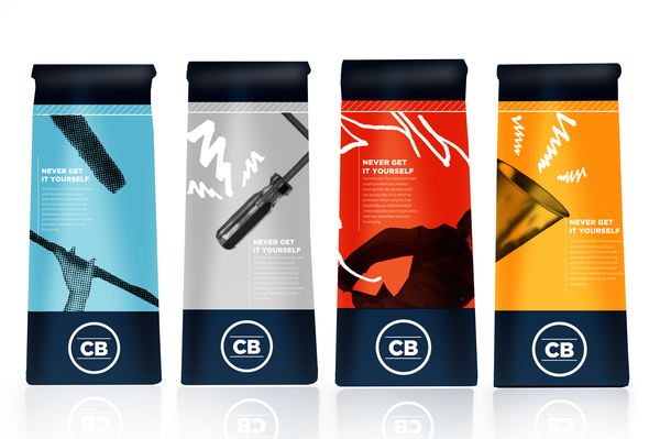
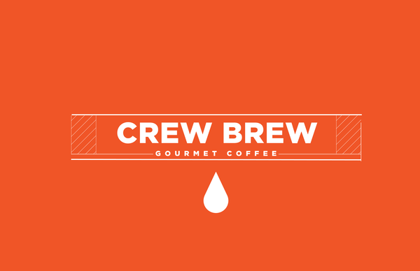
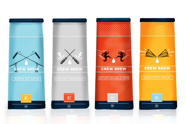
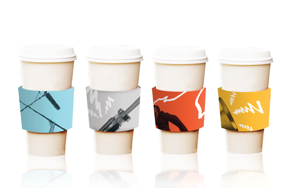
Crew Brew Coffee Company
This is great if you need to mock up branding for a non-existent company – obviously it can be done! This clever rendition of Crew Brew Coffee Company is a fictional coffee brand for prima dona actors and actresses. Clever, functional & Simple example of branding!
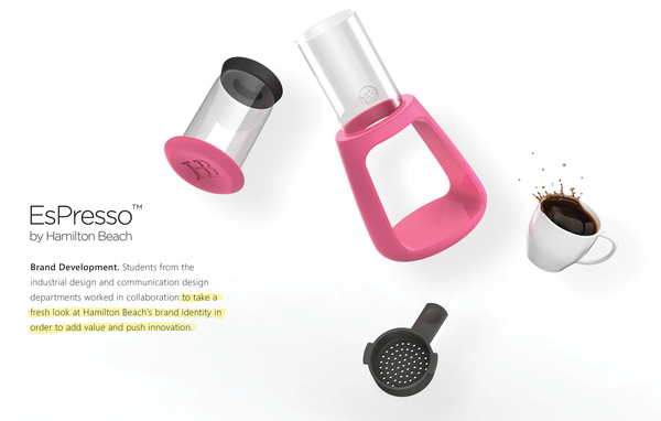
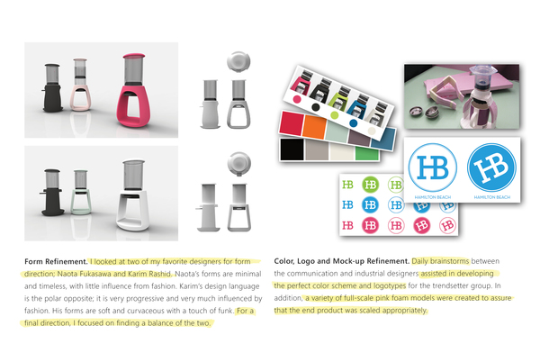
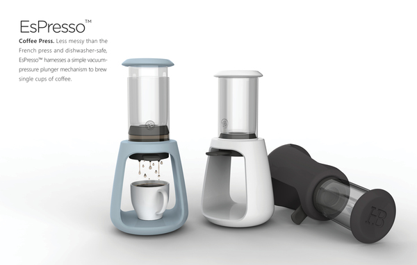
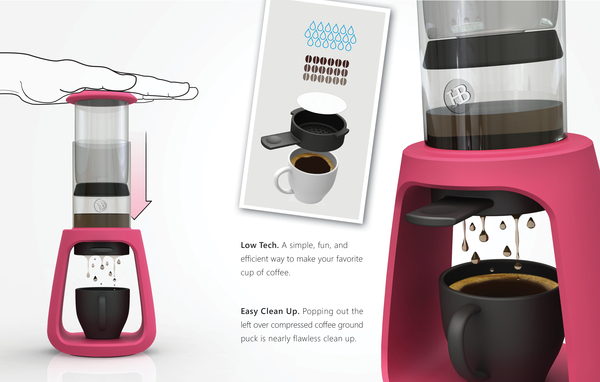
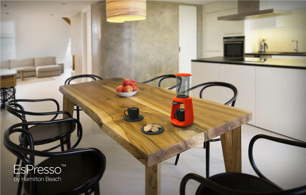
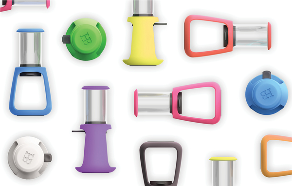
EsPresso™ Coffee Press Machine
The ESPRESSO™ COFFEE PRESS is Less messy than the French press and dishwasher-safe, EsPresso™ harnesses a simple vacuum-pressure plunger mechanism to brew single cups of coffee. Not only is this thing simple and elegant, its just a nice design – and looks like a really functional coffee maker! Not your ordinary mr. coffee that you see in stores! I’d definitely get this and display it on my minimalist table in my minimalist kitchen inside my minimalist mansion (If I had ANY of those things, that is haha – maybe I’ll stop daydreaming and drink more coffee – or perhaps go back to the beer post and start drinking hahaha)
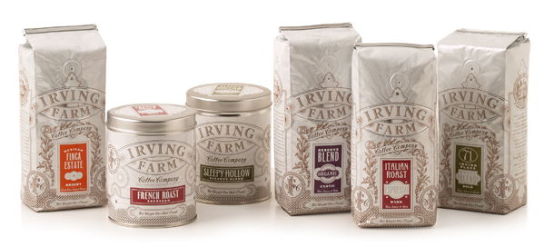
Irving Farm Coffee Company
Nice little Brand & packaging redesign – Its elegant and simple. It is an extension of the farm roasted concept, the hand crafted artwork created a new visual look for coffee packaging. Looks delicious!
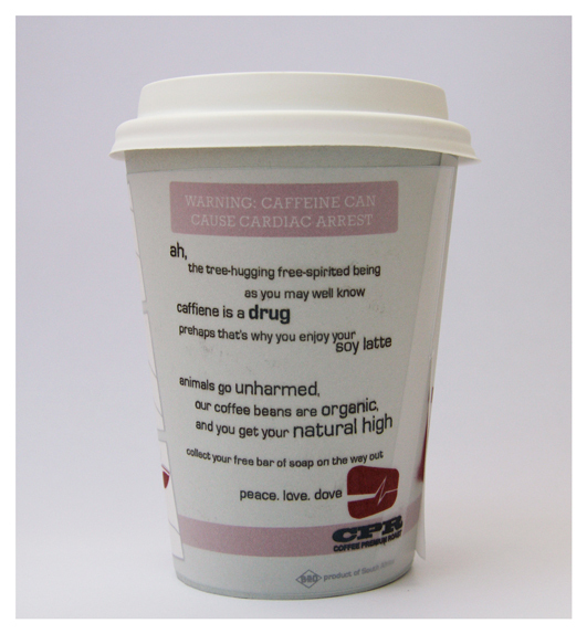
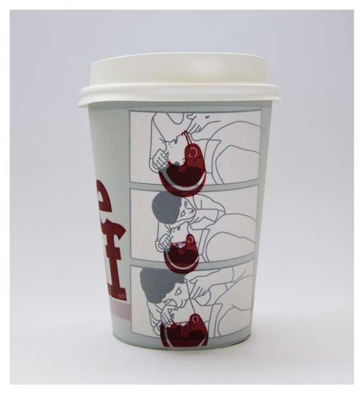
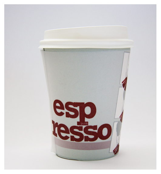
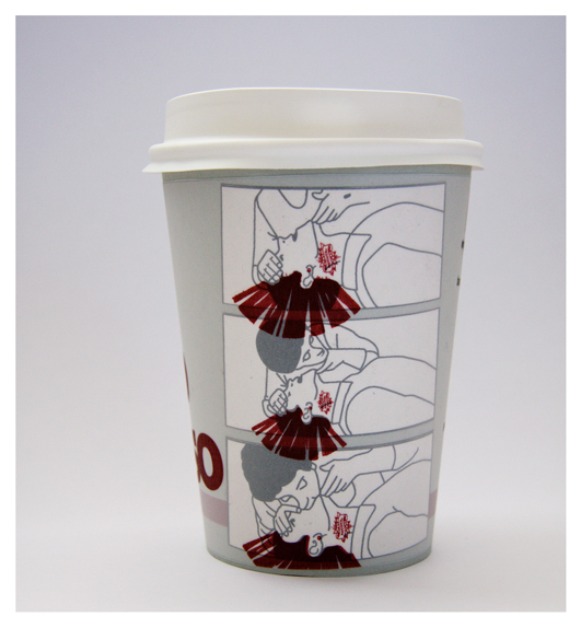
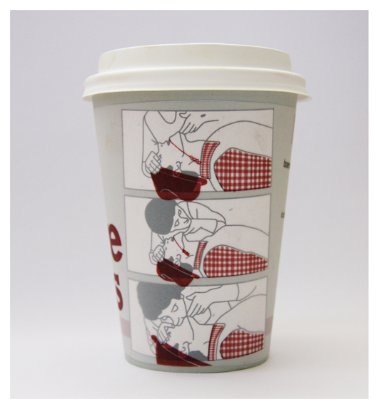
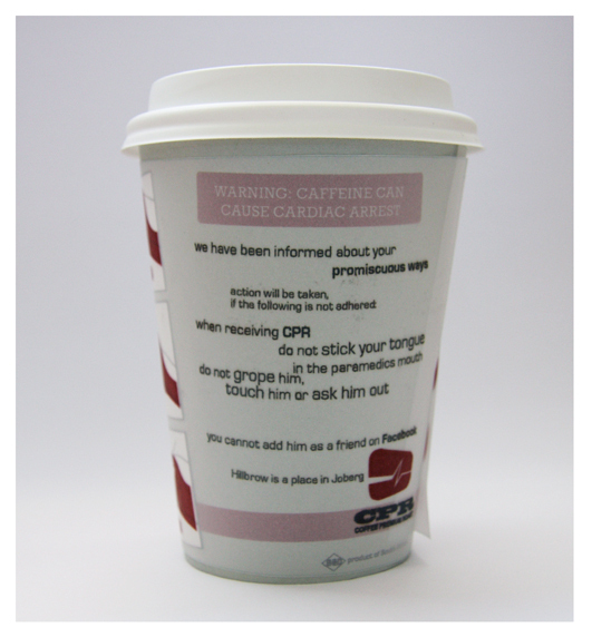
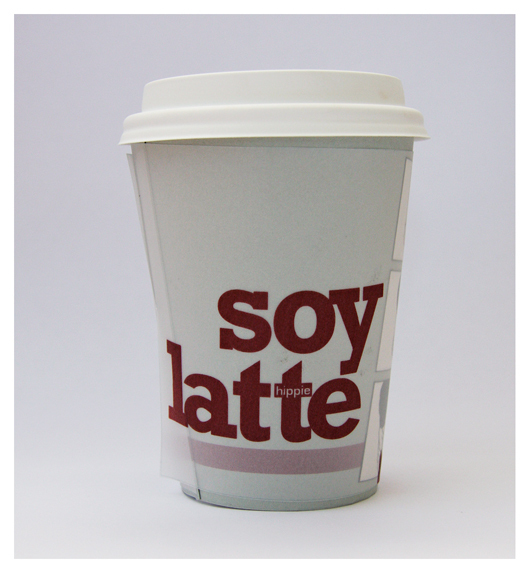
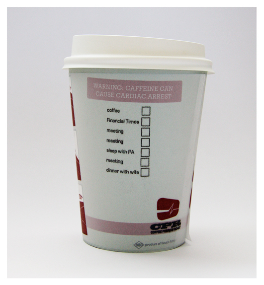
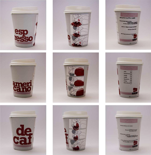
CPR COFFEE Company
I love how creative the designs (and copy on the cups lol) is – hilarious artwork too. All around win! Nice and simple coffee cup designs with added humor – you can’t go wrong with that combo.
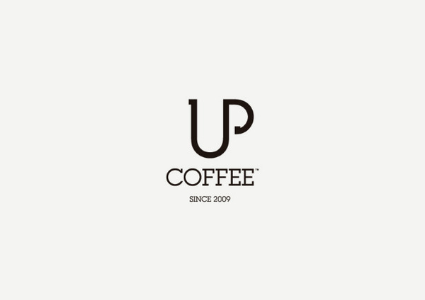
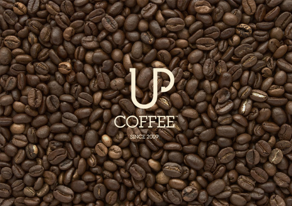
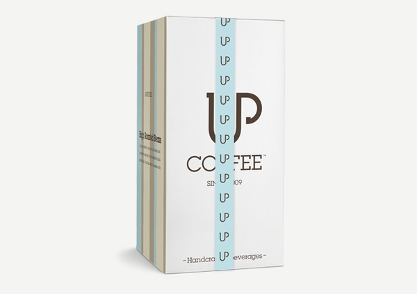
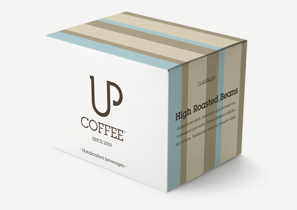
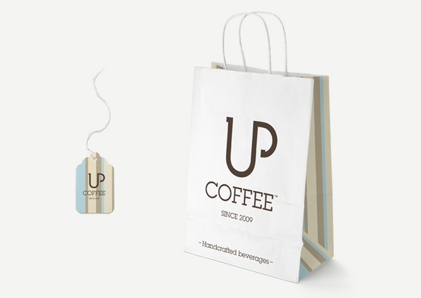
UP Coffee Company Identity
I really love the branding and logo design on this one – Such a good idea. Simple and straight to the point – the U letter makes up the cup – and the P follows up as the handle – Brilliant! I love minimal logos like that, it really makes me love whatever brand it is a little more for being clever (or for hiring a competent logo designer haha). I like the color scheme on this one as well – enjoy this clean little Identity package!
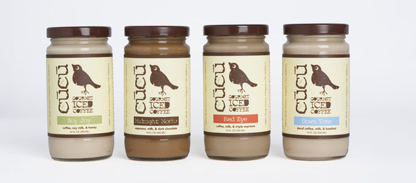
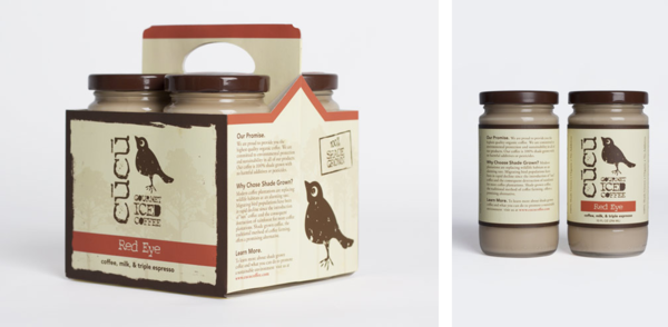
Cucu Coffee Company
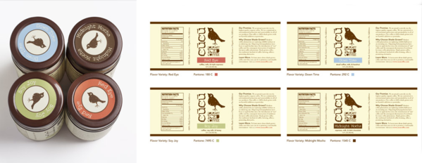
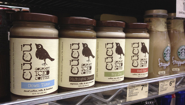
I love the look and feel of this coffee brand – nice organic texture to match up with its organic iced coffee product! Really nice colors (I like the browns and light textures mixed with pastel blue and pink colors) and package design concept – unique bottles that make it stand out – epic win! Also its a dollar more than starbucks fraps in the store apparently – AMBITIOUS haha.
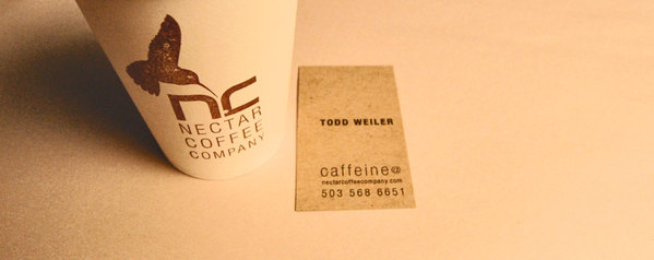
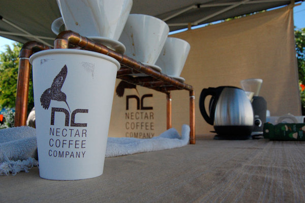
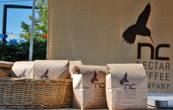
Nectar Coffee Company
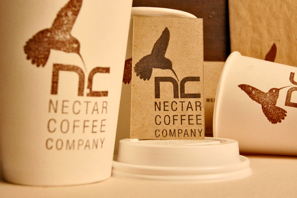
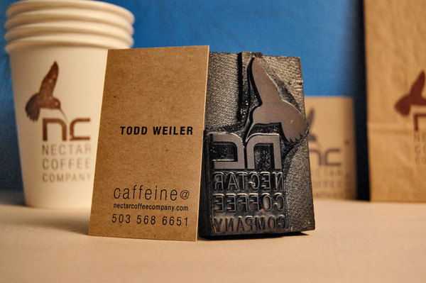
This is another epic example of just simplicity in branding. I love how its got a faded and rugged look. I love how it has a minimal hummingbird logo (FOR TEH NECTARRRR – GET DAT HUMMINGBIRD SOME NECTAR, BITCHES LOVE NECTAR lol). I also love how they only use 2 colors at once, and use a stamp for their cups – so simple, effective, and efficient! Gold Star!
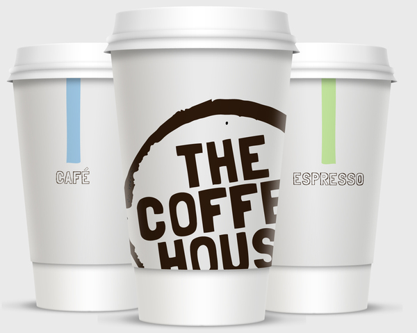
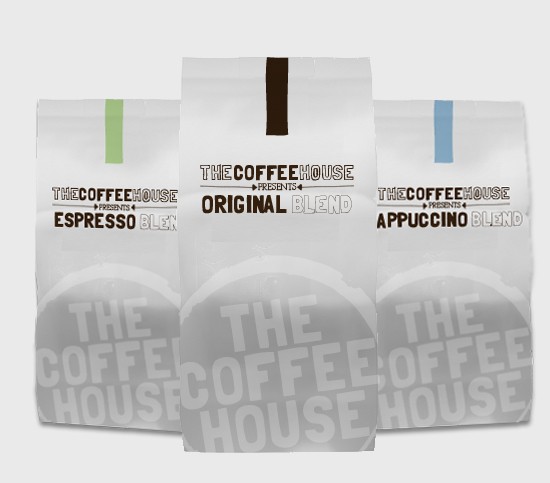
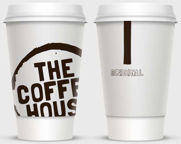
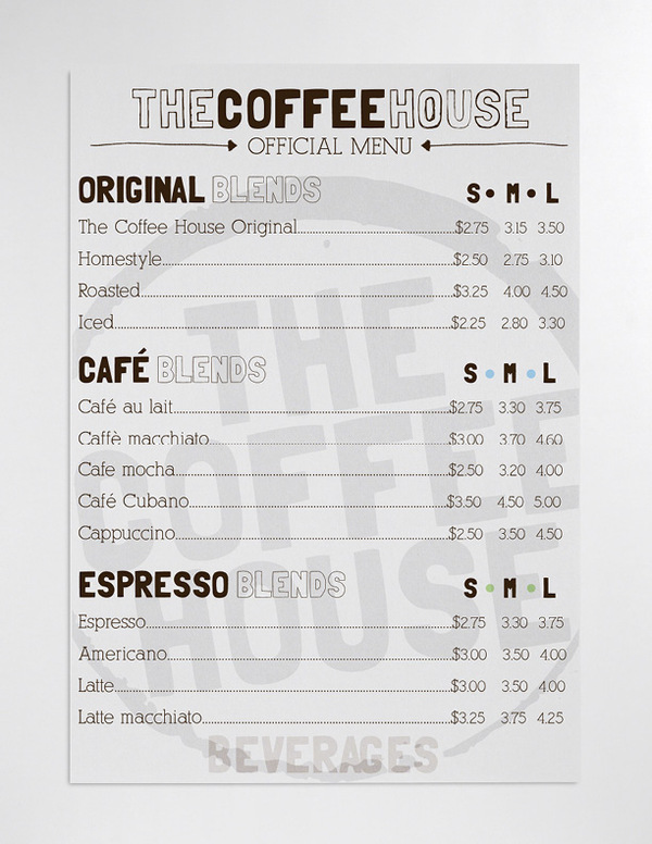
The Coffee House
Another good example of a completely made up and imaginary coffee company brand. Want to start any type of company? or get experience in said industry with no portfolio? Just start making junk up – its what people do, and it works, clearly! If you are a legitimate coffee company though, take a look, you might learn some new branding techniques! Or hire someone like this to do it for you!
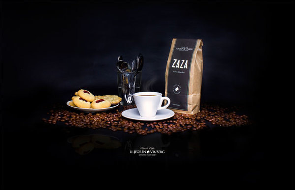
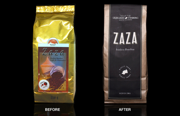
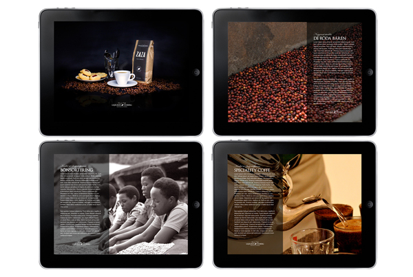
Liljegren & Vinberg Coffee Company
This coffee looks sleek & fresh with its dark colored design. Also looks delicious having imported coffee from Rwanda – to Sweden. That just sounds exotic and satisfying – like the branding design you will see here!
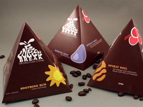
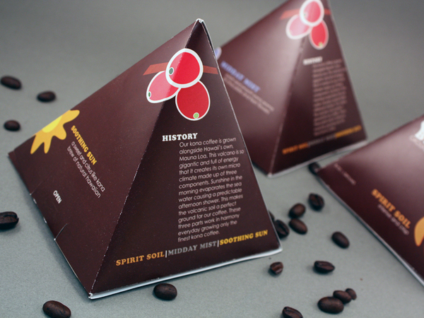
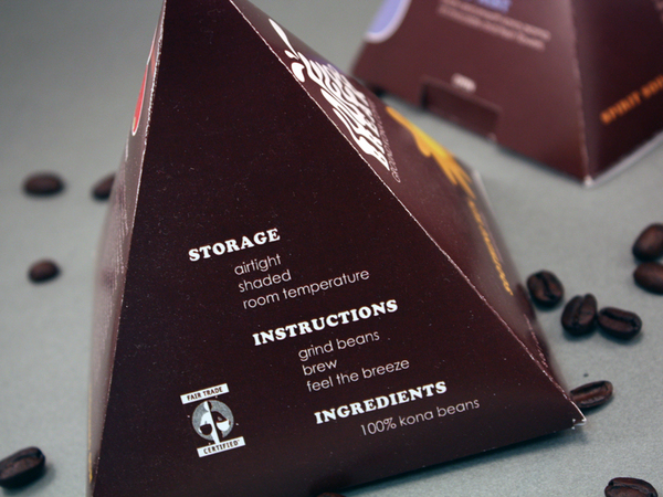
Coffee Break Branding
Little Coffee Pyramid Packages. Now that is unique. I want.
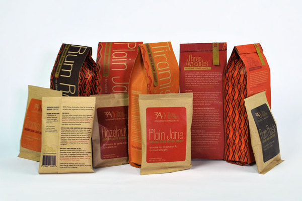
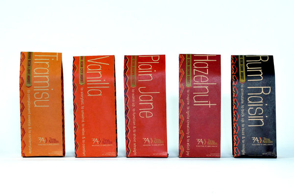
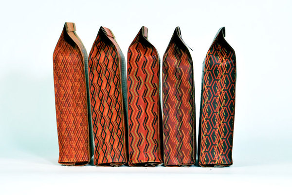
Nonprofit Coffee Co. Rebrand
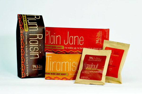
This one is really festive and different and it is for a good cause! Three Avocados is an existing non-profit coffee company that sells Ugandan coffee in the US to improve access to clean water in Uganda. The packaging has a nice palette of colors that reflect the texture of the coffee beans that it is made with – also sporting a unique typeface (gotta love dat typography). Each flavor has a unique color scheme design – which is also nice – I like when products do that on their packages and designs :).
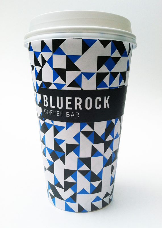
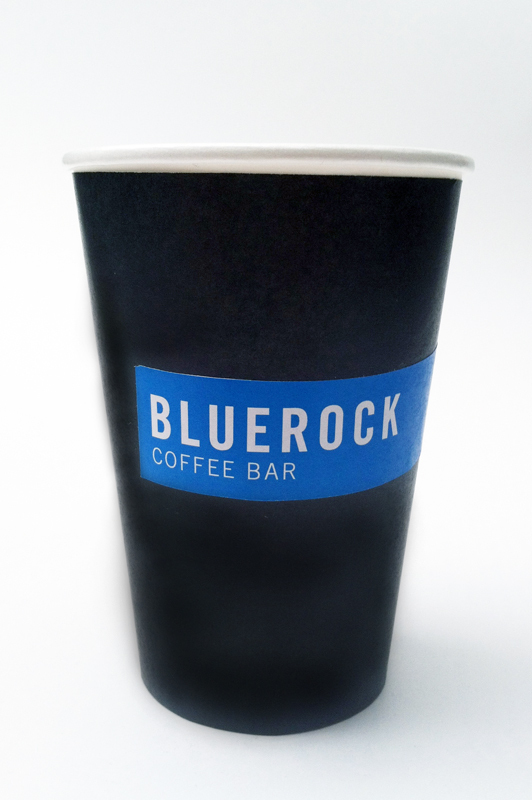
BLUE ROCK COFFEE BAR
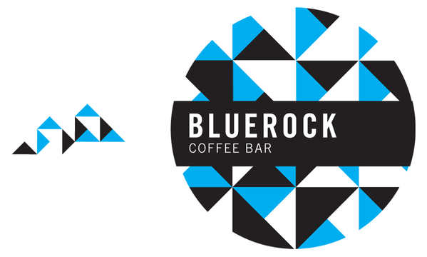
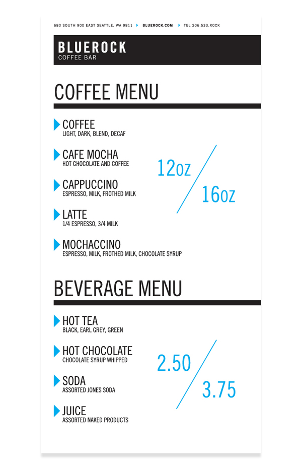
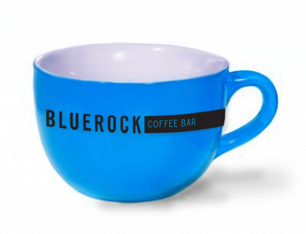
Love the colors on this one, I am a big fan of BLUE. Blue Rock Coffee Bar is an in process coffee company start-up located in Seattle, Washington. This branding really resonates with young urban professionals in any downtown area looking for the next hip coffee brand alternative. I like how the logo & brand design are based off the strong geometric shapes of a rock – kept really modern by using a tangram pattern and cyan blue and black colors. If I was a hipster I would grab a cup of joe there 
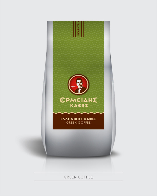
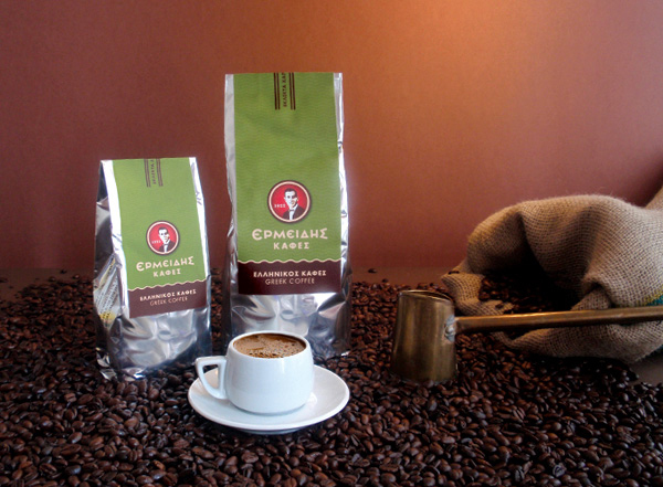
Ermeidis Coffees
I dunno about you guys but I really want some coffee now. lol. This coffee company is in greece – so it has a really awesome cultural feel to it – Love the typography!!!
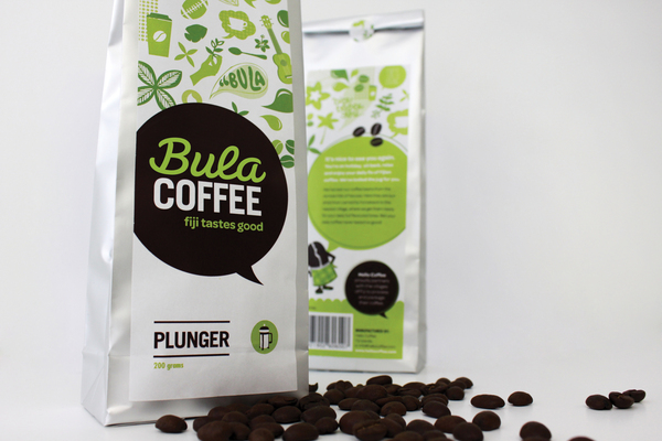
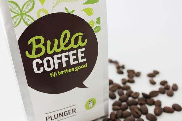
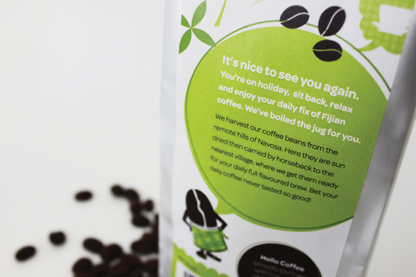
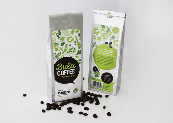
Bula Coffee Company
Another non-profit coffee company – these guys are helping the villages of Fiji to produce and package their coffee for sale. The branding has a unique look and feel, cultural cues and personality. Really like the fresh colors used on this one – also kept it simple while keeping it modern with some nice typography!
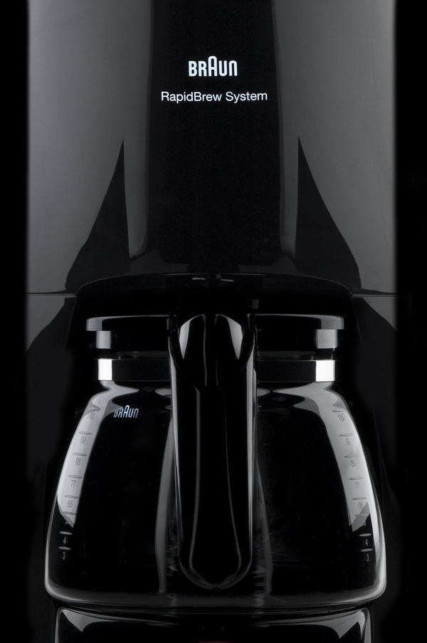
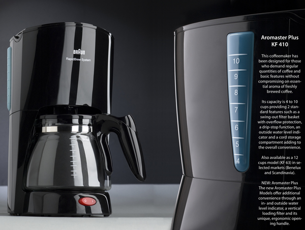
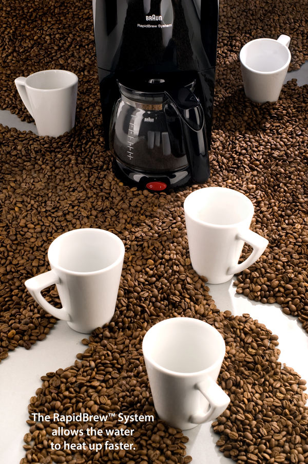
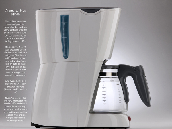
BRAUN Aromaster Brewing Coffee Machine
This is another coffee machine – but they should just shut up and take my money because this thing is sleek and beautiful. Looks powerful. looks like it makes delicious coffee. just take a second to drool over the awesome lines on this product design.
You can actually grab one of these things on amazon.
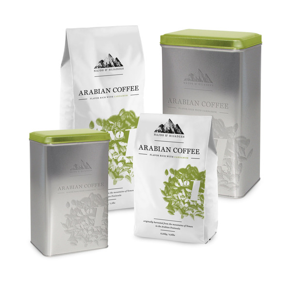
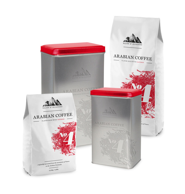
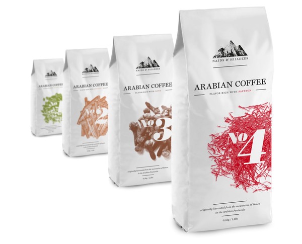
Najds & Hijadzes Coffee Company
Another Imaginary Coffee Brew 
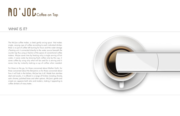
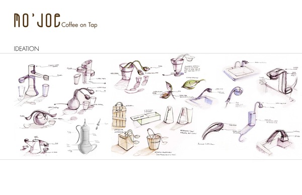
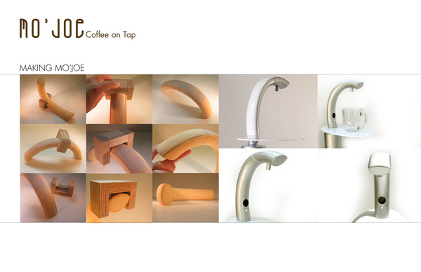
“Mo’Joe” Coffee on tap
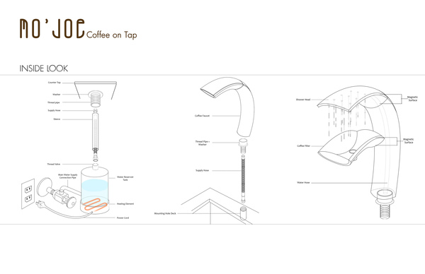
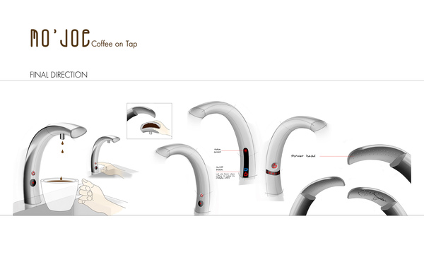
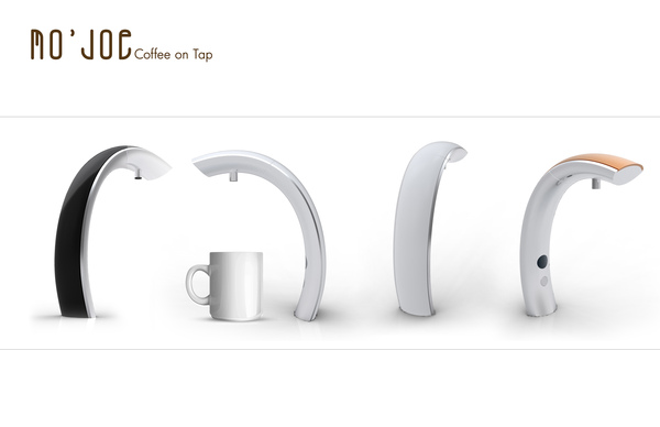
Save this one for last because it is my favorite – this is an epic coffee concept that If it became a reality, would probably kill us all haha. Imagine if you could just get coffee from the faucet like a brita filter? I can hear the collective “nerdgasm” as you guys read that last sentence. But yeah, that is what this concept is. The Mo’Joe coffee maker, a sleek gently arcing spout that makes single, varying cups of coffee according to each individual drinker. there is no pot of coffee left burning for hours
and the water storage/heating unit it connected directly to the water source beneath the counter top thus using a fraction of the space of conventional coffee makers.
Such a creative idea – doubled with a minimal and awesome design!
Someone please shut up and take my money.
What is your favorite brand of coffee? Or maybe you have a favorite Coffee Company? Or a favorite coffee product? WELL? WHAT IS IT? THE SUSPENSE – IT IS KILL ME! Tell us in the comments below 
You like this? Don’t forget to follow us on twitter @andysowards and like us on facebook @andysowardsfan! We are also on that Google Plus & Pinterest thing.



40+ Best Coffee Company
Branding Design Inspirations
I thoroughly enjoyed this. I am a petroleum landman, but my minor in college was Graphic Design. The Hummingbird stamp is solid. “LESS is MORE.” Interesting piece, sort of a mock up for Coffee Company logo’s. I was inspired to create an Oil Company Brand. Although I am well beyond 30+.
Matthew P. Galipp
Thanks for sharing with us Matthew!