If you don’t have the means or the budget to create your own email newsletter designs, then opting for a template often seems like the perfect plan. However there are so many templates out there that it can be hard to narrow down your choices, especially when some of them host features that are targeted towards certain niches (ecommerce for example) but not others.
If you’re looking for a cheap or even free template to use for your email newsletter campaign, then you have come to the right place. Here is my rundown of 7 of the most beautiful and also most versatile email newsletter templates that are guaranteed to pretty-up your email newsletter whilst also maximising conversions.
Market
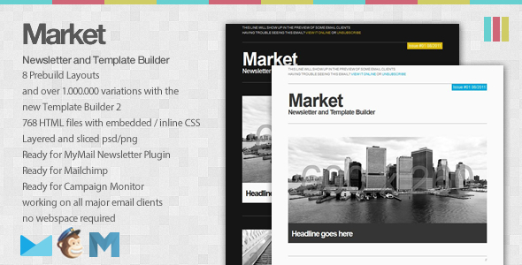
The Market template is great because the possibilities for customisation are endless. Grey might seem like a strange choice for a email newsletter, but the splashes of colour help to brighten it up and make sure that it is fresh instead of bland.
There are dozens of customisation options when it comes to colours and elements, so you can make sure that this template really does showcase anything that you need it to showcase. Perfection.
Metro
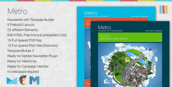
Metro is a great modern template theme that isn’t afraid to be bold. This eye catching design isn’t afraid of the fact that it is bursting with colour, which works with email clients today. Most email clients now show a preview of an email, meaning that colourful templates get a chance to catch attention. If you want to grab eyes fast, then this could be the way to go.
Elegance
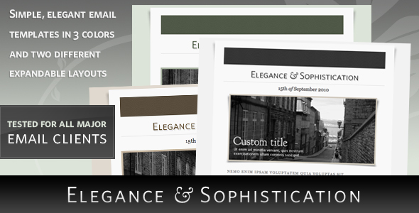
This email template truly deserves its name in that it truly is elegant and sophisticated. Instead of using a monochrome look to appear modern like other newsletter templates, Elegances goes for an old-time look that sets it apart from the crowd. A truly lovely template that works great with photographs – perhaps a good choice if your website is focused on design.
Eternal Emailer
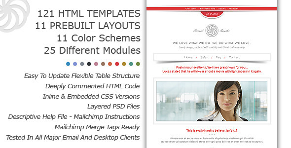
Available in a variety of colours if pink isn’t your thing, this email template manages the feat of being both clean and interesting at the same time. While not as loud as some others, the smooth lines and general ‘less-is-more’ feel make it extremely professional while at the same time being extremely stylish. A great choice if you want to appear businesslike while still retaining personality.
Fresh
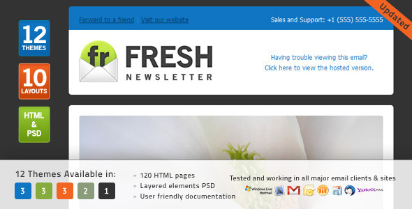
While Fresh has many colour schemes, it’s the dark background beauty that I love the most. Fresh does what it says on the tin – it’s clean and modern while the modular style means that your content is presented in the best way possible. Everything is presented in a clear manner meaning that it is easy for your readers to digest.
Skyline
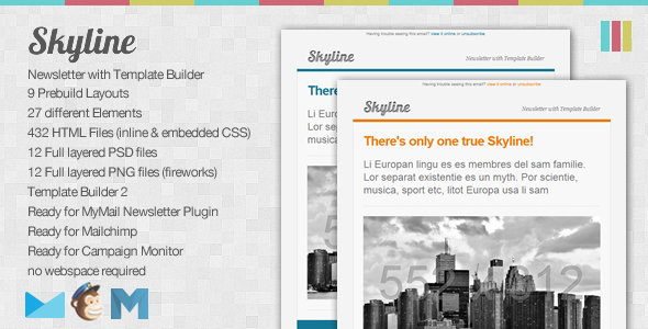
Skyline does ‘pop of colour’ better than any other newsletter template I’ve seen because it does it for a purpose. Instead of using the pop of colour to make your newsletter look good, it does it so it draws attention to your mail item of news or main advertisement. It’s not subtle, but that’s the point and that’s why it will work and help you maximise conversions.
Oceanic
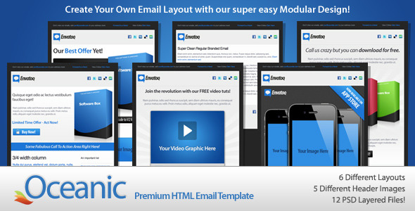
Last but certainly not least, Oceanic is the best option for those of you who like to use email to get people to social media. While there are many different template layouts that let you emphasises different things (the above screenshot being the ‘video’ template), all of them put an emphasis on social media buttons and sharing. It’s great if you really want to get word out there, and it looks pretty awesome too!

