Today, you can find that the majority of web designers are seen trying typography using CSS. Though you have the choice of trying sIFR or by simply using the images for your typography but the gleam and beauty of CSS is all together a different thing. The CSS Typography grants you a couple of opportunities to create some unique and special designs and are the perfect solution for flexible kinds of website projects, especially the ones which are driven by a content management system (like wordpress).
Using sIFR or images can be a good choice when you simply want to repeat the same typography over the next hundred web pages that are supported by a CMS. So when you have an easy and uncompromising option of creating stunning and beautiful typography using CSS, why heed for any other option. The below is the list of some beautiful CSS Typography examples which can vouch for the real beauty seen over these options.
If you or someone you know is attempting to replicate this look for a website or application perhaps consider web design that is very css3 savvy that can really make your typography pop.
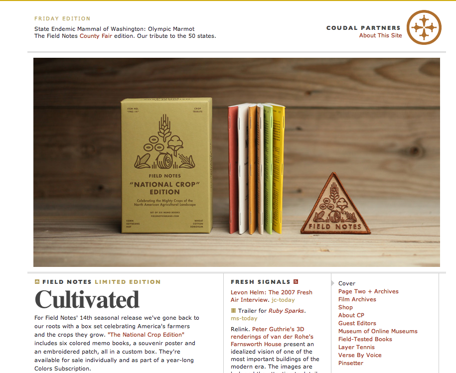
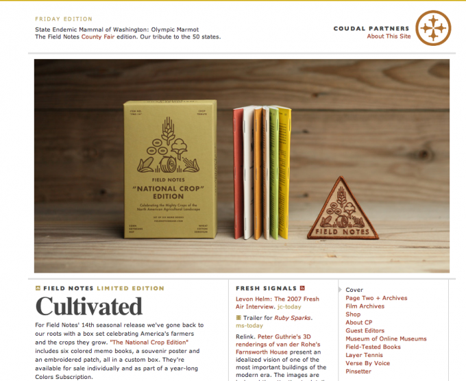
Coudal Partners
You would be surprised to see the serif font at this site is *gasp* ‘times new roman’, wherein it is used in a large bold version having a negative letter spacing of -2px. The nuances of this font do embark with a different and unique whitespace and relationship along with each other. The smaller headlines seen over this site are in capital letters carrying a moderate letter space of 2 pixels with Verdana or Gill sans which are crystal clear screen san-serif fonts. The stunning typography is due to the close proximity of the two diverse typefaces and the tension seen between the moderate and negative kind of letter spacing.
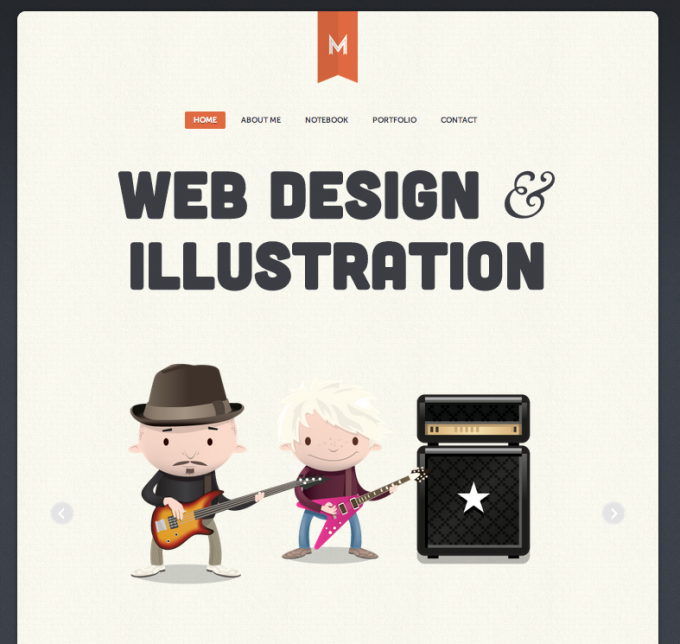
Matt Hamm
This site belongs to Matt Hamm who is a professional web designer, illustrator and developer and heads two creative design companies. His portfolio website can be viewed as a perfect example of beautiful typography. The web design is seen with vertical rhythm carved perfectly along with the premium web fonts which are served via TypeKit. As you look further, you would realize how the web design comes with a number of variations in terms of font size, capitalization and other font styles. These are all elements brought together to create some outstanding visual hierarchy.
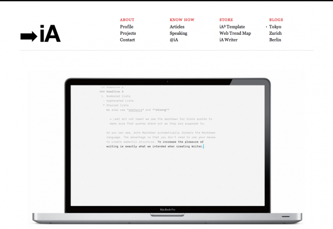
Information Architects
One of my favorite sites just because it is so simple and clean, this site has really done an excellent job at using Georgia in many different ways resulting in a stunning and beautiful example of CSS typography. The Grid style layout definitely adds to the immaculate organization of the Serif text – using different colors everything is neatly organized and separated. This is a great example of how using one font throughout a site, organized in a grid, can just be easily readable and also be an epic design.
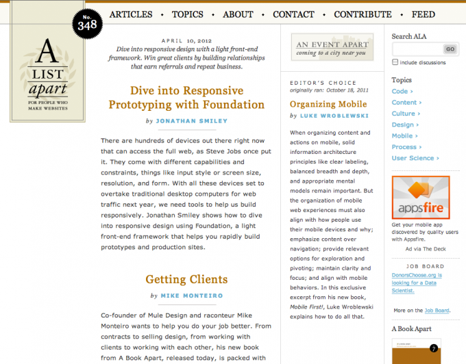
A List Apart
It is considered to be one of the best websites carrying stunning kinds of typography along with the factor of good content readability. For a content based site like A List Apart, typography is a very critical thing especially when you have too many lengthy articles taking center stage. The web layout of the site gives you great vertical rhythm and a perfect blend CSS typography methods and styles including capitalization, centered text along with an attractive hover state meant for hyperlinks seen in different articles and posts.
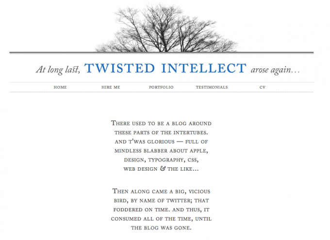
Twisted Intellect
This website has the composition with a daring use of some completely non standard font known as Adobe Caslon. The reason of such usage is simple since this site is more likely to be visited by other designers who have these fonts (which is available with the CSS suites) with them. If the font is not available with them it can simply fall back to the standard serif fonts. The subtle enhancements you see in the composition make it different and interesting.
The use of the CSS pseudo selector which is seen in the first capital letter along with the well thought out kind of spacing and the small caps certainly makes the first paragraph effective and interesting. Also, the contrast you see in a form of all caps and italics along with various gray values gives an elegant and interesting visual look and feel.
These beautiful examples would certainly give you enough reason and opportunity to learn and master the skills of CSS typography. Trying to replicate these in your website design project would certainly make your design stunning and beautiful which may not be seen with the options of sIFR or images.



Yes -A list site is a good example of how different fonts can help long articles, Thanks to CSS typography and Typekit –
For the last one Twistted … I still it is risky to use a non standard font.