The war movie poster is typically one of the most dramatic styles when it comes to poster art. Not only will you want to capture the scenery of a battle, but also the key emotions that must be emphasized in the theme. In this tutorial we will help you create your own war movie poster using Adobe Photoshop. Following these steps should help you learn exactly what you need to alter images and invoke filters/effects correctly for a typical war movie poster.
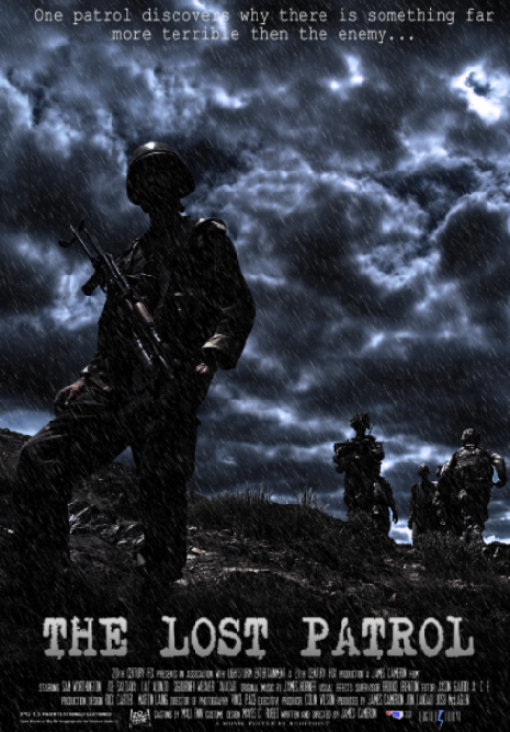
FINAL IMAGE
This is what we will be creating! excited? keep going!

STEP 1
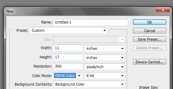
First create a new document for a movie poster. There are many different sizes of posters that you can adapt. For our example, we are going to use a 11×17 inch poster. Set the resolution to 300 ppi (or higher if your computer can take it) and the color mode to CMYK if you are printing these posters to four color type printers.
STEP 2
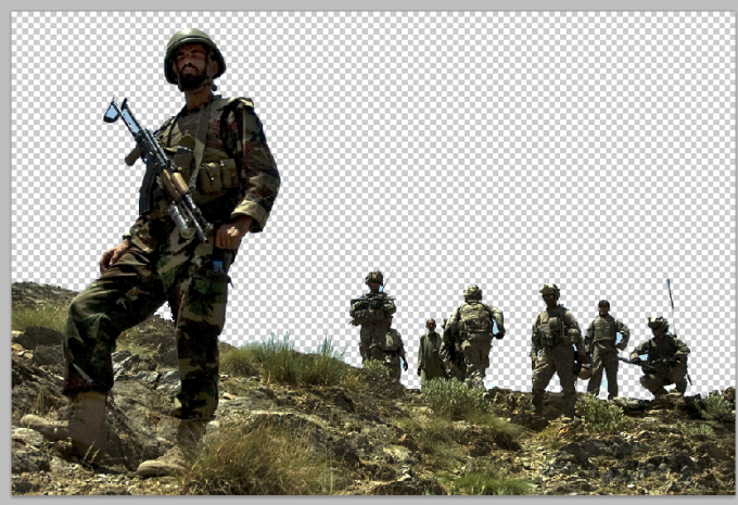
Good. Now on a separate document, cut out a picture of soldiers standing on the ground. Make sure that its background has been removed. You can either use the Magic Wand tool or the magnetic lasso tool to do this depending on how complex its background is. Our image here came from the soldiers media center.
STEP 3
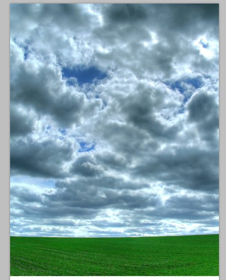
Next, on our main poster document, we paste in a sky background. Do not worry about the choice, we will process this later.
STEP 4
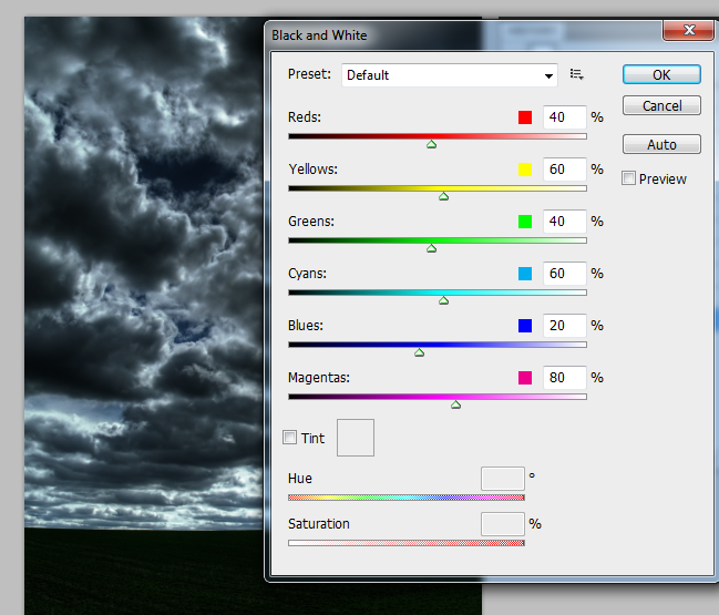
Duplicate this background layer by pressing CTRL+J. Then, on the duplicate layer, got to Image -> Adjustments -> Black & White. Once done, change the blend mode of this layer to “Multiply”. This should change our bright and sunny sky background to a much more gloomier image.
STEP 5
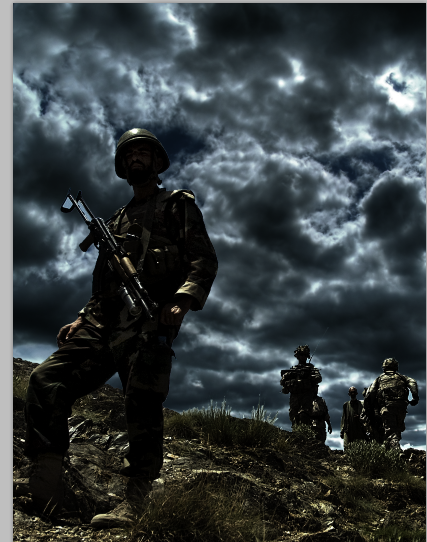
Now, paste in our soldiers cut out. Do the same procedure of duplicating it, changing the duplicate to black and white and changing the blend mode for a gloomier look.
STEP 6
Now, for the bottom area, create a new layer by pressing CTRL+SHIFT+N. Then, Using a large soft brush with a black color paint the bottom area so that the soldier’s ground area fades to black. Reduce the layer’s opacity to around 85% to blend id good. This will give us an area for the “movie” or poster details area later.
STEP 7
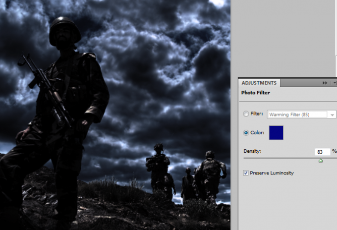
Next, go to Layer -> New Adjustment Layer -> Photo Filter. Set a blue color filter and increase its intensity to around 80% to still make our scene look gloomier.
STEP 8
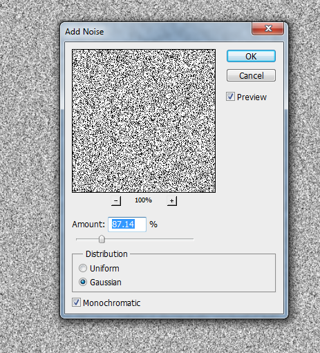
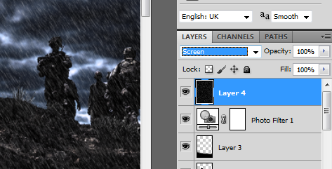
Now, we will add some rain. Create a new layer by pressing CTRL+SHIFT+N. Make sure this is on top of all the other layers. Fill this with a white color using the paint bucket tool. Then, go to Filter -> Noise -> Add Noise. IN the window that opens, set a fairly high Amount of noise (around 85%). Set the distribution to Gaussian and click on the Monochromatic check box.
STEP 9
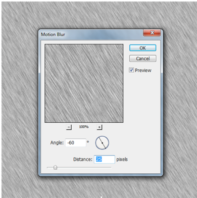
Then, go to Filters -> Blur -> Motion Blur. In the window that opens, set the Angle to -60 degrees and the distance to 25 pixels.

STEP 10
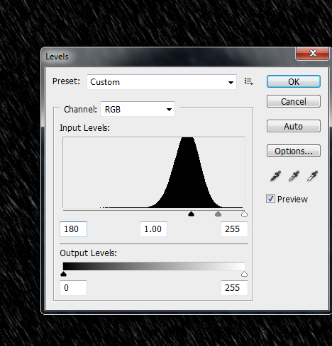
Now, go to Image -> Adjustments -> Levels. Set the black point level to 180-195 or until you see the white areas in the image look like rain. If you see too much rain, increase the value, if it is too little reduce the value. Use a 1.00 value for the grays and a 255 for the whites.
STEP 11
Finally, change the blend mode of this layer to screen to achieve the rain effect.
STEP 12
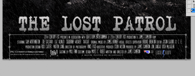
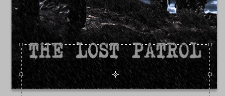
Next, type in our title. Use a light grey color here for the text. Of course, use the font style that fits your theme.
STEP 13
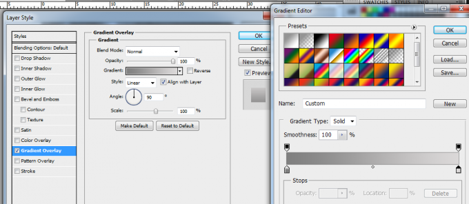
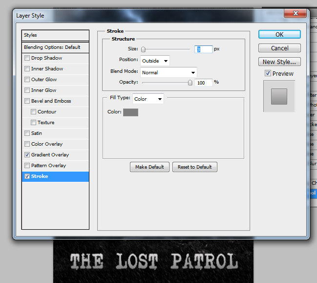
Then, double click on the text layer to access the layer styles window. Click on “Gradient Overlay”. Then click on the gradient box to change the gradient color to Grey-> Light Grey. Use a 90 degree angle and a linear style for the gradient.
STEP 14
Next, click on the stroke and add a 3 pixel dark grey stroke for the text, leaving everything on default.
STEP 15
Then, you type in the precise details of the movie below. Just try to use very thin and small fonts for this one. Also of course include the small logos of partners, sponsors (phony or otherwise) for your design.
STEP 16
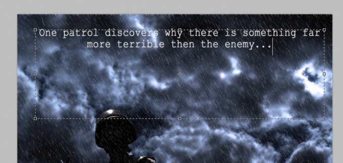
Finally, we add in a slogan/teaser on top to entice your readers to learn more about the movie.
FINAL IMAGE
Great! Now you have your gloomy war movie poster ready. Complement your movie poster with matching printed flyers, postcards or even tickets for a well-themed design.
