Internet users want one thing in a website: functionality. After all, websites aren’t just for looking at; they are meant to serve a purpose.
Most people will gladly use a visually unappealing site that does a good job of conveying information quickly over using a beautifully designed site that does not function well. The success of web design is measured in viewer traffic and sales, rather than how artistically unique it is. Here’s a guide to making your site functional and therefore, successful.
#1: Consider Your Audience

Designing for your target audience
Before designing your site, consider who will be most likely to use it, and what they’ll be looking for. If your site is informational, your audience will be looking for ways to get information fast. If it’s an e-commerce site, products will need to be searchable and categorized logically. Whatever purpose your site serves, you should design the functionality accordingly.
#2: Make Clear What the User Should Do

What Is Information Architecture? 30+ Epic Design Resources
People visiting websites don’t want to spend time figuring out complex navigation systems. Use a clear structure, including visual cues indicating where they should start. For an online store, this could involve a visible search box, featured products, or a layout of options for the shopper to choose from. If the customer has to go through a complicated process to find what they’re looking for, they’ll look somewhere else.
#3: Keep It Simple
The easier it is for users to accomplish their goal in visiting your site, the better. Here are some ways to simplify your design:
- Use icons to guide the viewer’s eye.
- Use white space to separate elements on the page. This will make it easier for the viewer to perceive information.
- Limit the user’s options.
- Categorize products logically
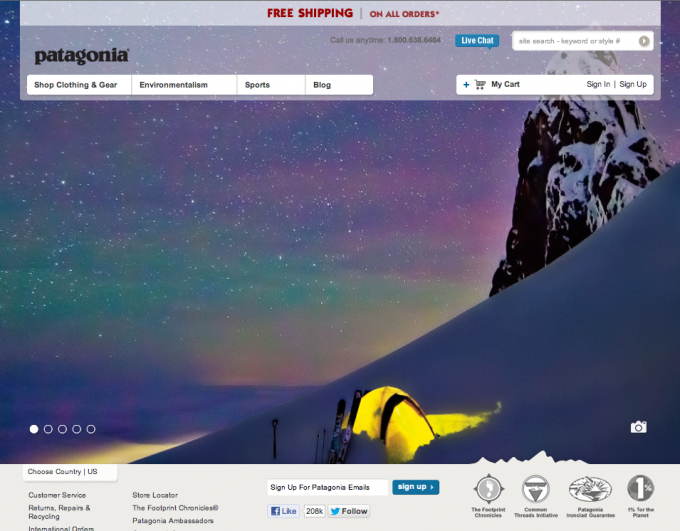
Patagonia’s website is a great illustration of simplicity in limited options. Shoppers are greeted with a beautiful photo that enforces the brand’s identity and are presented with a few options. They can shop, learn about the company or sports, and visit its blog. All without getting confused or bombarded with clutter.
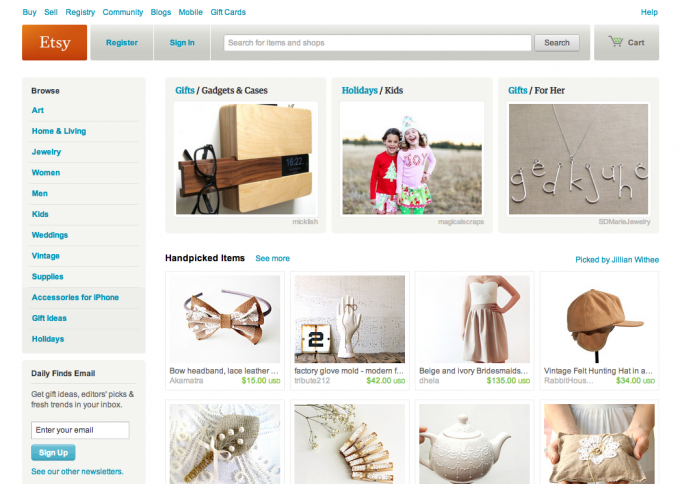
Etsy uses organization and white space for a visually pleasing and easily searchable shopping experience.
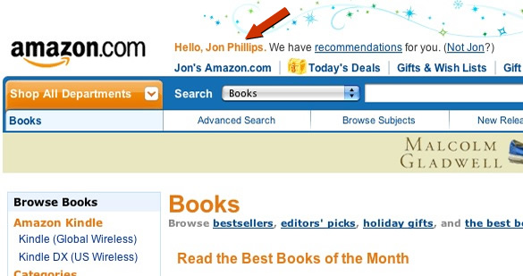
Amazon’s ecommerce software also makes great use of organization without being too busy. Everything is categorized in drop-down menus, and there is helpful information on the homepage about how the Webstore can help your business.
#4: Use Effective Writing

10 Must Follow Tips for Effective Writing
Since readers on the web don’t actually read line by line of text, keep your writing short, clear and concise. You can also use directional images or icons to guide the reader’s eye while scanning the page.
#5: Eliminate Barriers

5 Damn Easy Ways To Improve User Experience
Barriers on a website can be anything from number of clicks a user has to make to find what they’re looking for, to impatience in long loading time, to unnecessary registration. Minimize the number of barriers between the customers and their end goal so they have a good experience and don’t leave your site in frustration.


What a great article! I’ll definitely refer back to it as I create my own website.
It was worth reading this article. It helped me a bit with my work. Especially the idea of concise writing.