The Logo is a symbol of your brand identity. It depicts your business and its culture. There has been an abundance of artistic logo design showcases, logo design resources and logo design tutorials that are available for your disposal to help you out in designing a better logo, but they might or might not be of much worth in the crowded internet landscape. So here In this article, I will be giving you a few tips that will be a great value addition to shape up your current or new logo to make an iconic brand identity.
Having a Perfect logo, with perfect elements, will enhance your reliability, credibility and excellence – which obviously means more exposure and business for you!
The 9 Vital Value Addition Tips for your Logo Design & Branding Identity are:
Reliability
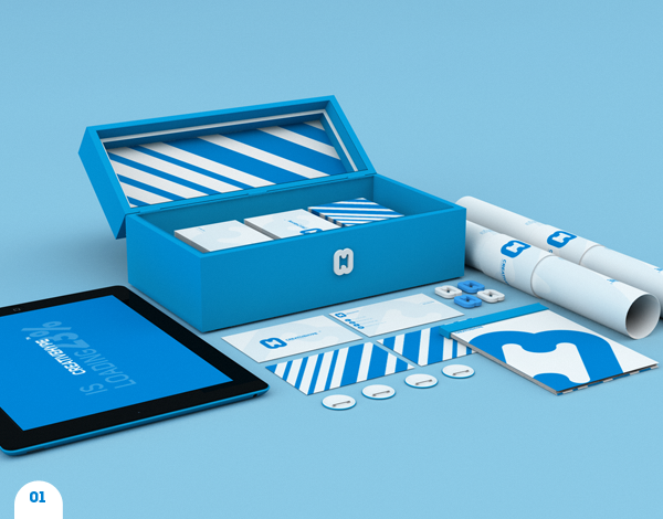
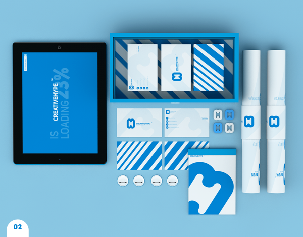
Reliability in utilizing your logo, tagline, and materials. Reappearance of identical factors, used in the same or similar means, helps people to memorize who you are and what you do. If you have too many logo variations or if the variations are pretty glaringly different – it could confuse people and they may lose connection with (or forget about) your brand. When people see your logo over and over again in the same or very similar form, it helps them remember (almost memorize) your brand – which brings us to our next point…
Remembrance
Remembrance is one of the fundamental ingredients for your logo stays at the forefront of your current and future customer’s brains. That way, they’ll consider getting in touch with you or using your service or product the next time they are in need of your unique solution to fix their problem! No one could forget some of the epic and classic brands of our day with the timeless logo design of the likes of Fed Ex, Coco-Cola, Nike and Pepsi.
Have A Good Idea

idea generation plays vital role for your logo and can reverberate the significance and the unique character of your business. Some logos are great ideas when you take into consideration what the business is about and represents, on the other hand, other logos are bad ideas, you know which ones I am talking about. Take some time and experiment with ideas and find the right one that fits your business and attitude!
Individuality
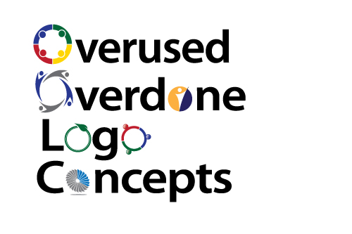
Individuality is what makes you stand out from the crowd. For example, if everybody in your business niche uses the same representation (i.e., web development firms often use globes or www in their logos), try to use something else, be original. That way, your logo doesn’t just look like everybody else’s.
Professional Approach
Using a Specialized, Skilled and Professional Approach in the way of the graphic design, the printing and the paper on which your materials are printed are all equally important. You need to be trendy, modernized and use latest tools to compete in your market. No one would think your business is credible if you are trying to sell them on something that has a sub-quality, badly thought out logo on cheap paper.
Time saving
To make sure that you don’t have to revamp your logo in just a few years – Planning ahead is the best and most cost effective approach. Plan out your logo, (draw it up on paper and then in a design software like photoshop) take the time to do it right the first time and keep your company identity and branding in mind. This will help you to avoid doing countless corrections and revisions to your logo.
Colors
Usage of Color (or multiple colors) depicts your flavor of working style, use appropriate colors to depict your product and service. The color combination should be a smooth blend rather than irritating colors. This will help you to have vibrant designs full of life when you have to print marketing materials and when you go to design the website of the company.
Compatibility

Compatibility and uniformity in all elements is very important. Make sure all elements of your branding are well managed and interchangeable. Uniformity in all aspects of designing a brand identity and logo are crucial.
Scalability
Designing a logo for a Brand name and identity is not so easy as just carving a logo into photoshop or on some paper. The logo should be as vector as possible – so that the enlargement of its size (for a billboard for example) doesn’t affect the quality and visibility of the image. Name should be clear and legible at any size – big or small. You should also be prepared for the logo to be depicted in different color settings (white and black backgrounds for example) for maximum effect and usefulness of a logo design

