A highly usable website is one that doesn’t get in the user’s way of achieving their goal. It functions easily and naturally, without presenting any confusion or distractions. While this may seem like a simple concept, it is easier said than done when it comes to designing a usable site. Follow these tips to improve your usability and to please your users.
Understand your user
Before refining your work, it’s important to know who your users are and where they’re coming from. Until you know what they want from your site, you won’t be able to tailor your design to best fit their needs. You can do this by researching your market, conducting polls and looking at what your competitors are doing. Before moving forward, refer to this article on refining your work for your audience, so that you’re continually keeping their needs in mind.
Tip 1: Define a Structure
The structure of your website should be designed with intention and strategy in order to function effectively. Several factors go into a cohesive structure, including:
Creating an intuitive and clear navigational system
While you can always personalize your navigational elements and menus, don’t go against conventions so much that your users get confused by how your site works. Make your navigation clear by defining options and highlighting which pages are currently being viewed.
Developing a visual hierarchy
Show users what is most important on your web pages by using color, placement and sizing to emphasize and group elements. For example, bright colors and bold type attract attention, while smaller and duller elements recede in focus.
Being consistent
One of the most valuable contributions to a solid site structure is consistency. If your users discover that a clickable component is a certain shade of blue and that they can go to the previous page by using a keyboard shortcut, they should be able to expect those functions to extend throughout the site. Make your layout and site parts work together, and your users will easily understand its functionality.
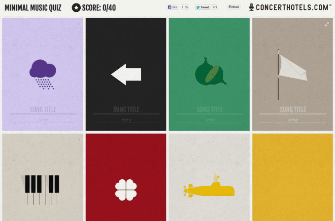
Along the same lines, when looking to layout your secondary elements it’s important to maintain clear consistency. Two of the most common approaches include using grid systems like seen in this minimal music quiz or this cashflow guide. The second common option is enabling different scroll functionality as can be seen is this uniform microsite. Regardless of your approach, make sure that all the elements interact in a consistent flow.
Tip 2: Choose Simplicity Over Complexity
Internet users have come to expect aspects in a website to function in certain ways, like clickable fields, search boxes and navigational consistency. Make common tasks like these easy to carry out by respecting conventions of website functionality. This doesn’t mean that it should look like every other website, but common functions should work the way others do. The least friction between where your users want to go and how they get there, the more usable and easy their experience is.
The same goes for the aesthetic factors of your design. Only use imagery, color and typography that add value to the functionality of your site to remove any possibility of distraction from users’ end goals.
Tip 3: Communicate With Users
Users ultimately want to know that their needs matter to your brand. Allow them to give feedback about their experience with your site, and let them know when changes are made. This allows them to see any progress being made and encourages them to stay engaged.
Another way to communicate is to create a tolerant interface that expects user error. When an error occurs, send messages to your users that inform them of what went wrong and teach them how to correct it. Approaching your design with the expectation that errors will occasionally be made will keep those affected from getting frustrated and leaving your site.
Usability is all about the best way to serve your users. As you make these changes and refinements to your design, always keep your audience in mind so that they know your site was designed specifically for them. They will enjoy positive interactions with your site, and you will gain a following that respects your brand.


