As a senior designer and developer I have identified some problems that are common with a large number of web projects. The main one is the failure to make a good plan. Therefore I’ve pieced together this guide to help designers, clients and businesses to plan and bring to fruition successful websites. I have used language that is non-technical and content that gives a broad view of the designing process.
The “Waterfall” Method
Flexibility is the key to good website design. The content should be such that it can be altered at will. It’s ludicrous to think that all aspects of a website can planned beforehand on paper.
Large projects sometimes use the “waterfall” method of developing a website. They specify everything before hand: the type’s point size, the length of headers and precisely how a photo gallery will function. In my view,
It’s ludicrous to think that all aspects of a website can planned beforehand on paper.
Websites being flexible we have to reconcile the necessity for clarity and thorough specifications with the intrinsic suppleness of the medium. This can be achieved by breaking down the difference. If you follow the process I’ve written here, you will be able to create content as well as design specifications which will greatly lessen the chances of glitches cropping up midway through the project, and at the same time create a framework that will give the website the flexibility to grow as time goes by.
Consequences of Failing to Plan

Simple. Intelligent. Powerful. A Simple Process For Product Design And Development
- Designer/developer has to make assumptions, correct or incorrect, about how some content will look on the website.
- Communication between developer/client on trivial subjects gets multiplied and work is delayed.
- Backtracking which leads to delays and deadlines getting missed.
- Cost rise above expectations as work goes outside the initial project plan.
- Client dissatisfaction as well as confusion that results from processes that are not based on original plans.
Assessing Needs
STEPS TO TAKE BEFORE DESIGNING A WEBSITE
Remember these things:
- A website should meet the requirements of the clients –it is not for you.
- A website isn’t an occasion. It is a bendable, extensible tool for communications that shows your business, both its negative and positive aspects.
The website must function mutually with the company’s basic marketing plan. The requirements for the site may coincide with the other endeavors and strategies of the marketing section. This is fine. The important thing to note is that the branding/marketing of the firm must reflect the website’s design and structure.
Typical Project Roles

10 Things to Know Before Designing for the Web
All projects are different; but there are typical roles in a web project of some size. They are:
- Clients, who stand for the main features of the business.
- Manager of the project.
- Editor/copywriter.
- Web designer.
- HTML coder.
- CMS/web developer.
Remember that one person can multi-task. The number of players has no direct bearing on the value of the result. Sometimes, a series of face-to-face meetings between executives and experienced designers can bring forth a great website.
Find Out What Your Website Content Will Be
Number of Contributors
Building and managing virtual teams
When you plan to put more content to the site, think about the contributors. In a small business, two is fine. In a firm, 5 or multiples of five could contribute. The time needed to edit/proofread the copy and image content expands in the same ratio as the number of contributors.
Content is Not Only Text

Designing Content Intensive Layout: Tips And Examples
The content must not be only plain text. By using these multimedia features, you will significantly enhance the allure and efficacy of the website: 1) Images. 2) Audio. 3) Documents (PDFs). 4) Adobe Flash files. 5) Video. 6) Content feeds. 7) Photos. 8) RSS feeds. 9) ‘Friends’ list from Facebook. 10) Twitter stream.
Good Photography is Valuable

21 Examples of Big Photography in Web Design
Photos explain the organization’s brand. Go for professional photographers. You will not need plenty of photos; only good pictures. Ten professional pictures are more worthy than 50 amateur snaps. Sometimes generic images will do; stock photos can also be used. But nothing can substitute for high-class photos of your storefront, staff, services or products.
Good Writing Has High Value
How to Produce High Quality Written Content
Writing web content is not just writing policy papers, memos or technical documents. If your company doesn’t have a person who can write clearly and briefly marketing copy, take on an expert/editor.
Key Elements in Website Structure Planning
Site map: Your site map must resemble a flow chart and be created with software like Visio or a tool that’s free. You could also build an outline with featured lists and serrations that point to pages as well as sub-pages.
Definition of Content
It’s important to define every element of your content. If you fail to do this then developers will have to guess what each kind of content must be. Content elements need clear direction. They need to say exactly what they aim to accomplish and how they will be used.
Checklist of Content
Here’s a list of common kinds of content: Articles, banner advertising, blog, documents, discussion forum, forms for contact, e-commerce, quotes, physical products, email newsletter, digital content, event registration, event calendar, image gallery, incoming and outgoing RSS feeds, link management, search, staff directory, and social media links.
Separating Content From Design
Website Design Dominates in the World of Web Content Development
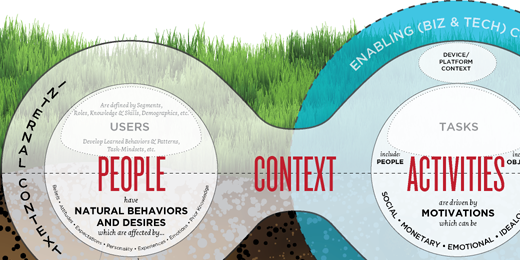
Though design has an intimate relationship with content both are also detached from one another. This may sound confusing. What is means it that content does not have all elements of design. For example, each article in your website will have: Title, Meta title, Meta description, Author, Date of publication, Category, Summary, Main text. These bits of information make up an entire article, regardless of design you use for your copy: layout, fonts, colors, photo thumbnails, author and so on. Content is applicable even without design. The plain text may not look pretty but it reads well.
Meta Data and Good Content
10 Excellent SEO Tips That Will Improve Your Web Design
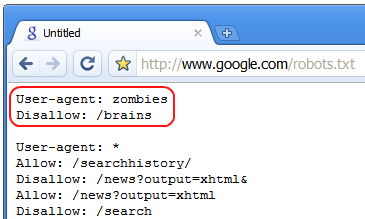
Meta data relates what your content is all about. In an article, everything — except the title and text — is called Meta data. Some people think that Meta data is meant for search engines. While search engines rely on this data for effective web page indexing, you may need Meta data for your records, without showing it. The minimum you require to qualify as an article is: Title, Text, and Author.
Plan for Future
The value of high-quality Meta data rises with time. Over the years, if you have a stock of 150 articles, you could sort them out by category, author and date.
Wireframes
A Beginner’s Guide to Wireframing
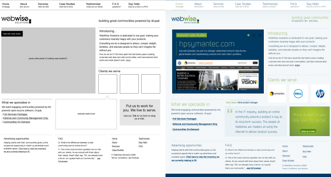
Wireframes deal with the layout factor of web design. They show the layout of the page and are created in grayscale. Great tools like Illustrator, Photoshop and Visio work nicely for this, as do specialized ones like Balsamiq.
Designers tend to make things appealing from the start but this must be completely avoided at the wireframing phase for it will divert from the aim of the wireframe which is to resolve where things must go and not what size of font to use or in what color should navigation be. Generally, one wireframe must be crafted for each distinct page. After the wireframes are reviewed, move on to the next design phase.
Beneficial Good Design

25 EXAMPLES OF INTERESTING AND CREATIVE STRUCTURES IN WEB DESIGN
Take the iPod for example. Exquisite design did wonders for this Apple product. In fact iPod has fewer features than other similar gadgets but its great design and interface, along with terrific marketing, made it a very buyable item. In websites, sadly, great design and minute details often don’t count. The reason: if something works it need not be refined. But this is wrong thinking. A website significantly affects customers’ perception of a business. A website that is harmonious, attractive and has easy navigation will have a positive impact. If it isn’t, then visitors will leave your website.
Preliminary Design
The preliminary design, generally created in Fireworks or Adobe Photoshop or even Adobe Illustrator, comprises visually precise images of your home page as well as one inside page at least. Visual branding of your business elements must be included. Create elements that correctly reflect the business.
Approval of Design and Revisions
After submitting the preliminary design for approval, the possibility of a revision arises. The designer and stakeholders will share ideas and try out some variations before final approval is given to the design.
Don’t Design by Committee
Multiple opinions could be problematic. Critics of the design may be absent at the time of filtering the website’s content. Normally in small businesses, having in excess of five people to give design feedback causes a deadlock. In short, restrict your ‘review committee’ to five or less persons.
Client versus Designer

A Tribute To Clients From Hell
Often there is tension between expert designers and clients who are less-informed. The “bad idea” problem illustrates this well: the client may ask for a design feature that is unattractive as well as unworkable. In this scenario the willingness of the client to listen to constructive criticism should be tested.
Think of Content

How to Bake Content Strategy into Your Web Design Process
Think about the future and expansion of your website. You may have a news segment with half-a-dozen news reports; a core news page that has summaries which link to the entire view of the item. This is good. But is you have a huge number of news items, you have to consider other options. These questions must be considered in the process of designing.
Web Design Guide
20 Web Design Examples of Blog Front-end Structures
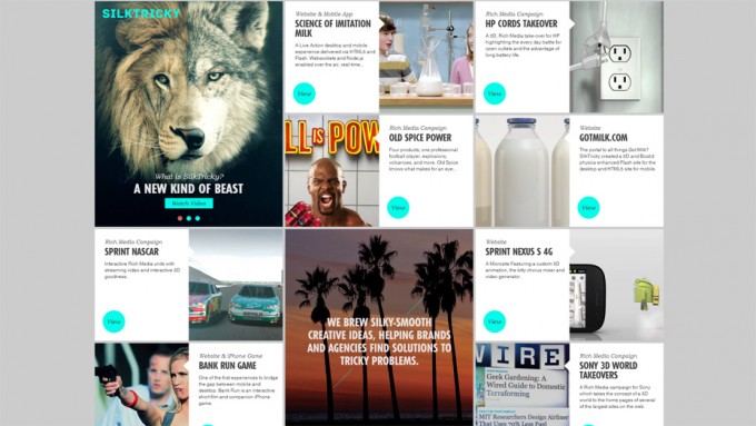
A style guide can make adequate planning shine. A style guide defines the design, interactive, layout and the kind of elements used in the entire website.
These include: Navigation styles; Lists; Paragraphs; Italics, underlining and bolding; Block quotes; Links; Icons; Use of images/style; Background images; Elements that are common like sidebars and <h1> to <h5> (heading tags).
Integration with CMS
Top 12 Free Content Management Systems (CMS)
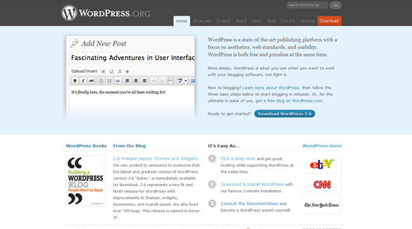
Your great design is now ready for integration with a CMS. The team that’s tasked to do this will give you the CMS log-in details that enable you to include content, text, video, photos and documents. You could do this comfortably and stick to plain formatting like italics, bold and lists.
Putting It Together
Now you will be sitting pretty on a solid website. Whatever the project’s size, you now need to do the following:
- Go over the content again. Check all the requisite points.
- Get your content proof read. Someone who has a fresh perception should be allotted the work; don’t do it yourself.
Beta Testing & Launch

Tips to Create a Web Design that Overcomes Browser Compatibility Issues
When you think that your website is nearly ready for public viewing, beta test it. Go through this checklist:
- Looks correct in all target web browsers.
- Interactive features are working well.
- Contact and supplementary forms are working predictably.
- External, internal links work.
- Images properly sized.
- Final copy content is in place.
- Links from intermediary software work.
Once you’ve completely beta-tested your website, launch it!
After the Launch

After The Site Launch – A Marketing Tutorial
Here are some tools to maintain the site post-launch.
Website Statistics
Visitor statistics give you an insight into the way people are using the website. One/two months’ data is needed to draw authentic conclusions. Consider these questions:
- From where are visitors coming? Check out search engines and direct traffic, links from other sites, ads, etc.
- Are your visitors local, national, regional or international?
- What are your most popular pages?
- How long do visitors stay on the website?
- Bounce rate? How many users leave after visiting only one page?
App Google Analytics is generally used to get answers to these queries. There is other software too that provide the answers.
Documentation
A lot of your documentation will comprise different elements earlier discussed. These include wireframes as well as Photoshop documents. Details of how different sections of the website are deployed in the CMS will be needed. Check out the information that will be needed if new people were to take care of the website; what they would need so as to take up the project? Proper documentation includes all these factors.
Back-Up

Your Website’s Disaster Contingency Plan
The files as well as the database of the website should have frequent back-ups, preferably daily. The company that hosts you may provide a way to do this. If your files/ database get erased or hacked or corrupted or damaged, you can repair the damage with the earlier day’s copies.
Plan Maintenance
Your plan for maintenance must define clear roles as well as responsibilities for all aspects of the website. This refers to posting of articles and photos and graphics that have to be created regularly. Proper assigning and understanding of this is vital. The best thing is to have a written maintenance plan.
Seek Visitor Feedback
Soliciting visitor feedback is a terrific way to better your website’s impact. There are many ways to do this. You may conduct easy online surveys or focus on groups on-site. Visitors generally cannot explain what they like – or dislike. So pose specific questions to them when seeking feedback.
Summing Up…
A great website is not a one-time happening. It’s a communications tool that’s extensible. Once you’ve created a terrific website, the momentum must be kept going. Be regular with your maintenance and interact with visitors on a regular basis to spot areas for website enhancement. I hope you liked this blog post in which I have incorporated a lot of factors that need to be considered when designing a website. Your comments on it will be greatly appreciated!


