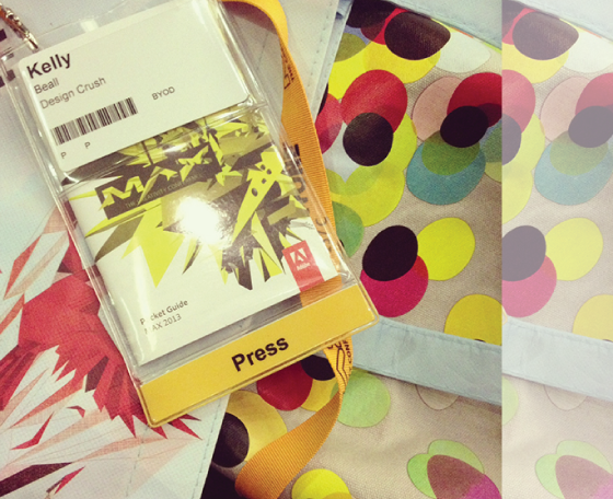
As some of you know several weeks ago I had the honor and privilege of being invited to attend Adobe MAX in Los Angeles, CA as an Insider! It was a completely amazing (and creatively overwhelming) experience – While I was there (From May 6th to May 8th) I was taking pictures, meeting awesome new people, taking in all of the information, tweeting, facebooking, and google plussing my butt off – So I gave it a few weeks to let the experience sink in (and got caught up on some work haha) so now I am writing about all the ins, outs, and good times that were had at the conference so you guys can enjoy it too! Ready to take a journey? Come, let us travel.
What Is Adobe MAX?
Adobe MAX is one of the biggest design conferences around! Adobe MAX is all about creativity and expressiveness. If you create, you won’t want to miss MAX. Designers, developers, strategists, video professionals, photographers, and more all come to MAX to exchange ideas and inspiration. Together with industry pros and visionaries, you’ll learn about the latest technologies, techniques, and strategies for delivering your best creative work. Come to MAX and explore how creativity is changing the world and what part you have to play in that change.
The Experience
So to start off – instead of going day by day (It was a whirlwind of awesomeness, and I already broke down my day to day at the creativity conference on G+) this post is going to cover the overall experience, what stood out the most, some detailed highlights and what I am looking forward to the most from Adobe this year.
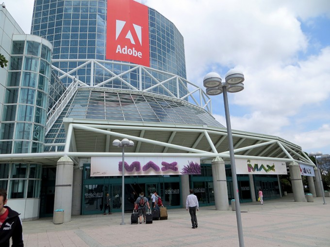
So upon arriving at the event – I had expected everything to be awesome, but I didn’t expect it to be as awesome as it was. Whoever planned this thing had everything covered. EVERYTHING. I wasn’t expecting everything to be branded for the event – like everything – there were signs everywhere, the windows had branding in it, the swag was branded, the tables, the rooms, the ceiling, the everything! It was a huge conference center, and it was branded so much you would think that the place had belonged to adobe for years – that amount of attention to detail had to have taken months of meticulous planning. Ok now that we have established that I was smitten by the place. Being constantly impressed was a theme for the entire trip. Registration was a breeze – there were tons of people with computers ready to give you a badge after a few seconds of registration, I got a fancy one that said PRESS on it.
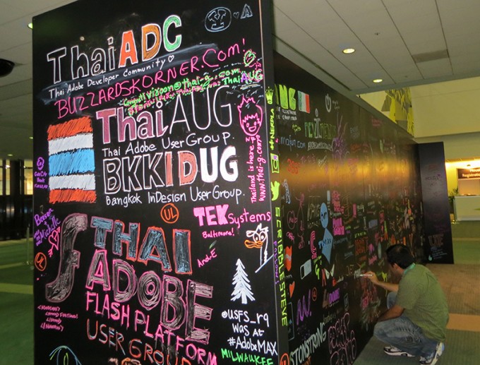
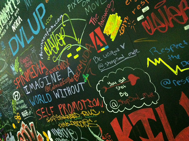
You could draw whatever you wanted on this board with all their cool markers
Every morning and lunch they would provide free food for everyone. That’s right. Free food. Free coffee and drinks too! There was free beverages and snacks available all day in the exhibit room. I was not expecting that much free stuff – it all looked awesome, and it was delicious. On the last day at the Adobe MAX Bash there was a concert, with more free food (really awesome food) and open bars – yes you got to enjoy free adult beverages and it was epic. They had a lot of stuff at Bash, we will get to that. Plus we got a cool swag bag with a shirt and other awesome design goodies. So overall the entire time I was at the conference I was constantly saying to myself “Oh man, this is awesome!” they really made it easy to relax and get into the mood to be creatively inspired by all the wonderful things they had planned for us – but while branding, little creative event details and free stuff are awesome, enough about that for now – on to the creativity and the meat of the event!
The Creativity
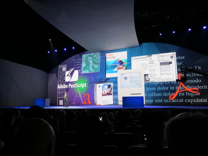
I really loved the old school adobe products tribute backdrop while Adobe CEO Shatanu Narayen gave the intro to the first Keynote of the event! So cool.
At the creativity conference, creativity was surely present. Everywhere you looked, or went, it was hard NOT to get inspired by SOMETHING. The Nokia Theatre which was next door played a huge roll in the creativity because when we weren’t getting our mind blown by the latest product announcements (software AND Hardware! I know! We will get to that.) our creativity was tantalized by creative keynotes at the Nokia (which was beautifully setup by the way) such as Oscar winning visual effects supervisor Rob Legato, iconic graphic designer and illustrator Paula Scher, inspirational artist Phil Hansen (His story was really great), photographer and photoshop manipulation master Erik Johansson.
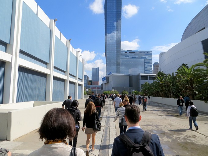
This is what our daily migration to the Nokia Theatre looked like
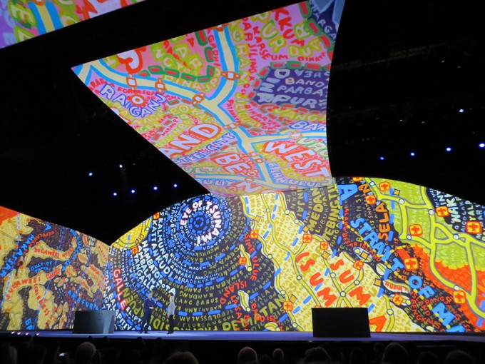
This was the awesome Paula Scher’s talk – you can check it out in its entirety here!
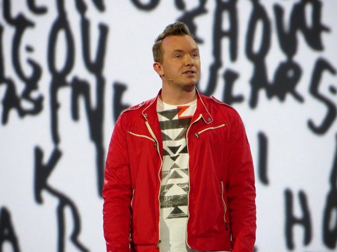
A pic I snapped while Phil Hansen was giving his talk – which was definitely inspirational, you can see it all here!
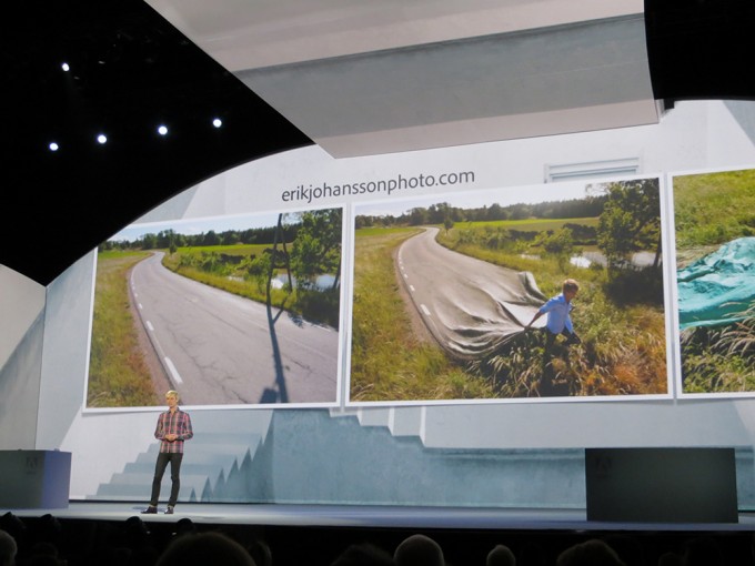
Erik Johansson giving his talk – and showing off some awesome artwork! Check out his talk here
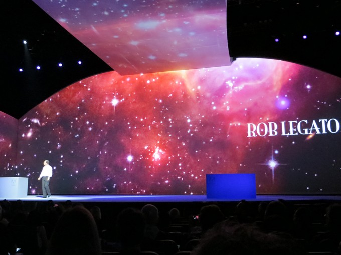
Here is Rob Legato talking about the just amazing film work he has done on movies like Apollo 13, and behind the scenes of some Titanic shots – definitely check out the full keynote on this one especially if you are into film.
All the creativity wasn’t just in the Nokia Theatre, in the LA Convention Center where the bulk of the event was held (where all the food, sessions, and exhibits were residing) they had lots of great talks by great Designers such as Paul Irish, Jeffrey Zeldman, Aaron Draplin and many many many many more! There were literally so many sessions going on that you could not possibly attend them all even if you wanted to – it felt like a college campus with people picking and choosing the things that mattered most to them to attend (which is a good thing!). Since Adobe is so awesome though, they put it all up online for everyone to enjoy so check that out (I know I have, caught up on a lot of stuff I missed :D) it’s the whole show folks!
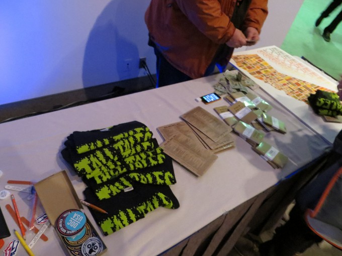
All the cool stuff Aaron brought for his session “Tall Tales from a Large Man” – it was inspirational, hilarious, and real – you go watch that shit right now. Easily one of my favorite talks.
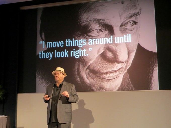
Jeffrey Zeldman giving his famous “Ten Commandments of Modern Web Design” talk to the Adobe MAX 2013 attendees – it was PACKED, for good reason, somehow I managed to snag a front row seat to this one! Another one of my favs, check out the whole thing!
As you can see, there were a lot of very smart and successful designers, filmmakers, developers and creatives sharing their wisdom at Adobe MAX – so many tips, nuggets, and just inspiration can be found in the words that you take away from the event. There was still even more to the event, lets start talking about the product announcements and demos :D.
The Products – Hardware
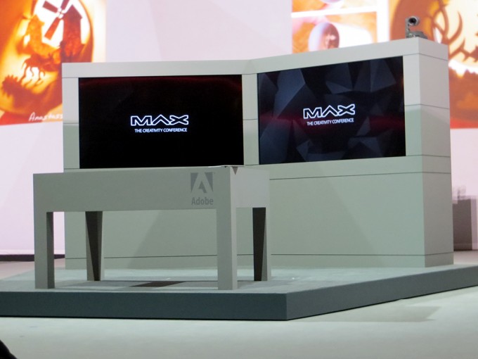
Project Context in all of its on stage glory.
Hardware? Is that hardware? At an Adobe event? Yes. Adobe shocked everyone with their hardware announcements – which were actually really awesome. So let’s talk about that first!
Project Mighty
One of the first things we got a glimpse of that shocked the audience that was there was Project Mighty. The Project Mighty stylus is a pressure-sensitive pen with a single button that can bring up a menu of design options and content, including drawings and files from a user’s Creative Cloud clipboard. Adobe’s software recognizes whether a user is interacting with the screen using the stylus or with a finger, allowing for using the stylus solely as an input method and one’s fingers to erase.
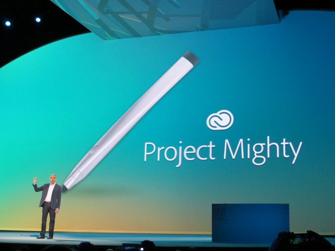
Mighty was showed off at Adobe MAX working on an iPad, and it looked a bit similar to what we’ve seen from existing pressure-sensitive input devices from other companies, but with tighter integration into Adobe products and the cloud. For example, It can pull in stored Kuler (the iPhone app that they showed off was incredible btw) color palette themes from Creative Cloud, for instance, as well as brush settings and a cloud clipboard that stores assets you’ve created previously for use in new artwork or drawings. Moving from tablet to tablet preserves the settings associated with your pen, which makes it possible to take everything from tablet to tablet.
I will be going into further depth on the tech side of things on my tech blog InfiniGEEK so stay tuned there for the behind the scenes details on the tech specs and what not. Mighty wasn’t the only hardware surprise that we had, a similar and just as cool one was Project Napoleon.
Project Napoleon
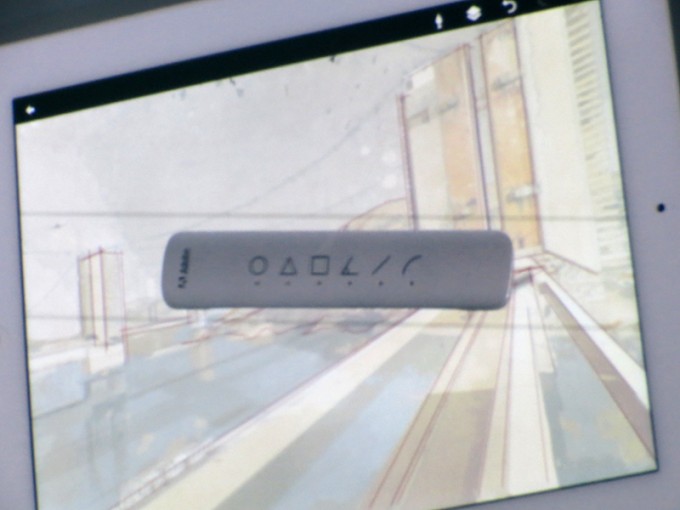
Behold, the short ruler!
Napoleon is named after a “Short Ruler” because it is in fact, a short ruler (lulz from the crowd). It has a very minimal look to it as if it were an actual ruler with some buttons, but it allows you to easily draw straight lines and arcs via snap tools combined with digital pens like Mighty and accompanying software. It will be almost like having traditional drafting tools including squares and triangles, but better suited to the digital media that we work with today. For precise drafting and more serious, demanding graphics work, these two tools in tandem should help push creativity on mobile devices quite a bit further than what we have available today.
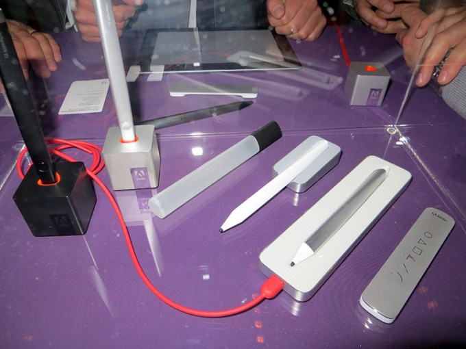
Here is a behind the scenes shot I grabbed at the red carpet event that we got access to where people were playing with these awesome prototypes of the Mighty and Napoleon. They looked awesome!
These tools will definitely be helping designers get creative in all sorts of different mediums – but Adobe had one more hardware surprise up their sleeves which had a more specific goal for a specific medium – the Magazine industry!
Project Context
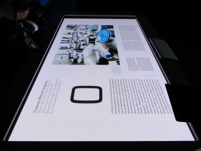
We got to snag some behind the scenes time with Project Context – here is one of those exclusive images!
Project Context was demoed on stage at Adobe MAX with Wired’s design director Claudia de Almeida. What we saw was an intricate software setup that tied together 3 large TV sized touch screen panels – 2 standing upright beside each other and another laid flat like a big surface-like table. It looked like a lot of work had been put into this project as it worked smoothly – when we went behind the scenes we were able to throw stuff from the two 1080p high-def main screens to the table screen in order to make changes to a particular layout. Once you’re done, you just swipe it back in the direction of the main screens and it’ll show up there again like magic! The keyboard integration was awesome, you just sit the keyboard anywhere on the flat table and start typing and it makes that note – or you could draw with your fingers and put notes. It allowed multiple inputs so many people could work on the project at the same time touching the screen in many different places independently.
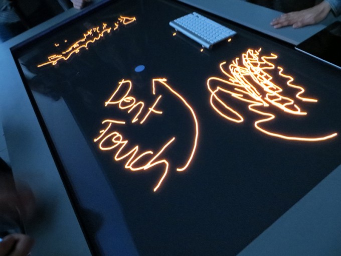
This was us playing around with it – that little circle in the center would erase all the writing on the board if you touched it, kind of like a reset button. Hence the “Don’t touch” sign we made haha.
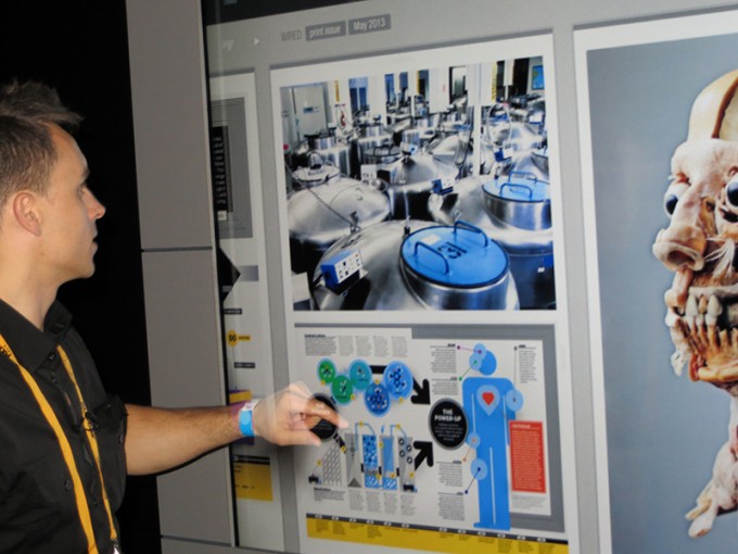
We got to watch Paul Trani doing a demo of Project Context for Adobe TV! Super nice guy (everyone at Adobe is super nice lol).
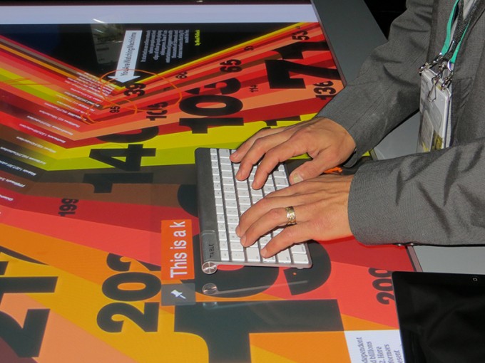
Here is a pic of the keyboard feature – just plop the keyboard anywhere on the table and start typing! So smooth. You then push the pin icon with your finger if you want to pin it there, or you could move it somewhere else. So fun putting together a magazine layout this way.
It will be interesting to see where Adobe takes these hardware beginnings – surely down the road we will see some killer hardware/software combos with the already magnificent software apps they are known for.
The Products – Software
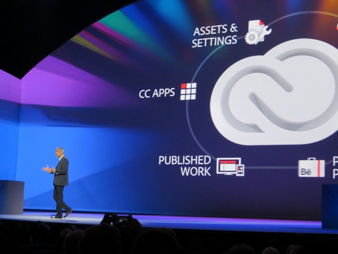
Easily one of the most controversial things to come out of Adobe MAX that everyone was talking about was the switch from the creative suite software model that we all know and love to the subscription-based Creative Cloud model (which actually just took place last week). So instead of the traditional unveiling of the next CS (this would have been CS7) we now get CC (creative cloud) versions of all of our favorite programs! This came as a shock to many and very mixed emotions in the design communities (love and hate) but overall it sounds like it will be actually more affordable (for access to all the apps) than the previous software business model (which was expensive for most). Plus you will now have the benefit of all of your apps and settings following you in the cloud wherever you go – and your subscription includes Typekit! Adobe sums up the creative cloud as “It’s like an app store where you own all of the apps.” so we will see where it goes (at the moment I believe they have more than 700k paid subscribers)! Adobe will allow everybody who currently owns a license to CS3 and up to subscribe to Creative Cloud for $29.95 per month for limited time. Everyone that attended Adobe MAX got a year of free creative cloud – which is awesome (another reason to go to MAX! lol).
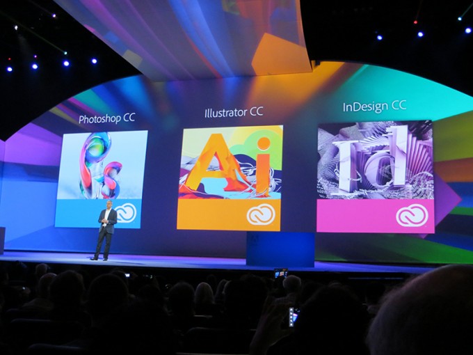
Photoshop CC
Here is Terry White demonstrating the new Camera Shake Reduction feature in Photoshop CC – see it in action here!
New versions of Photoshop are always exciting :). One of the most useful new features announced is “Camera Shake Reduction”. Photoshop CC will now be able to intelligently correct photos that are out of focus due to a slight shake in the camera. No more blurry pictures during your priceless moments (or expensive photo shoots!)!
Illustrator CC
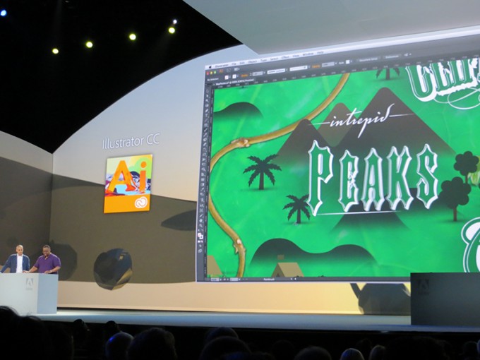
Here is Terry again showing off Illustrator CC and Touch Type on stage at Adobe MAX
Illustrator had a few new announcements as well, most notable were the ability to turn vectors into brushes (most helpful!) and “Touch Type”, which allows characters to be manipulated like individual objects. Touch Type was demoed on stage and many “Ooo and Ahhh” moments were had by everyone in attendance.
After Effects CC
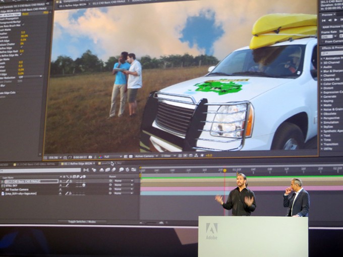
Jason Levine giving an awesome demo of After Effects CC and ending with a very hilarious music video he made lol.
One of the most mind blowing software announcements was that After Effects CC is now bundled with 3D modeling app, Maxon Cinema 4D. You could hear the tears of joy flowing from the film geeks in the audience – they were losing their minds after Jason Levine demoed them on stage and basically took a film shot they had done with an SUV and put a 3D model of a bumper accessory on the front of the SUV with minimal effort, very quickly – and it looked nice! Also another mind blowing feature was the ability to crop out backgrounds of moving footage ala Photoshop for still images.
The Rest
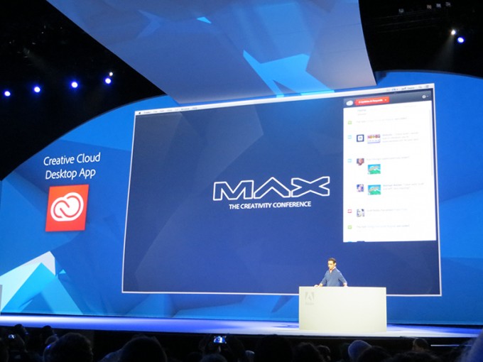
There were obviously a TON of software stuff – rather than me list every little thing off here which would take forever, it would probably be best for you to watch it for yourself from MAX 2013 on Adobe TV since a lot of the features, if you don’t use the particular app, won’t interest you. There are a lot of gems in there though – especially with Muse and Edge Reflow which people were really excited about.
A lot of the experimental effects that were showcased during the “SNEAKS” were mind blowing as well – although they are not in production yet, they are just fun projects the engineers are working on that might make appearances in the later versions of the software – but that went on while Rainn Wilson and Erik Estrada were parading around on stage 
The MAX Bash
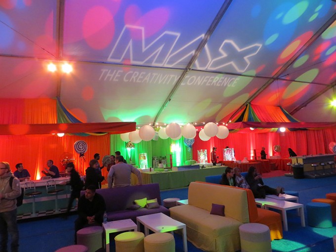
This was the huge MAX Bash tent they had setup, which was just a fraction of what was actually there. In the tent they had mountains of ice cream, Ice Sculptures and some crazy breath mist stuff along with a graffiti wall you could paint on.
Oh the MAX Bash. Fun times were had. This was literally the biggest, and best party I had ever been to. The moment you walk in, you had a concierge bag check where you could drop off all your heavy gear (FREE) and prepare to have a good time! They had a recharge station at the front too – super convenient! I recharged my camera battery and went on a journey! There were several tables of awesome food setup where you could grab any cuisine from different countries – awesome dinner, while live music played in the background. There were also several open bars setup where you could just walk up and get free wine or beer. I had never seen so much amazing free stuff in all my life – I wished it would never end haha. After walking around the bash area for a bit it was time for the concert! The Black Keys were playing a concert just for us!
This is a video of me walking around MAX Bash! You get to see a glimpse of all the stuff at the party – they even had trapeze artists above the bars
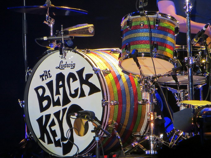
The Black Keys were Awesome!
The Black Keys concert rocked!! They played for quite a while, everyone had a really good time there and there was still quite the crowd there all the way up until it ended at around 11PM. Wrapping up an awesome and unbelievable experience – definitely unforgettable. The last day was just light stuff – I checked out some of the businesses at the exhibit hall and left in time to catch my flight back home (7 hours of traveling yayyyy lol) but Adobe MAX was definitely amazing overall – everyone I talked to was super nice, and they had a great time as well. If you have the chance or are thinking of attending a design or creativity conference, I would make Adobe MAX the one to go to. But don’t just take my word for it, check out what the other Adobe Insiders had to say!
ADOBE MAX 2013: AN INSIDER’S VIEW
Adobe MAX 2013
What were your favorite announcements from AdobeMAX? What are you excited to see from Adobe over the coming year? Share with the class and let us know in the comments! Thanks for reading!
You like this? Don’t forget to follow us on twitter @andysowards and like us on facebook @andysowardsfan! We are also on that Google Plus & Pinterest thing.
Disclaimer: Registration, travel, and accommodations provided by Adobe. All words are my own.


