Sometimes web design suffers from its inherently digital feel; it can be difficult to inject a sense of tactile, dimensional surfaces into a design that was entirely created by taps of the keys. But the illusion of those surfaces can be a great way to add interest and individuality to a design. One of the most effective ways to overcome this problem is to add texture. There is a large assortment of ways that this can be done, and some of the most successful and appealing techniques are highlighted here:
Grunge
There are plenty of great resources for grunge textures, which can simply be multiplied over a plain background to get this popular effect, like on the site Bangers Austin.

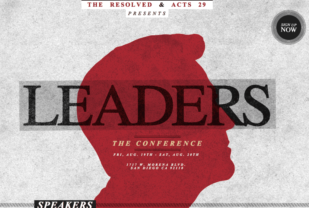
Stippling
For a look that’s a little more refined than grunge, create a light stippling effect with a custom paintbrush, as seen on the Leaders, The Conference site.

Pattern
There are a lot of ways you can go with adding a pattern to the background of your site, whether it’s large-scale and graphic or small and delicate. You can make really intricate patterns using photos, or for simpler patterns, you can search through pattern libraries or create your own from a symbol or brush.
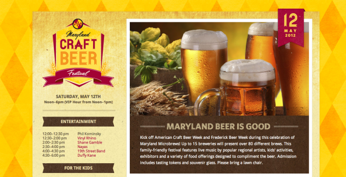
Bold
Maryland Craft Beer’s website is a great example of a larger, bolder pattern used in the background.
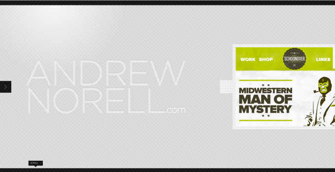
Subtle
Andrew Norell’s site is a great example of a smaller, more sublet background pattern.
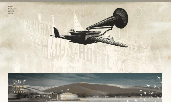
Vintage
The texture of old paper combined with an overlay of vintage engravings makes this website’s background particularly compelling.
Vector
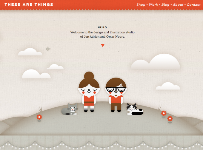
Many vector illustrations can look a little too flat and simple unless you add texture, drop shadows, or other effects. This website combines the two methods along with a few subtle gradients to create a satisfyingly tactile feeling.
Illusion
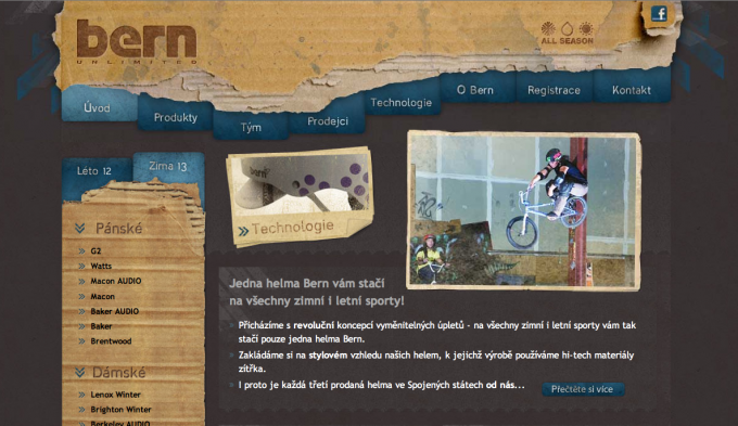
Another interesting way to use texture is to create an illusion of depth and reality, making elements of your website look like they’re interacting with a background of real material, such as wood grain or cardboard.
Background
This website uses a wood background to create the illusion of depth and subtle texture.
Overlapping
This site uses a cardboard texture to create an overlapping illusion of depth.
Photographic
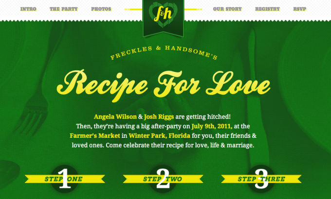
Another great way to add unexpected depth is to use photography in the background. Although there are a lot of beautiful sites that use unaltered images, adding a layer of texture over a photograph is unique way to mix things up a little, like Freckles and Handsome’s did with this background photo.
Although these examples show that there are a lot of directions you can take textural effects, it’s important to be aware of the moment when a design moves from being interesting to cluttered or overbearing. Texture should be used in manageable doses, which often means restricting it to either the background or the foreground of a site, or toning it down significantly if it’s being used in both. With this guideline in mind, consider adding texture to your next design that needs just a little something to be taken up a notch.
What is your favorite Texture style? Any awesome Texture packs we should know about? Let us know in the comments below! Thanks for reading!




I love using textures in my designs, in both graphic and web design projects. I feel that textures give more personality and emotion to the works.
Bangers website is so great! I like those grungy typos!
Yeah I love grungy stuff too haha, probably because when I first got into photoshop grunge was all the rage
Nice collection, my favorite is Andrew Norell‘s