Typography is the art of selecting and arranging the proper fonts. This creative discipline has long been used on printed materials. Today, typography is equally important for online content where you need to draw in your reader and keep him engaged.
Make it Readable
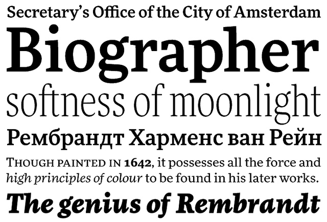
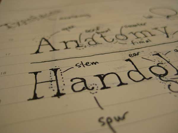
Image via Flickr by FontShop
Readability is the most important consideration in typography. If your font is too hard to decipher, the reader will abandon your site. This is especially important with the body of your blog. Large blocks of text need to look neat and simple. There’s much debate over whether you should choose serif or sans-serif, but the truth is that readers will most likely stick with either one so long as it’s still readable.
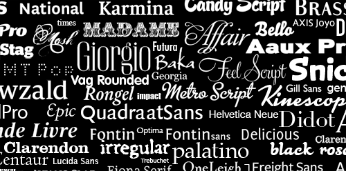
The best way to test readability is simply to read a block of text in the font yourself. Common standbys like Georgia, Arial, and Calibri are popular for a reason. They’re versatile and work well with many different types of copy. Choose a simple font for the body of the page and save fancier options for headings or logos.
Limit the Number of Fonts
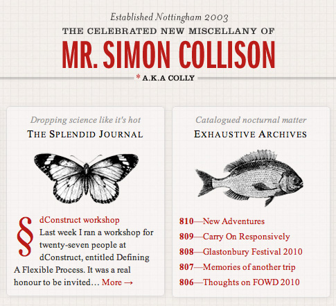
You should use either two or three fonts for your blog. Use one font for the body of the page and another for headlines. If desired, you can also use a third font for your logo or for call-out text. Adding more than three fonts makes the page look confusing and cluttered. Make your logo stand out by keeping your fonts to a minimum. The heading and body fonts should contrast for the most interest. Use a serif and sans-serif and opt for fonts that aren’t too similar.
Connect with the Appropriate Audience

Captivate your Audience with Typography
Consider the reader you’re targeting when you choose your font. If you’re writing for children, keep your font simple. The heading might include something colorful and silly, but most of the text needs to stay simple so beginning readers don’t have any trouble deciphering the letters. A script with lots of romantic curves speaks to women more than men. Choose an all-purpose font for a diverse audience so you’re not turning away potential readers with a look that’s unappealing to them.
Set Your Tone

When Typography Speaks Louder Than Words
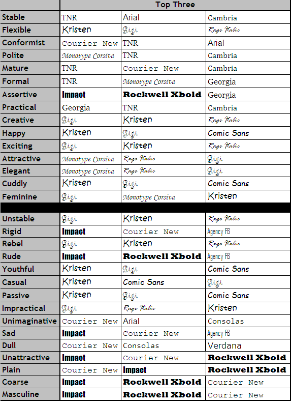
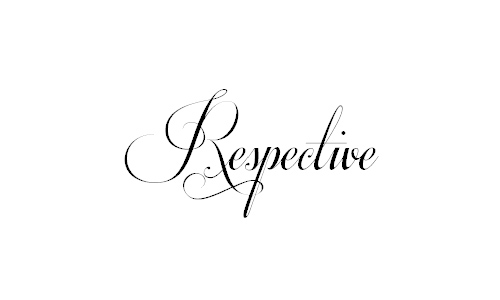
Once you begin experimenting with typography, it becomes clear that different fonts have different emotions associated with them. A blog about weddings naturally calls for a romantic script while a bold and assertive font will look completely out-of-place. A playful font like Comic Sans or Kristen is perfect if you blog about child care, but it will hurt your credibility if you’re targeting business professionals with posts about trends in the financial sector. Look for a font that conveys the right emotion.
Convey the Proper Message
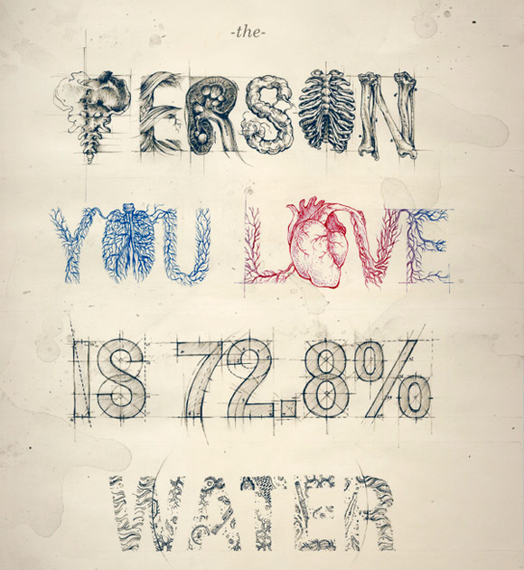
Typography with a Message: 55 Powerful Examples
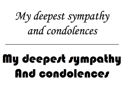
Your typography needs to sell your message just as clearly as the content does. Choose bold fonts with high impact for headings that need to grab the reader’s attention. Choose something softer for sentimental quotes called out from the body. Think carefully about the message you’re sending on each part of the page and choose typography to match.
The right typography will convey your message clearly and make it easy for visitors to read and connect with your content.
Typography And Fonts Resources
Need more information and help with picking the perfect typography and fonts for your website? You’re in luck! Check out these amazing resources to further your typography knowledge!
Web Typography: Choosing the Right Font for Your Website
Choosing the Right Font: A Practical Guide to Typography on the Web
Your Most Important Typographic Choices
Font Personality
Perception of Fonts: Perceived Personality Traits and Uses
How to Choose the Right Typography Font for your Designs
30 Beautiful and Elegant Wedding Fonts
How To Choose A Font
Choosing the right typeface for your project
On Choosing Type – First Principles
How To Choose The Right Face For A Beautiful Body
What is your favorite style of typography? Have a strategy for fonts in web design that works for you? Share with the class and Let us know in the comments below! Thanks for reading!


