
Typography can have a huge impact on the style and message of a design. Big, obvious differences – like whether it’s a hand-drawn, elegant script, a big bolded fun, rounded style sans-serif or a stern, professional serif font (amongst many, many others) – can change the tone of the design completely. Imagine a newspaper that reports on the events of the day in comic sans. Typography is important.
Typography Matters
It’s also true in logo designs. There’s very little room to work with – so each design decision you make is even more noticeable. When you’re designing a logo that uses type, it’s not just the font choice that affects the visual aesthetic and messaging – it’s also the little details, like the kerning and the white space that you use. Type that’s bunched together can feel quite constrained – and sometimes this suits the design, and at other times it might not. Type that’s given more room to breathe can look stylish, but too much can feel out of place. It takes a lot of hard work, careful thought and effort to achieve a logo design that uses type just right.
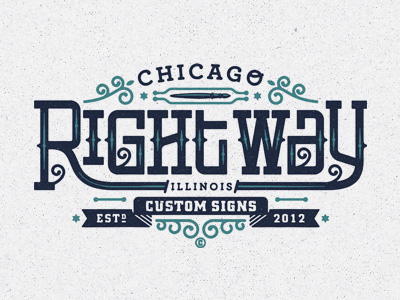
We’ve brought together some incredible examples of beautifully crafted logo designs that all use typography to create a tone, style and visual aesthetic that suits the brand. We hope you find this collection a useful source of inspiration for any future logo design projects that you have coming up.

What was your favorite Logo Design? Are there any examples of logos with beautiful typography that you’ve found? We’d love to hear your examples in the comments!








Great collection of typo based logos. I liked CANDY’S! Also check out the logo of Roger Feder (one of my favourite)