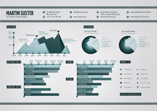
How To Design An Infographic CV
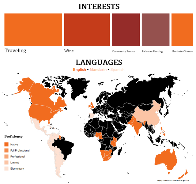
4 Simple Tools for Creating an Infographic Resume
The idea behind an infographic CV is to gather large amounts of information about yourself and to present it in an insightful and fun way, making it interesting and easy for the reader to understand, just like the info-graphics we have all become familiar with online. I have personally tried applying for jobs online using this approach, I posted my infographic CV online and in various other places and it has been more than effective, hopefully I can help guide you in the right direction from my experience on the topic.
There are plenty of tools and techniques you can use as well to track and make your infographic resume even better so pay attention and make incremental improvements over time (or at least until you land that job! haha). Using a service such as bitly.com You can actually monitor the analytics of the links that you post your CV to. If you post the links in emails or on job boards, or wherever you send it out to, it is valuable to look at that data in order to find out which CV applications had been viewed. Thankfully both my CV applications were quickly viewed and replied too, offering me job placements. My infographic CV had good designs and unique content about myself, briefing in detail all of my skill sets and relevant experience information. More importantly my CV stood out and showed that I’m willing to try something new and different. Others that I known personally that have had tried a similar approach achieved success as well in acquiring great jobs (some even their dream job!) by submitting an infographic CV to the potential employer.
Infographic Design Tips

40 Stunningly Creative Resume Designs on DeviantArt
Everything in moderation. It is important to strike the perfect balance between visuals and text, as this can be a little complicated. My earlier infographic CV design was criticized for the amount of text being more than images. Let images do most of the talking. Graphics and images should have a familiar cohesive theme that varies in color and the text should appear large so that it is still focusing on the important details about you. Learn to design with certain tools that may restrict the user.
Sound Planning
A Handy Guide to Infographic Marketing
It doesn’t hurt to start off with a theme in mind, if you are a cook perhaps make all of the information in the shape of food – If you are a designer then whatever you are most passionate as a hobby perhaps design something around that theme. Planning your personal content is of course a very important part of the resume, but it should be kept quite simple, after all someone will have to review it in a timely manner. If you have already made a classic text resume/CV in the past then you are already halfway there! I would review your resume and clean it up a little bit and use the usual prejudice when writing up content for a resume – focus on your strong points, don’t mention things that really don’t matter to the position you are applying for, stay relevant and showcase your experience, etc. Picture yourself as the reader, ask yourself what information is the most important in regards to being good in your desired future position, and place your content accordingly. You can even highlight any information that you feel is important in bright colors and give it a nice priority spot in the infographic design.
Design Your Infographic Resume According To The Medium
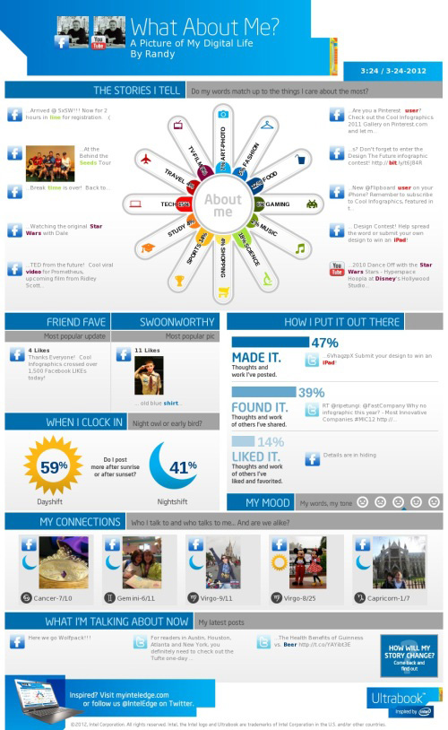
20+ Tools To Create Your Own Infographics
Whatever the method of delivery will be for your infographic resume, make sure that all of your hard work is shown correctly in that medium. For example, when designing a resume for print, your infographic CV will need to reflect that – make sure you set the resolution and DPI accordingly, as well as make sure it looks good on the paper size (or type) you are printing it on. If the infographic CV will only be shown online in a digital form for the web however, then make sure the PDF looks nice – or you could even go a step further and build it into a web page to showcase your web design skills. Whatever you do, remember that the main goal is for your Infographic resume to make them say WOW on the first impression.
As always when it comes to anything, designing a resume or applying for a job, even if you have some experience in creating a infographic, a CV, or both, share it with your friends and colleagues first and get some feedback – be open to any criticism or advice they choose to lend you and that process alone will certainly help you improve and increase your chances of getting that job you want. Don’t forget the basic information either, make sure your personal profile is easy to see and remember – and it doesn’t hurt to have a photo of you somewhere. Of course there are no fixed rules to follow for infographic CVs, so thinking on one’s feet and a flair for designing really helps. Just be yourself, and let your creative juices flow – if you can successfully showcase your skills while showing who you really are in your design then you will certainly get the job that is right for you – Good Luck!
Have you designed a Creative Resume? Have any tips for others trying to get a job? Let us know in the comments below – Thanks for reading!


Andy thanks for a great article! I’ve tried a different approach and made a video cv.
Please let me know what you think about it. Thanks, Octavian
Thanks Octavian! And LOL That was Awesome – well done *slow clap*