We’ve all heard that trope about making lemonade when life gives you lemons. Well, if anything can be called a “lemon” in the world of web-surfing, it’s the irritating 404 page. Whatever the reason for it, be it a down server, a broken link, a page that no longer exists, or a badly typed URL, the 404 page is annoying.
But clever business owners can turn that 404 lemon into gallons of sweet, delicious lemonade by re-purposing that page into a sales magnet. With the right elements in place, you can make the 404 page a new means of getting subscribers. Here’s some practical advice to help turn that negative into a positive.
Maintain Consistency Of Design
There you are, checking out a company’s site, and their pages all incorporate a design of green and yellow pastels, the colors most often associated with this particular business. You click on a link, and suddenly you’re faced with a stark white 404 page. It’s bad enough that you got an error message, but also that nice experience of seeing soft, warm colors comes to a jarring halt.
That’s why your 404 page should keep the same design themes as the rest of your site. You don’t want to do the equivalent of throwing a bucket of cold water on someone, especially not on the heels of them being aggravated by encountering a 404 message.
Does your business have a mascot? That character should be on the 404 page as well. Visitors need to know that, despite the error, they’re still on your site, and haven’t been somehow tossed out or disconnected from it. Keeping the color and design scheme going even on a 404 page preserves the impression that the visitor is on your site, but has simply encountered a minor glitch. More on this later.
Be Funny, Not Cutesy

60 Really Cool And Creative Error 404 Pages
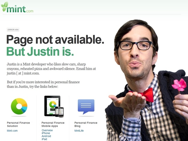
No matter what the situation, having the ability to laugh at a mistake is valuable. If the fault of the 404 lies with your business, the experience becomes a little more tolerable if you throw in a self-deprecating humorous reference. But like everything else in life, moderation is a good thing. Don’t go overboard on the cute stuff; a simple pithy line, perhaps a humorous image, then stick to the important stuff.
Don’t Let Them Get Away!

Effective 404 Error Pages: Best Practice and Examples
The key to a good 404 page is making sure that visitors and potential leads stay on your site. The 404 page shouldn’t be a cue for them to wander off. You can keep people interested and involved by:
-
Keeping People Informed: The first word that pops into people’s heads when faced with a 404 page (okay, okay, the first non-vulgar word!), is usually so iteration of “why?” Let people know what the problem is, and keep it short and decidedly non-technical.
-
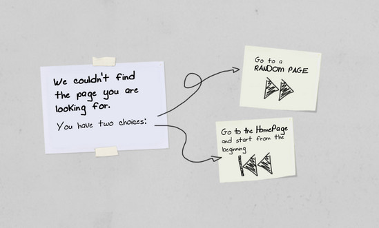
Linking To Your Homepage: When facing an error, the simplest and most direct solution is to go back to Square One, in this case, your homepage. Put a link that brings the visitor back to your home page, so they can access another page via your site map. Come to think of it, you can include a site map link on the 404 page as well!
-
Making It Easy For Them To Contact You: If the error page came up as a result of a glitch on your site, you want to know about it as soon as possible. If you place a “contact us” link on the 404 page, you provide a convenient way for visitors to ping you, and if you include fields such as name and e-mail address (especially the latter), you now have their contact information on file.
-
Offering Alternative Choices: In addition to (or instead of) linking to your homepage, consider adding a list of relevant links to popular pages, such as ones offering products and services.
-
Giving Them An Offer: The 404 page can be used to advertise a special promotion, perhaps highlighting the current best deal or newly added service. Nothing mollifies the frustrated web surfer like a freebie. Additionally, you can use the 404 page as a medium for getting people to sign up for e-mail updates or a newsletter, provided it’s phrased in the right way. For instance, an error message for a page that’s still under construction could say “We’re sorry, but that page is still under development, but it’ll be worth the wait, we promise! If you’d like to stay in the loop and be informed when it’s ready, sign up for our updates, and you’ll get the exclusive advance heads-up to all of the nifty new changes we’re implementing!” Remember: people like to feel special, and giving them a chance to be in something exclusive will do just that. And just like that, you have a prospective customer’s e-mail address!

The 28 Best Error Pages On The Internet – Error 404: Post description not found.
It should also be noted that you can download 404 error page templates, many of them customizable. By putting your 404 page to work for your business, you are maximizing every aspect of your site for the betterment of your enterprise, and hopefully building up your customer list.


