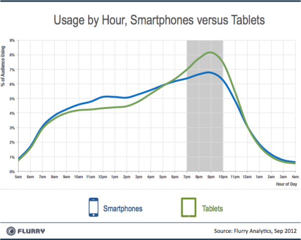
Demand for responsive Web design is booming, as traffic from mobile devices keeps growing. Since 2012, global Web traffic coming from mobile users has increased from 11.1 to 17.4 percent, notes Mashable. Market watchers expect this to expand as adoption grows in Asia, Latin America and Africa. Websites that aren’t designed for mobile will be left in the dust by the competition. Designers who want to stay competitive will also need to adjust by learning to use and apply responsive Web design tools.
Issues Demanding a Response

Adapting To A Responsive Design (Case Study)
Not too long ago, designers were satisfied if sites displayed equally well in Internet Explorer and Mozilla Firefox at 960 pixels wide on desktops. But today’s Web users can view sites on anything from smartphones, iPads and other tablets, HDTV, and even Google Glass, which creates new issues.
The biggest variable is fluid screen size. Common displays range from less than 400 pixels for some phones, to more than 2,000 pixels for desktop monitors. Further complicating this are high-pixel-density technologies, such as Apple’s Retina Display. Third-generation iPads are similar in size to their predecessors, but have double the resolution.
Speed is another issue. While responsive Web designs possess many advantages, they can load more slowly than other options, due to more code and content. Evaluating how to handle this is something Web designers need to know and communicate to clients.
Know Your Site’s Mobile Market

Go Mobile or Go Home: Why Your 2013 Marketing Plan Must Include Mobile
The main alternative to responsive Web design is mobile-only design, geared towards smartphones and tablets to the exclusion of desktops. Webmasters can determine where traffic is coming from by using tools such as Google Analytics, where the information can be viewed under the Audience > Mobile > Overview report. Generally, non-mobile traffic tends to be higher for sites with a non-local orientation, while mobile traffic is higher for local businesses like restaurants.
For sites with heavy mobile traffic, especially from users with older phones that lack more modern smartphone features, there can be advantages in going with the faster loading speed of mobile-only designs. But responsive design has advantages in other areas, too, including wider device support and superior search engine optimization, and is the better option for most sites.
Flexible Wireframes

50 Useful Responsive Web Design Tools For Designers
For designers committed to the responsive option, the place to start is with good wireframing tools. These enable you to develop and preview your design’s layout, navigational structure and interactive elements before committing to full-fledged coding and content. Popular responsive wireframing tools include Boostrap and Wirefy, among many other alternatives.
Responsive Design Tools

30+ Responsive Web Design Tutorials & Tools
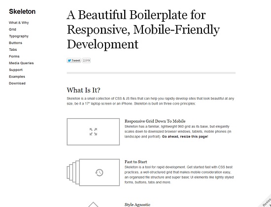
Adobe’s upcoming Edge Reflow addition to its Creative Cloud suite seems poised to gain widespread currency among designers using Dreamweaver. For an open-source, responsive design tool, check out ZURB Foundation.
Fluid Text

Responsive Typography: The Basics
Typography is another crucial element of responsive design. In this category, the current cream of the crop is Typecast, acclaimed as the 2013 Game Changer of the Year for bringing responsive text to new levels.
Responsive Testing Tools

10 Helpful Resources for Testing Responsive Web Design
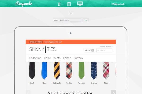
Google standards now expect content “above the fold” to load on mobile devices in one second or less. This makes it imperative for designers to test site loading times, reinforcing why site testing is always a best practice. A variety of free and premium responsive testing tools are available, including Am I Responsive, BrowserStack, CrossBrowserTesting, and Responsive Design Testing.


