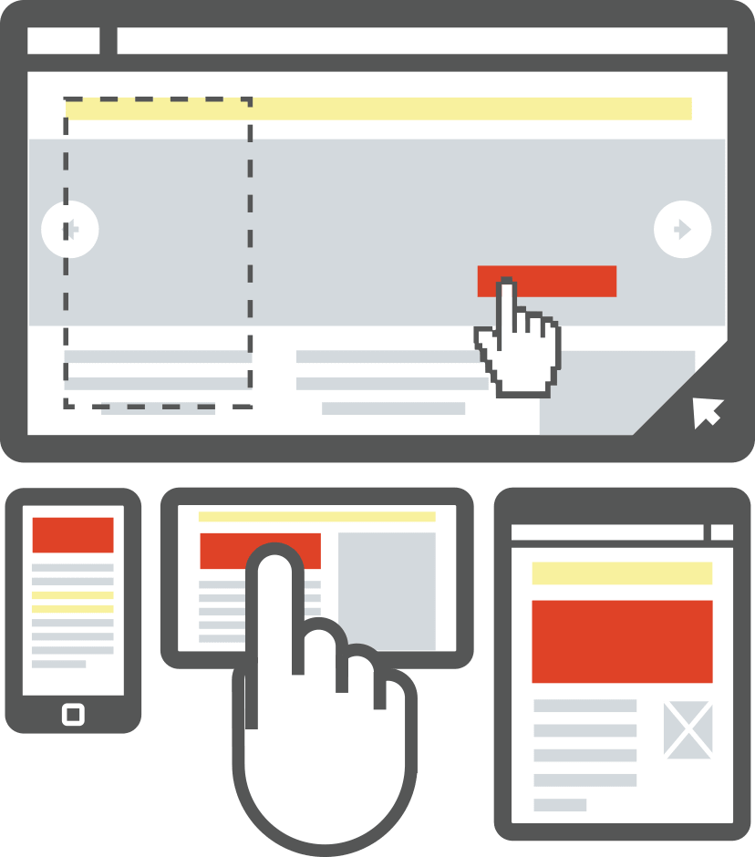
The goal for any aspect of a business’ digital presence is usually all about customers. We either want to satisfy existing customers, and attract new ones. But while these objectives may start out as the focus, businesses often forget about the customer in the process. As a result, websites don’t always serve the needs of their target audience. In order to avoid making this mistake, here are three ways to ensure your website succeeds so your business can too.
1. Change Your Perspective

Understanding the User in User Experience
The first step in making your website appealing to customers—both current and future—is to get outside of your own head. Business owners and web developers alike usually have strong feelings about how the design of a site should be or what content needs to be included, but it’s not about you. In a planning meeting, talk through what your customers want. If you’re a software company, are most prospects looking for your free 30-day demo? If so, place a related web form in a prominent place so they can quickly request one. Do customers often struggle to assemble your product? If so, place a link to a training video somewhere highly visible on your home page. You get the idea.
If you’re not quite sure what your customers want, it’s time to collect some data. Apple Rubber recently did this, and the results revealed which parts of the company’s site users were attempting to access most often. The company then redesigned its toolbar and made popular action items more readily accessible. Any website owner can make smart moves like this. Figure out what visitors are looking for, then work to make that available in a snap.
2. Zero In On Ease

10 steps to engaging user experience
While customer data can be helpful in showing what areas of your website should be front and center, there’s one feature of any website that is often second to none—ease. An intuitive website is of utmost importance. No one wants to waste time trying to navigate what they need, or run into slow loading times. If you can make your website easy for visitors, they will come more often and report greater levels of satisfaction.
Begin improving your site’s user experience at the homepage. Consider your navigation bar—are you site’s categories arranged in an order that makes sense? Are subcategories available in a dropdown menu if applicable? And don’t forget to add in a search bar; help your audience find what they need with a layout that anticipates your customers’ needs, and provide ways for them to navigate quickly.
3. Mull Over What Matters

Web Design vs. Web Content: What Matters for Higher Conversions?
The final step is adding the bells and whistles. What visuals will enhance your audience’s experience on your site? Will the addition of social media buttons be beneficial to keeping customers informed about your latest news and products? If your company has a blog, would it make sense to include a feed of most recent posts in the sidebar?
Once your website has received the attention it deserves, customers will take note.


