Everyone knows Apple cannot be ignored. Ever since the company captivated the masses with its revolutionary iPhone, it has been setting the standard for the smartphone market. Although some would say the flagship device was threatened by the larger screens found in Android devices, since the iPhone 6 was released, this argument has been all but completely shut down. With the iPhone 6 clocking in at 4.7 inches and the iPhone 6 plus at 5.5 inches, you’d be hard pressed to find someone who’d argue the screen size is too small when compared to other phones on the market.
The bottom line is that Apple’s iPhone is still the undisputed king of smartphones, so your understanding (or lack-there-of) on how to properly design apps for the platform will determine your success as an app developer. So, let’s talk about how to design a stellar iPhone 6 app with the following six steps:
1. Draft Your Problem and Solution Statements

How To Create a Minimum Viable Product
The first thing you need to do when designing an app is defining what it is that you’ll be building. The best way to start that is by developing a high-level problem statement. The answer to that problem statement should be the functional requirements for your app.
For example, let’s say this is our problem statement: As an iPhone user, I have to input too many passwords into various apps and websites and it becomes difficult for me to remember them all.
We might answer that by saying: The “ABC” iPhone 6 app seeks to solve the problem of having to remember and enter various passwords for many different apps. The app will automate this process.
Now, you have identified your problem and created an elevator pitch to explain your app. Being able to communicate your vision is a crucial first step.
2. Check out the Competition
If your app is an improvement of an existing system or application, you need to scope out the competition to see what they’re doing. You need to understand two things: what IS working and what ISN’T working. If you can identify these things, you can unearth some compelling ideas for how to make your app competitive.
When scoping out the competition, evaluate the design, usability, functionality and popular appeal. If one of your competitors has a poorly-designed app with non-intuitive usability and limited functionality, then it may not be popular. If it is popular, then you may have an opportunity to capture some of its user base by creating and marketing a better solution.
3. Explore App Designs

I HAVE AN APP IDEA BUT NO PROGRAMMING SKILLS
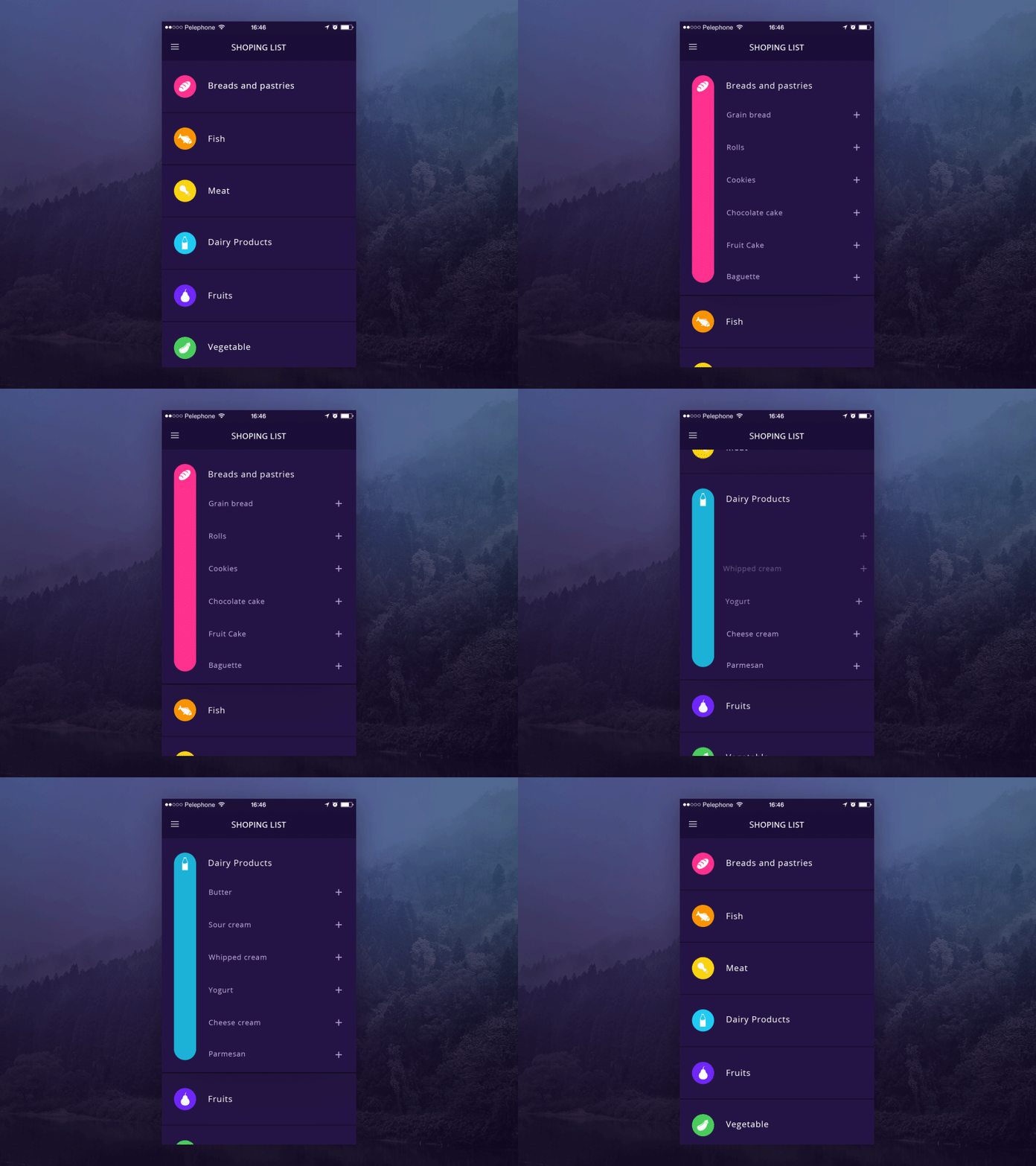
Aside from researching direct competition and evaluating some of the top performing apps the iPhone 6 has to offer, you should take a look at what the creative community is working on. Behance and Dribbble are great places to search for and get ideas.
Look at a variety of apps that serve a variety of purposes to begin thinking outside of the box in terms of how you can solve problems that you face when building your app.
4. Use Wireframe Mockups and Prototypes
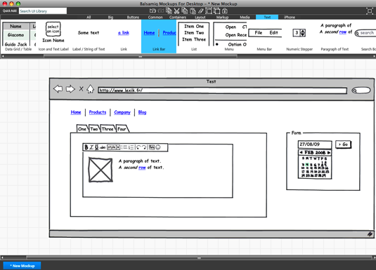
Take your napkin sketches to the next level with a program like UXPin, which allows you to quickly create retina ready, interactive designs. This is a critical step for ensuring there are no surprises during development. Oftentimes, written requirements can be interpreted in multiple ways. Visual requirements in the form of a prototype, however, leave little room to interpretation.
You also want to be sure (especially when you get to the pixel-perfect stage) that you can view the designs you’re creating for an iPhone 6 on an actual iPhone 6. If you don’t currently have one, pick one up through your favorite carrier to give it a try.
5. Embrace the iOS Human Interface Design Guidelines
8 Tips From Apple’s Official Guide To App Design
When designing an application, it is imperative to understand the strengths and limitations of the platform on which you are designing. You don’t want to break obvious design rules without good reason, especially when Apple has done an excellent job at documenting the design practices it encourages via the Human Interface Design Guidelines.
This document urges you to “defer to the content,” use “plenty of negative space” and avoid “gratuitous embellishments” when designing your app. This is not only sound device, but it also makes the job of the developers that much easier, which has the potential to have a tremendous impact on the cost of the app.
6. Achieve Pixel-Perfect Design
![]()
Does 2015 mark the end of pixel perfect design?
Before you can hand over your designs to the development team, make sure you have achieved pixel-perfect design. The only difference in how the design of apps on previous generations of iPhones were executed is that they scale up differently on retina screens. This should not be an obstacle if you’re designing with points instead of pixels and using vectors wherever possible. Generating scalable, pixel-perfect designs ensures your creative vision is executed to a “T” when it comes to building the application.

