There are plenty of tips out there on how to compile a great portfolio, so much that people tend to get confused with them. However, it can all be made simple through three major principles for a portfolio that can impress clients.
It’s well known that in order to get clients, you need a good-looking portfolio that showcases the extent of your skill set. However, the path to having an impressive portfolio is not set in stone. There are too many ways to do so, and yet not nearly enough that’s tailored to every individual. Coming up with one is kind of like a journey of self-discovery, or at least some brainstorming on what makes your work look best.
Presentation

The Dos and Don’ts of Portfolio Presentation
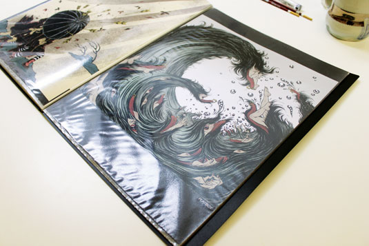
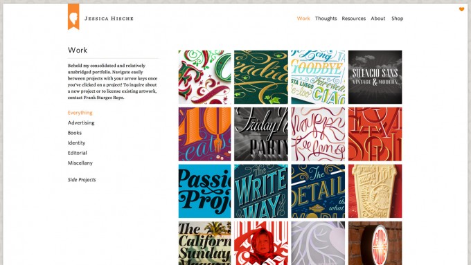
It must look organized and concise while still somewhat colorful and lively, but without being too garish and overstated. It must catch the attention of those who view it, but not put them off with too much going on. The key word here is “cohesive,” having all visual elements married to each other through its layout and thematic uniformity. This holds mostly true to art and design portfolios, wherein the presentation must express how proficient you are at visual language.
Communication

How to Present Your Creative Portfolio
The portfolio must appeal to the viewer’s sensibilities, telling them how much you want them to think of you as good in what you do without seeming too desperate. On the other hand, it must also not say nothing at all—a mistake that many people tend to make. Not only are potential clients looking to see if you’re good at what you do, but also if you’re any good at communication. If you can’t communicate through your portfolio, then you most likely can’t for real as well.
Experience

5 Tips for Creating the Perfect Web Design Portfolio
It must become like a journal of sorts, showing your development but without looking amateurish. While it’s best not to put up work when you were an absolute beginner, but at least it should have some that comes from the earlier days of your pursuit of mastery. Each item must be dated so that viewers can see where you came from and how you improved throughout that time.
It must also show how you push the envelope without being too experimental. While it’s not bad to experiment with various things, that’s not something you do in your portfolio. But if you have some quality work that came from your bouts of messing around, then perhaps you can take a risk and put that up in case that catches a potential client’s eye.

Create the perfect design portfolio: 30 pro tips
But overall, it must show how much your skills measure up in a professional capacity. If you’ve done professional work before, then it has to show through. But if it’s your first time looking for work, then do your best to show that you’re ready through your portfolio.
It need not be hard, but it’s not a trifle either. Coming up with a portfolio that can make potential clients nod their heads in fascination takes some considerable thought and effort, but it also shouldn’t leave you paralyzed in fear since the point of the exercise is to have it getting you clients in the first place.


