One of the hardest things about keeping a business alive and thriving is making sure that nobody gets bored. This means keeping your team energized and happy. It means doing everything you can to keep your products and services feeling exciting. The worst thing in the world for your business would be to have people get so used to your brand that they stop seeing it and start taking it for granted.
Perhaps the best way to keep this from happening is to update and upgrade your company regularly. This helps keep your team, your audience and your brand feeling fresh and new. Why else do you think that big companies like Pepsi, Frito-Lay, etc do big rebranding projects every few years?
There are three areas in which these updates and upgrades must occur if you want them to be successful and to “stick:” your office space, your branding/advertising and yourself.
Your Office Space
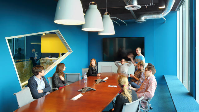
You don’t necessarily have to do a huge overhaul and spend a lot of money trying to make your office space look like something out of a design magazine. If you’re still using the same boring gray cubicle farm setup you had when you opened your company a decade ago, though, it’s time to make some changes.
A good place to start is with your color scheme. Introducing color and trading gray for white is a fantastic way to brighten up an office space as well as the moods of the people who work in it. There is a psychology behind color and design, you know.
While you’re at it, switch out the gray fabric cubicles for something in wood or glass. You don’t necessarily have to adopt an open office plan–studies show it’s bad for productivity anyway–but making some aesthetic changes to your bullpen is important.
Your Branding

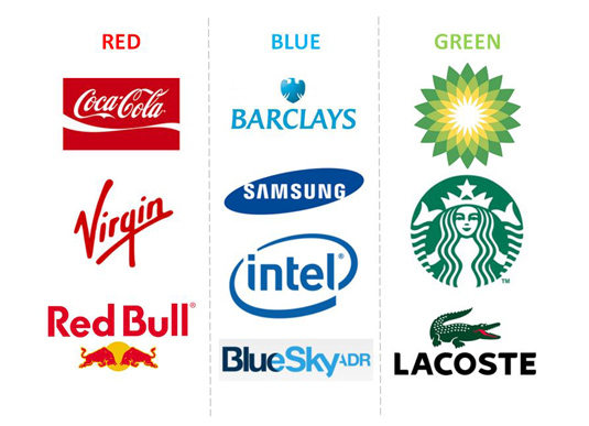
Importance of Color in Brand Identity
Are you still using the same logo and advertising techniques you were using a decade ago, it is time to stop. People have probably stopped noticing it. You don’t have to make radical changes to your logo or graphics, but updating them to reflect the current year is a good idea. A good place to start is by learning about the psychology of color and branding.
While you’re at it, it’s time to upgrade your actual marketing materials. For example, if you’re still sending out refrigerator magnets to clients (and giving them away at conventions and networking events), quit it. Trade up for things that are actually useful for the new millennium. One of the most popular trends right now is for companies and brands to design personalized USB drives to give away. Another popular choice is to switch the t-shirt for a tote bag. People aren’t likely to wear a branded shirt unless they are a super fan. They will, however carry the tote bag around.
Updating and Upgrading Yourself
CSS-Tricks Screencast #125: How To Stay Up To Date on Web Technology
What we’re talking about here is updating and upgrading your knowledge and habits. For example, if you still insist on using only a paper calendar, it’s time to learn how to use the calendar app on your phone as well as a few scheduling apps that can sync across devices. It’s time to trade the notebook for a tablet.
This isn’t just true when it comes to physical technology either. If you’re still running your business using knowledge that you learned a decade ago, you are forcing your company way behind the curve. Learn what is popular for contemporary audiences and in your niche. Take a class or two if you have to. It’s one thing to still insist on using the hard “g” sound when you say “GIF.” It’s entirely another to call a GIF “one of those cute repeated graphics” (which sounds condescending, but you’d be surprised by how often things like this happen).
The great news is that you can work on all of these things simultaneously and phase them in over time. You don’t have to keep doing things one way because you’ve gotten used to them. Sure you’ve found some success but don’t you want more?


