Conventional wisdom tells us that “content is king” when it comes to blogging. While compelling content is absolutely necessary to driving traffic to your site, consider what happens once users land on the page. Do they stick around? Do they bounce? Do they actually click on anything?
Design represents the sleeping giant of just about any blog. Unfortunately, design is often neglected or ignored by many bloggers who see it as a second-rate aspect of their site. From keeping visitors on the page to standing out versus competitors, the importance of design simply can’t be ignored. Consider, for starters…
Your blog’s design ultimately represents your users’ first impression of your business and brand
Design ultimately sets your brand apart from your competitors: something as small as a logo can have a big impact on whether or not visitors perceive you as professional
The design of your blog can have a huge implications on your SEO efforts, especially if your layout isn’t optimized for mobile search
With fierce competition in the blogosphere, standing out is critical for bloggers looking to grab the attention of new visitors. Likewise, the elements of design continue to evolve as bloggers push the envelope and work to give users what they want visually.
Whether you’re looking to start your own blog or intend to revamp your current design, keep the following three trends in mind to ensure that your site is both visually compelling and user friendly.
The Benefits of UI Patterns
How to Use the Best UI Design Patterns
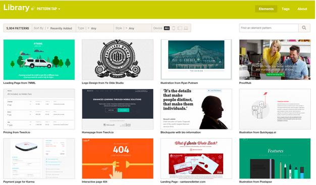
Bloggers today understand the expectation to meet their users’ needs in terms of content; likewise, modern blogs require a user interface which is free of clutter, allows for easy social sharing and readability.
A number of UI pattern layouts exist for platforms such as WordPress, offering blog designs which are both easy to navigate and pleasing to the eye. For example, consider the three following UI patterns which are wildly popular with today’s users:
Long Scroll
The New Rules for Scrolling in Web Design
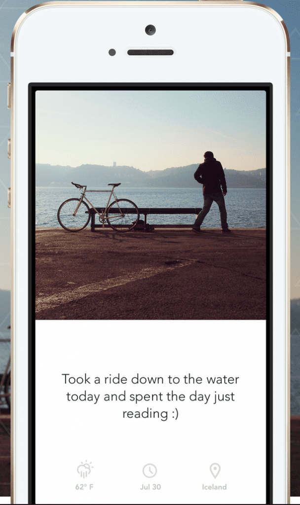
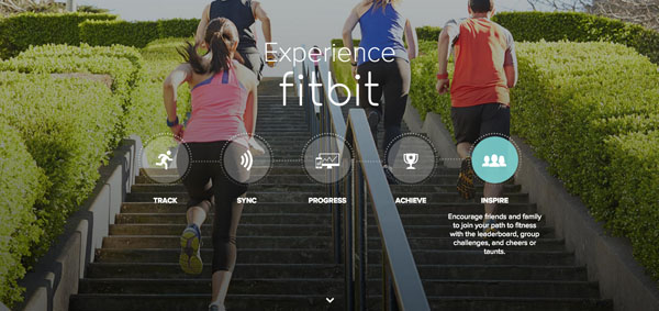
Scrolling is all the rage thanks to mobile devices; thankfully, web designers have taken notice for the blogosphere. Long scroll designs are ideal for blogs looking to reach readers on the go, allowing them to simply flow through their sites instead of worrying about link placement and what’s above the fold.
Card Design
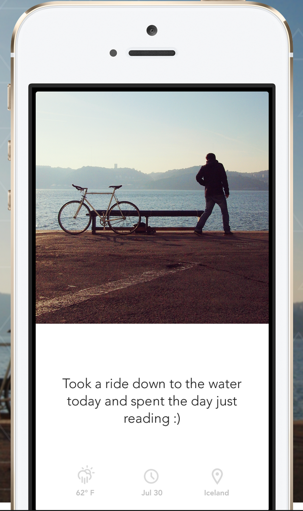
15 delicious examples of card-based web design
Card designs, which segment blog posts into separate “cards” (essentially images and headlines), are ideal for catching the eyes of readers and organizing your site. Such a design is also preferable for users on touch-screen devices who can quickly find relevant articles want and tap accordingly.
Hero Images
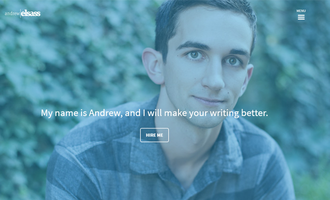
Exploring the Hero Image Trend in Web Design
Imagery is incredibly important to today’s users, which is exactly why hero images have become so popular. A far cry from the tacky headers of the past, hero images should pop (think: breathtaking and high-definition) and ultimately serve as a billboard for your blog’s content. Go out of your way to find a truly compelling hero image from a quality site like Dreamstime where you can find free photos as well as for-pay options. Add some killer copy to go along with it and you have a winning combination.
Regardless of which design you choose, remember the two golden rules of modern web design: every post needs and images and clutter will kill your blog.
While there are a number of UI patterns out there, the aforementioned three follow the current best practices of design and look fantastic on mobile devices. Don’t let your site sleep on design: instead, stand out from the pack with a blog that drives traffic and looks good doing it.

