As online retail began to grow, one of the biggest hurdles was the process of receiving and handling payment. Eager online shoppers were noticeably more comfortable with choosing their items online than they were with paying for them online. It didn’t help that there were plenty of security breaches that compromised credit card and bank account information for the shoppers.
In time, better systems came along. As the system developed, we went from rickety platforms with numerous security holes to tightly-sealed, effective systems like Checkout.com.
So once there was a safe way to pay, retailers and customers alike began perfecting the process of building effective shopping cart and checkout systems. It’s important to treat this step with a high degree of attention because customers come to a site with the expectation of a checkout experience that’s as pleasant as the shopping experience.
Remember these general guidelines for making your checkout process work.
Keep It Graphic

60 Shopping Cart UI For Your Inspiration
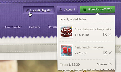
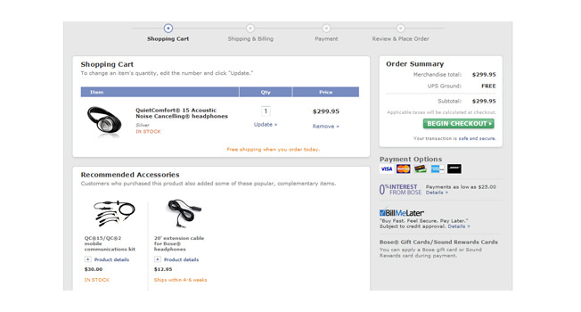
A picture is still worth a thousand words. When a customer views the cart before checking out, it’s much easier to cast off a few items when they are only represented by boring text and meaningless SKU numbers. Use a cart system that features thumbnails of the product so that the customer can imagine the sale as a happy little family that simply must stay together.
And the text you do have should be meaningful, with a few of the gushing adjectives that you used to lure them successfully to a purchase. Describe it the way your customer would describe it, not with your internal jargon: It’s a Sterling Silver Mother-Daughter Locket, not ITEM 33421 LOCKET, SS M/D. Keeping that accessible description present will remind the customer of what they liked about it–and your business–when they decided to buy it.
Display The Details

36 E-commerce Homepage Design Best Practices from the Experts
Everybody hates a checkout surprise, with unexpected fees, taxes, or shipping charges. They also resent the 11th-hour discount loss, where they discover only during checkout that their promo code isn’t valid.
Keep all that in the cart from the moment it’s established. Show the customer, penny by penny, where the savings are taking place. It builds their enthusiasm for the purchase when every new item added to the cart generates another moment of bargain joy.
It’s also a good idea to have a little corner of your page to show the running total of the cart. This prevents checkout sticker shock that can scare the customer into dropping the whole sale. Adding a little bit at a time is the best way to ease them into a rising total, and rising totals are what it’s all about.
Hang On To The Cart

40 Checkout Page Strategies to Improve Conversion Rates
Imagine if you ran a clothing store that could hold items for people indefinitely, with no risk to future sales. It would be great to see a customer return to the establishment and to be able to tell them, “We still have the things you were looking at last time!”
With an online store, you can do exactly that. The customer can build a cart, then leave the site and return later to find everything exactly as it was left. And it doesn’t keep you from making a confirmed sale in their absence; if you sell out of their chosen item before their return, it simply goes on backorder.
Make sure that your carts are preserved for future return trips. This allows your customers to comparison shop, consider a purchase, or otherwise debate the decision without losing their selections and giving up on you.
In a brick-and-mortar store, customers often have the expectation of a slow, burdensome checkout process. Building your e-retail status as a superior option to shopping in person is much easier when you show that you have a superior way of checking out, along with all the other things you have to offer. Keep it smart, secure, and efficient, and the customers will be with you for the long haul.


