Infographics aren’t a new concept. The ability to quickly convey large sets of data or complicated subjects in a quick and clear manner is a winning tool – and it’s one that brands, companies and designers jump on time and time again. In simple words, infographics are visual representations of information and closely related to data visualization, with an added twist of graphic design.
Historically, they are quite similar to the famous Pioneer Plaques, two gold-anodized aluminum plaques placed on board the Pioneer 10 and the Pioneer 11 in 1972 and 1973 respectively. They were intended to visually convey basic information on planet Earth and humankind, in an effort to communicate with any alien civilizations that could find them. The US-made Pioneers were the first man-made objects to leave our solar system.
To tell the rest of the story, in an inception-like move, we consulted an infographic on the history of infographics, created by copywriting brand CopyPress. It was visionary graphic designer Peter Sullivan that introduced the concept of infographics to the general public in the 1970s, through his work in The Sunday Times. By 1997, the printed press had already started using them, but they became much more of a hit the more people got online. After all, 90% of the information the brain takes in is visual, according to 3M Corporation.
We are living in a world where mobile tech is more important than ever. According to reports, by 2020, there will be 6.1 billion smartphones in circulation – that’s over 70% of the world’s population. Following the mobile trend, data has to be easier for us to digest on smaller screens, but this doesn’t mean that design has to be sacrificed. There are some very clever designers out there creating beautiful infographics and we’re also seeing a trend of mobile-friendly website design that mimics the same format. We’ve looked at many different infographics and are presenting you with some of our favorites, explaining what’s so special about them.
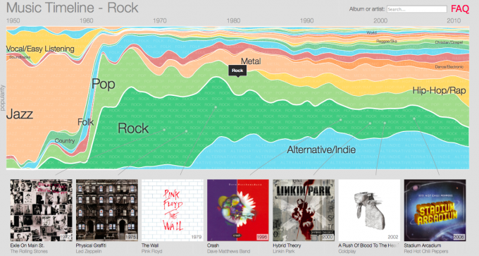
Music Timeline – Google
Google is undoubtedly one of the biggest owners of data in the world. With so much at the tips of their fingers, you’d expect them to be able to create some thought provoking pieces of work – and they have with their music timeline
Infographics are at their strongest when they are communicating information in an intuitive way that is also beautiful for the person looking at it. The human eye can register 36,000 visual messages in an hour, while, according to Zabisco, 40% respond better to visual information than plain text. Google’s music timeline is a full microsite that visualises music trends from the 1950s to the present by popularity. This is an interactive site that allows you to click on different time periods and genres. Once you’ve hovered or clicked on a genre you’ll be able to see the most popular albums from that category, for that era.
Google takes their infographic one step further by allowing people to click on an album of their choice to take them through to Google Play. It’s a pretty nice life cycle of an infographic: discover large data, research further into data that interests you, target in on the specific information you desire and get access to a Google product.
Personality Traits of a Poker Player – PokerStars
The world of poker and casinos, as well as professional players of these popular games, relies on math and data as well as personality and style. So it’s not that surprising that casino brand PokerStars creates infographics that mirror the environment and preferences of their target market.
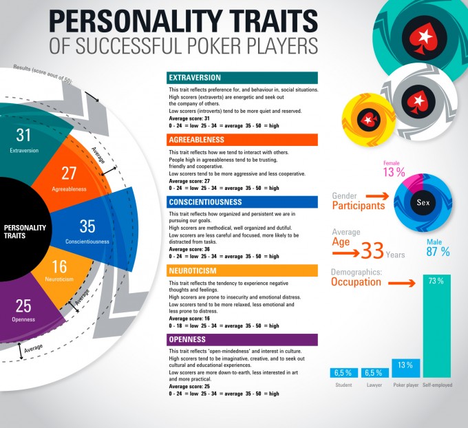
One example that stands out, in terms of merit for an infographic, shows the personality traits that make a good poker player. Here, the brand has taken a psychology study –the kind that throws out a mass of information that is often unmanageable for non-scientists to read– and has presented it in a clear and concise manner.
The infographic breaks down the big five personality traits and maps the results of where several poker players score within them. Looking at their average results, it offers some insight into what the personality of a successful poker player might look like.
It’s a good example of lots of complicated data being refined into an easily digestible image.
10 Dinner Table Customs From Around the World – Wimdu
Infographics don’t all have to be about taking big data and making it small. There are many topics that can work as an infographic and one of them is a do-versus-don’t scenario.
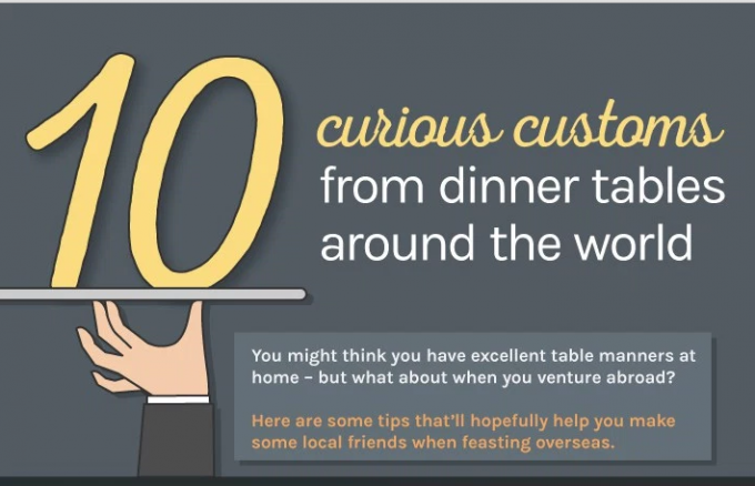
Wimdu demonstrates this example very well. This travel site has created an infographic which gives their audience some insights into several dinner customs from around the world. Quite a useful piece of content for the traveler who doesn’t wish to make a faux pas at the dinner table.
This infographic lists the dos versus the don’ts side by side, and country by country. They could easily have written this as an article, however the infographic adds a pleasing visual element that makes all this information more attractive. With just a quick glance, their audience can gain the same information that would have taken 10 minutes to read in an article.
This infographic also has shareability, so Wimdu can spread the word -and brand awareness- with a much wider audience.
How Music Affects Your Driving – No Nonsense Insurance
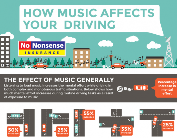
Not all brands are exciting and glamorous, and almost nobody likes to talk about insurance, which is why No Nonsense Insurance’s infographic that demonstrates how music affects your driving is even more commendable.
Here, No Nonsense has combined lots of data and facts with a fun and appealing design. The infographic goes into great detail on how listening to music affects your driving. The content itself is useful to the audience, it demonstrates the brand’s expertise and knowledge, and it’s leading people to think about insurance – without the audience feeling as if they are being pushed into it.
Rather than listing monotonous details about your car insurance, this brand has managed to find a topic that is appealing to their target demographic, and this is a key hook you should consider if you want to build your own infographic.
If you’ve taken a look at these infographics and think you’d like to create one of your own, just keep in mind why you are creating it. Do you really have lots of data that you want people to be able to digest in an easier manner? Perhaps design and beautiful representations of data is your thing? Or maybe you have a topic or idea that you want to share to your audience in a creative and fun way? No matter what your objective is, consider the action of making the big appear small, taking something large and hard to understand and breaking it down into its components – and you’ll probably have the makings of a solid infographic.

