It’s fair to say that in the competitive retail world, the last thing any savvy entrepreneur wants to do is turn customers away. In fact, you’re going to want to create the exact opposite impression; you want your store to look wonderful, enticing that valuable foot traffic to browse the store and see what you have to offer.
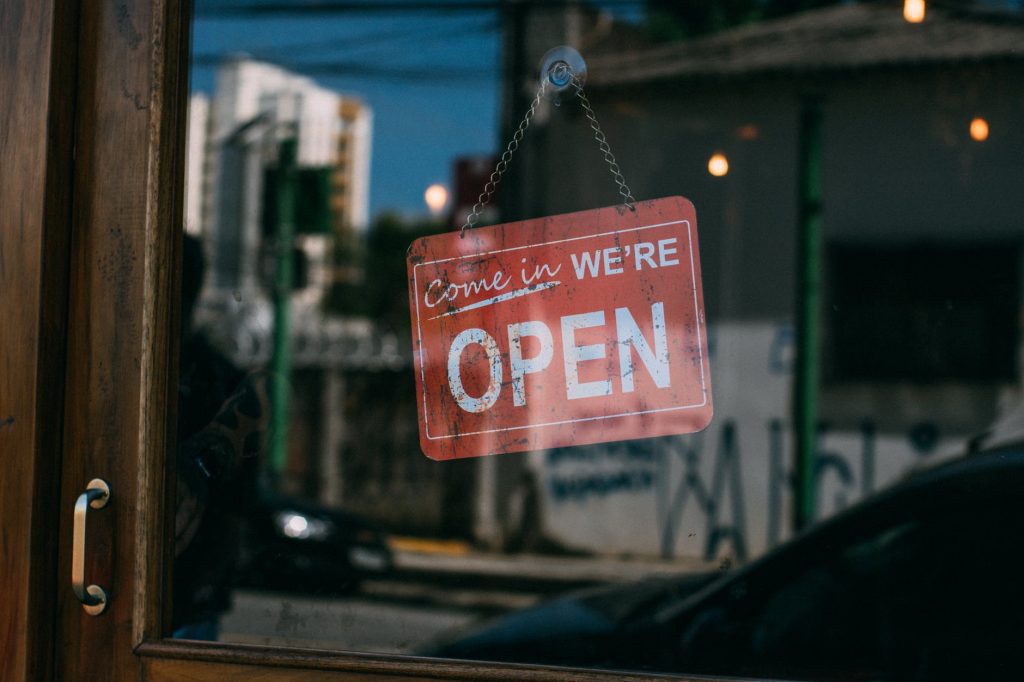
Of course, no store owner is choosing for their store to look off-putting to customers; it tends to happen as a consequence of missing important details, often because you’re trying to focus your efforts into too many areas at once. However, if a customer glances inside your store and immediately wants to step back outside, it doesn’t really matter if they’re being given that impression intentionally or not– you’ve lost a potential customer, and they’re going to be nigh-on impossible to tempt back.
In retail, aesthetics matter, so if you get your interior design choices wrong, then you’re going to find yourself struggling from the get-go. Take the time to peruse this list of six errors that far too many stores are making with their interior– so you know what you should be avoiding in future.
#1 – Poor Lighting
12 Smart Tips To Increase Customer Footfall
If a customer can’t clearly see into the interior of your store, then you’ve got a problem. Think about it: would you step into a store if you couldn’t clearly see what you were going to experience when you step inside? Probably not, and prospective customers of yours will feel much the same.
Your Business’ Brand is Everything Your Customers See
If you don’t have a lot of natural daylight in your store, then use High Bay LED lights to fake it. You want the store to look bright and welcoming rather than like a customer would need a torch just to consult the pricing labels.
#2 – Too Much Stock On The Shop Floor
Location, Location, Location And Why It’s So Important In Retail
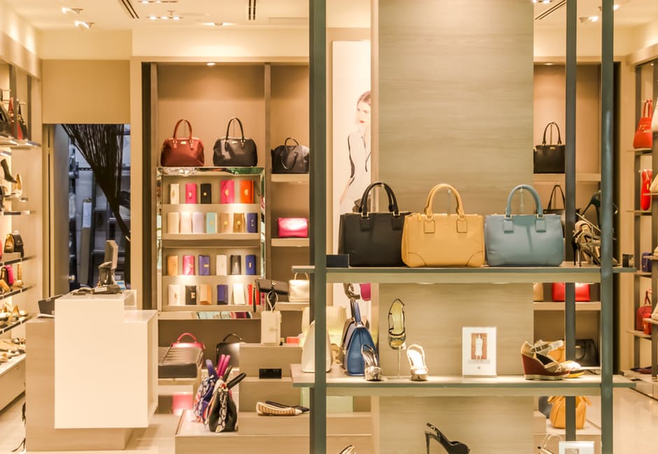
The old rule of less being more applies here. Your shelves should look well-stocked, but not like they are about to collapse under their own weight.
Marketing Your Business in the Physical World vs. Online
If you have more stock than you have space to display, then commit to rotating your products every few weeks. This is more effort, but will look far better than cramming everything into a too-small space.
#3 – Shelving From Floor-To-Ceiling
Shore Up Your Store with Better Organization
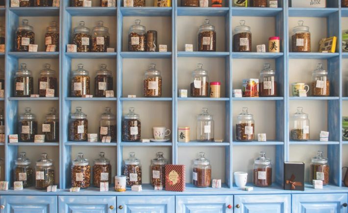
Nothing makes a space look cluttered like floor-to-ceiling shelving. You might think you’re making the most of the space you have available, but you’re actually just going to be inducing claustrophobia in your potential customers.

12 Smart Tips To Increase Customer Footfall
If you do want to make the most of the height of your store, then use mirrors to help create a light and airy feel which also helps to showcase more of the stock around the room.
#4 – Competing Colors and Textures

Branding 101: Top Tips to Help SMEs Build an Effective Brand
Your overall decor within the store should be complementary, with no obvious competition between colors, textures, or patterns. Choose a simple color scheme that you don’t deviate from; muted colors are preferable to loud, bold colors or prints that resemble a Magic Eye painting.

Branding 101: Top Tips to Help SMEs Build an Effective Brand
By avoiding these classic errors, you can be confident that your store is always going to look inviting to any customer who happens by.

