Banner advertisement has gained momentum in the digital world from the past few years. Similar to the concept of traditional roller banner advertisement, catching the eyes of those who pass by, or in this case site users. More and more companies are trying to woo their customer by placing banner ads on relevant platforms. But, in this highly competitive market the question stands- is banner advertising really working? Also, one might think of how many advertisement they themselves have clicked? Not many for sure. So, now do you think putting money in banner advertising is really worth? Surprisingly, yes! But, only when you have properly planned your banner ad strategy.
From making the right type of banner ad, to targeting right audience, everything needs to be researched well and after that only the ad should be placed. Now, knowing your target audience, their likings, the search they do comes under the SEO part of banner advertisement. This is the most important part of ad strategy because if you haven’t targeted right audience you won’t get required result even with an attractive ad. So, here are few quick tips to help you in your banner advertisement-
Right ad placement
Users are accustomed to see ads on certain places in a website. The chances of them noticing an ad on these spots are much higher as compared to other places on the same website. Researchers have found that on average a user are used to-
b.The chances of a user to see an ad in the top fold of a web page is 156% higher than that at the bottom fold. [2014 Infolink Study]
c. Also study by infolink revealed that the chances of people seeing an ad increased by 451% when integrated advertising was done rather than only banner advertisement.
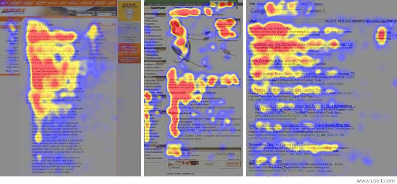
Also, a notable point to note is the study done by Nielsen Norman Group that said that users follow a certain pattern while going through a website called the F-Pattern. They first go from left to right of the top content and then would scroll down to see the content associated with left side. This explains the higher probability of a user seeing an ad on left side of a website.
Now, when you know about user’s behavior, it’s important that you follow few basic rules of ad placement-
b. Try placing ad in the top fold of the website for better viewability.
c. Always make sure that your ads are unobtrusive, but at the same time catches the attention of the viewers.
d. The most important of all is to place ad only on the sites that are relevant to your business and your audience.
For e.g. if you are in a t-shirt design business then placing an ad on a morgue site won’t bring you any audience.
Simplicity is the key
One of the most common mistake one does is adding too many colors, text in the banners. Now, since most of the audience are now coming from mobile device it would be hard for them to grasp your ad and as a result they won’t click on the same. Therefore, our tip would be-
b. The headline should stand out so that the user knows what to expect upon clicking the ad. Apart from the headline being bold make sure it’s catchy and arouse curiosity of the viewer.
c. Always add image that is relevant to the context. The image should be of high quality and has a professional look.
d. If you are giving offers then do not add more then 1 offer in an ad.
Now, since the user attention time on an ad is very low, the probability that the user goes through both of your offer is negligible. So, rather than placing two offers and getting no clicks it’s advisable to place one offer and increase the chances of clickthrough.
Websites like Creatopy make it possible to design beautifully simplistic adverts that will match the styles used by much larger companies. The banner making tools on this site are second to none, giving you access to a wealth of options when you’re making your ads.
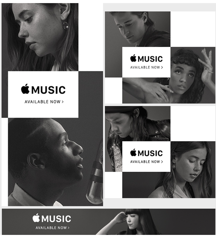
The best example of keeping banner ad simple can be seen from apple. In the banner image below one can see how through a simple image they created to promote the apple music created a great impact on the mind of users.

Know what your audience like
Have you researched what your audience likes, before placing an ad? If not, then the chances of your ad getting good number of clicks are very bleak. This is how one can know what their target audience likes-
b. Create a survey form asking your users about their likings, expectation, etc. You can give gifts to the users who have filled the complete form.
c. Research what your competitor is doing. It’s important that you know what your competitor is doing and then make plans on how to be better than them.
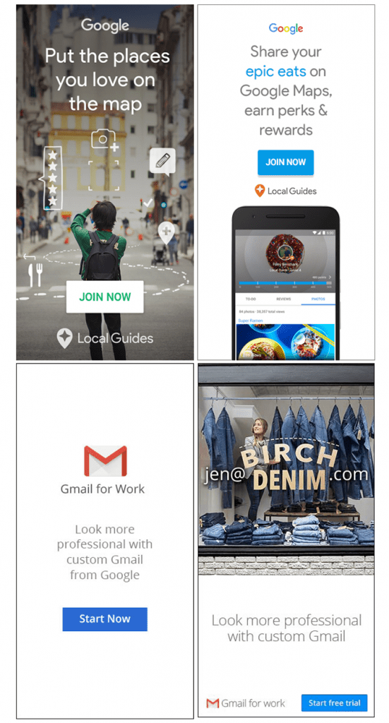
Once you have done your research, take time to compile all the information and go through it once again. Based on your finding create an ad that can easily make your audience to click on the banner and take required audience. The ads created by Google can be a good example of how to present things that your target might find useful and want to know more about it.
Also, we would advise not to make content that is always a sales pitch. Instead you can make banner ads that educate users about the problem they might face and it’s possible solution. This way you might not be redirecting the user to your product/service page, but on blog page of your website. The advantage it creates is that it develops trust among the users and develops a sense among them that your company is truly concerned about their welfare.
Visible Call to Action button
You want your users to perform a certain action, right? Now, for this it’s important that you place your call to action button on a spot that it is easily visible to viewers and creates an urge to click. Now, here are few points to consider when designing a call to action button on your banner-a. The CTA button should be placed as such that it easily catches the attention of the user. Also, test how it would look on mobile device. See if it stands out from rest of the content or just gets hidden among others.
b. CTA should look like button. Even though one knows that you can click anywhere on the ad and the person gets redirected to the desired page. But, it has been seen that people generally tend to click more on a banner that has a well-designed button.
c. Give proper white space between the CTA button and the rest of the content.
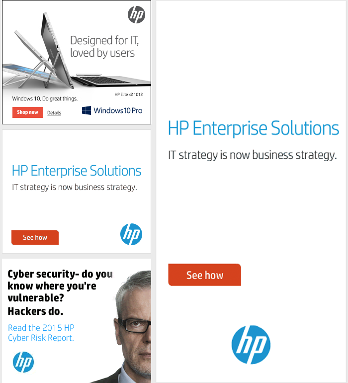
HP create amazing banner ads with clear call to action that helped the user to identify the user what next to do.
Do A/B Testing
One of the major mistakes marketer do is that they create a single banner ad and then bid a huge amount of money on it. Now, there are chances that the ad might not perform as per expectation and the cost per click is too high. This causes the marketer to take down the ad and they think that the research done on banner ads was not good. The only thing they do not realize is that the design of the ad created might not be catching as much attention as it should.
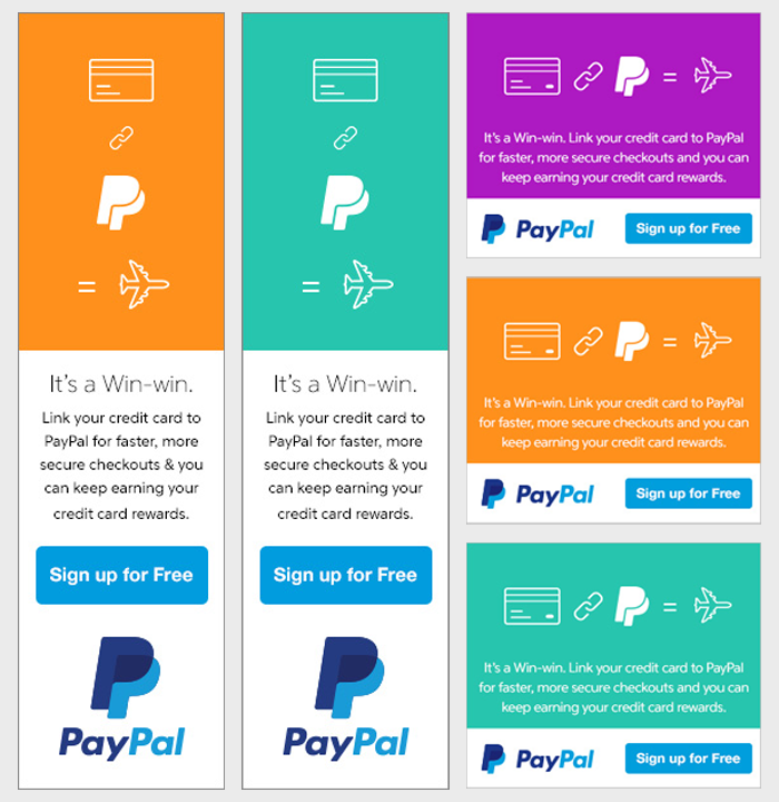
Now, can you recall what you do when you have to send mails to your clients? You create 3-4 versions of the mail, do A/B testing and then send the one that has received the best response during the testing process. Similarly, one should create ad variation during banner advertisement. The advice would be to make a single change in each variation so that you can know which variation is bringing in the most traffic. A very good example of a slight change in banner ad is of PayPal. They did a color variation to target their different set of audience.
Once you have find the ads that are performing best you need to kill out the ones that are underperforming. Also A/B testing is a continuous process in banner advertising so keep looking for new variation in ad that might perform even better.
Monitor your ads
Once you have researched about the banner, placed a banner ad, thereafter the real battle begin of analyzing and monitoring your ads. Now there are several parameters on which you can monitor your ad, like-
b. Monitor which ad type are getting most clicks. Not every banner ad gets user attention and as such it’s necessary to kill those that are underperforming.
c. The device from which most users are coming. Chances are you are getting more clicks from users on mobile device rather than that on the laptop. So, you might need to customize your banner ad to target more audience on such device.
These are some major SEO tips we would like to give you to help you with your banner advertisement. Do you have any more tip which you would like to share with us? Do comment below.


