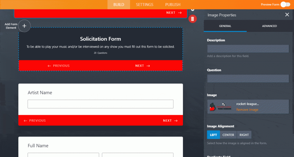
You guys know we love reviewing new tools on the web that we can use to increase conversion and make our lives easier as marketers and web designers – well we are back again to review a product from a company that we have reviewed more than a few times, and that company is JotForm – who has truly been killing it with products and features! Early last year we were pleased to see that JotForm had completely overhauled their form builder app, and we were there to break the news to you loyal readers of AndySowards.com! We were some of the first to get access to the v4 build of JotForm’s web based app last year and again we were granted the prestigious early access to JotForm Cards which launched officially on February 6th, 2018 and we can’t wait to show you what the Cards feature is all about!
Who Is JotForm?
JotForm is an online form-building tool based in San Francisco. Its simple drag-and-drop interface along with conveniently sortable submission data allows you to create forms and analyze their data without writing a single line of code. JotForm is the solution for online payments, contact forms, lead collection, surveys, registrations, applications, online booking, event registrations, and more.
What Is JotForm Cards All About?
JotForm Cards is a new format that is also available on JotForm in addition to Classic Forms. It’s the same form generation you know and love but with a newfound focus…
on keeping your focus! It’s no secret that these days we are all super distracted – squirrel! The purpose of JotForm cards is to reduce the monotony of filling out the forms that users sometimes feel. Keeping questions short, sweet, and to the point (with a little fun thrown in) is what JotForm Cards is all about.
Key differentiators of JotForm Cards:
- Asks 1 question per page (making it easy to focus & fill out, especially on mobile where you can swipe for the next question)
- Motivates users (progress bar & navigation)
- Fun components (smileys & icons)
- Gives feedback (microanimations & suggestions to prevent users from making mistakes)
- Smart Embed (Forms can adapt users’ page automatically, automatically adjusting to a website’s colors, fonts, style. This feature is customizable as well).
JotForm continues their mission to increase conversion rates for small business owners, marketers, and agencies by reducing complexities and making the form submission process as simple as possible – after all simpler user interfaces make happier customers and higher conversion rates!
Hands On With The New Features
If you have had the pleasure of using JotForms in the past then you are familiar with the level of customization you can achieve with ease on the platform – Cards is exactly as you’d expect. You can quickly and easily figure out where things are, and how to manipulate things if they are able to be manipulated (hint: most things are).
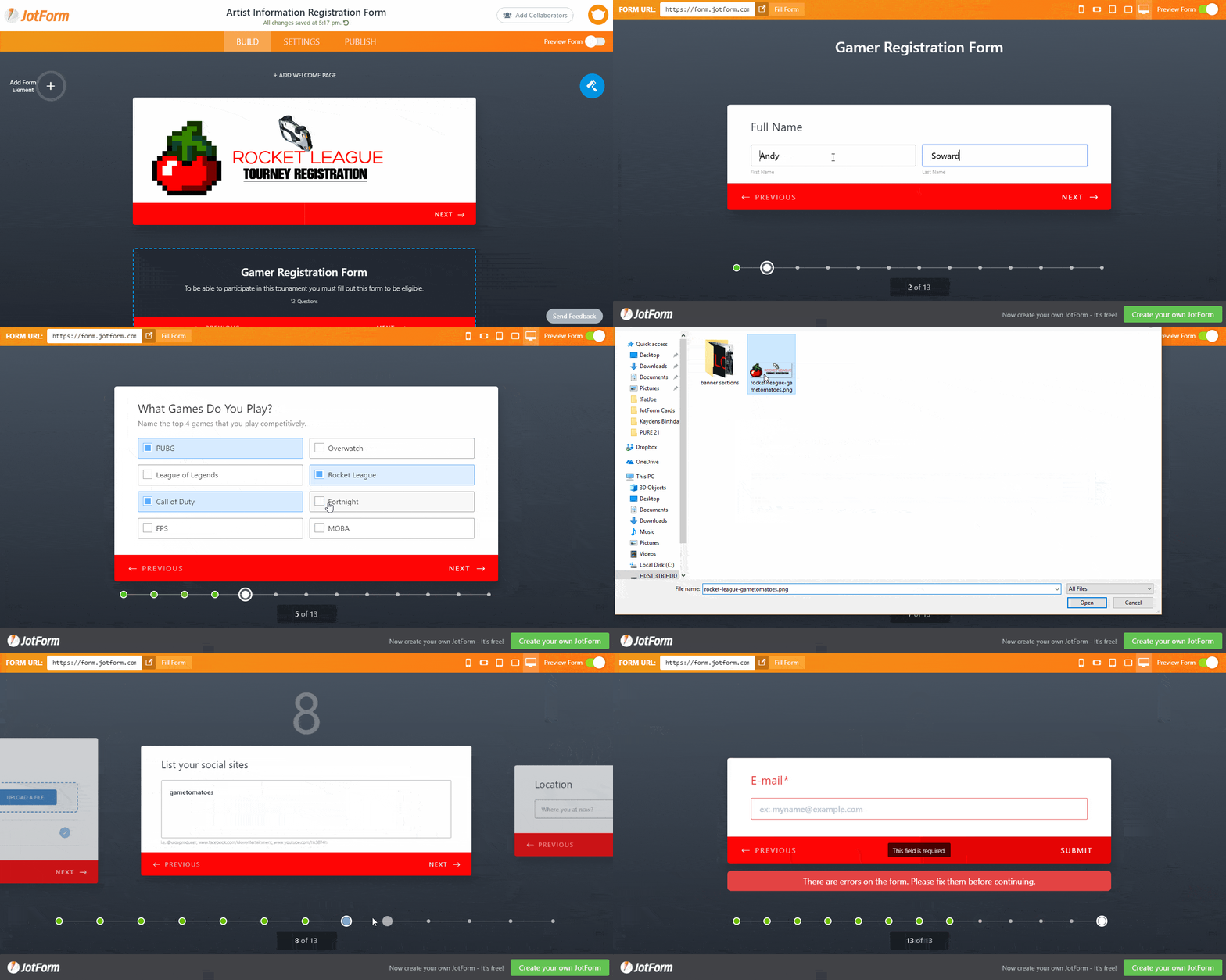
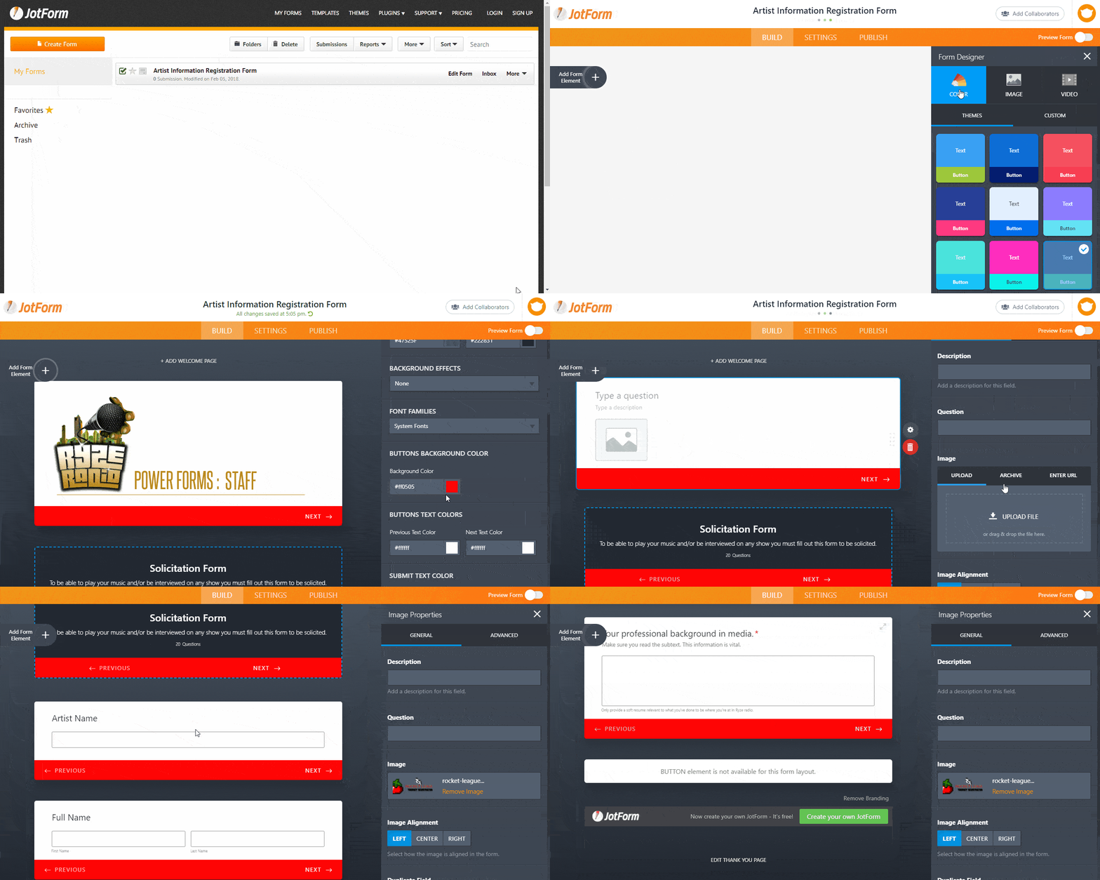
First thing we did was take an existing event form, and modify it for our own use – in this case a Rocket League Tournament registration form for our sister site GameTomatoes.com. Within minutes we had a great looking form, with our colors and image, and gathered all the info we needed from the gamers coming to the event with a very focused and easy to fill out form – complete with animations and validations!
Years ago, and even today, it would take you a few hours to set something like that up! Time savings abound!

Changing text in forms, changing the colors, alignment, the fonts, how it appears to the user – even adding validation is super simple and intuitive – without needing to know any HTML, CSS, or Javascript. No coding experience necessary at all with this app. It’s actually FUN creating these forms, and fun to test them – because they are just so simple and beautiful. Bravo JotForms. Don’t take our word for it of course, it’s free to try out JotForms and there is even a pretty robust free account that you can use if you just need a few forms to get something going – give it a try and you’ll see how easy it is to use.
If you want to be the first to try the new Cards features be sure to follow the steps below:
1. Try out JotForm Cards here: https://www.jotform.com/myforms
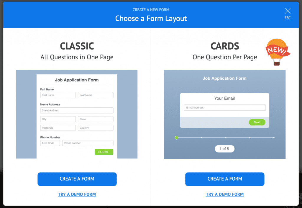
2. Select the CARDS format (the one on the right – like the image below)
Advanced Functionality
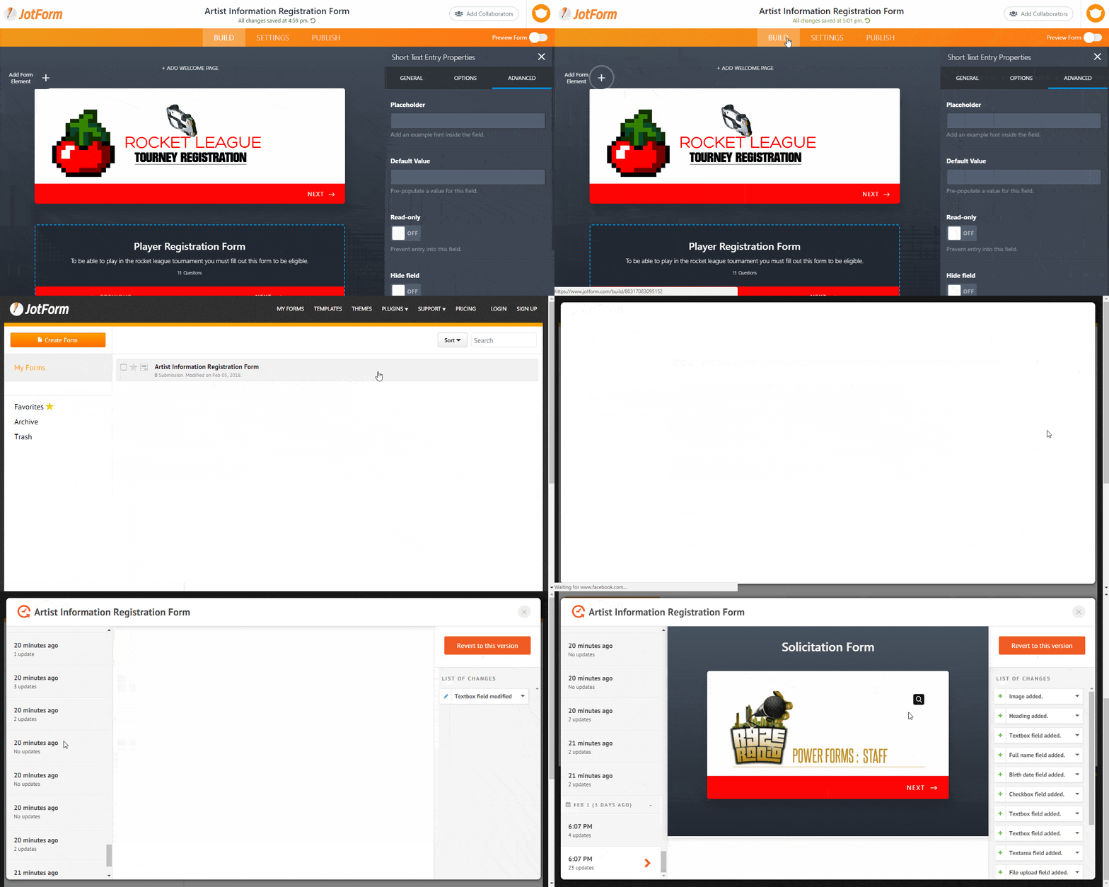
While JotForms has lots of great integrations with other software and 3rd party apps, there are some really cool advanced features in the new Cards platform. If you were to mess up on your form, there is a version control history that lets you look back (quite a bit) to see a previous version of your form, and if you want that old one back after making some bad changes – you can just revert to it! On the other hand if you really like your form from that last party you threw, you can just copy that one and modify it as necessary in a new form save. Once you are using your forms you can even keep track of what is going on with them with the built in analytics! It is clear that the team at JotForms took great care to try and think of everything.
You can even setup autoresponders that go out after the form has been submitted – talk about features going above and beyond. If you dive into the overall form settings you can also tweak small things such as form warnings and the ability to turn on or off the data encryption.
Conclusion
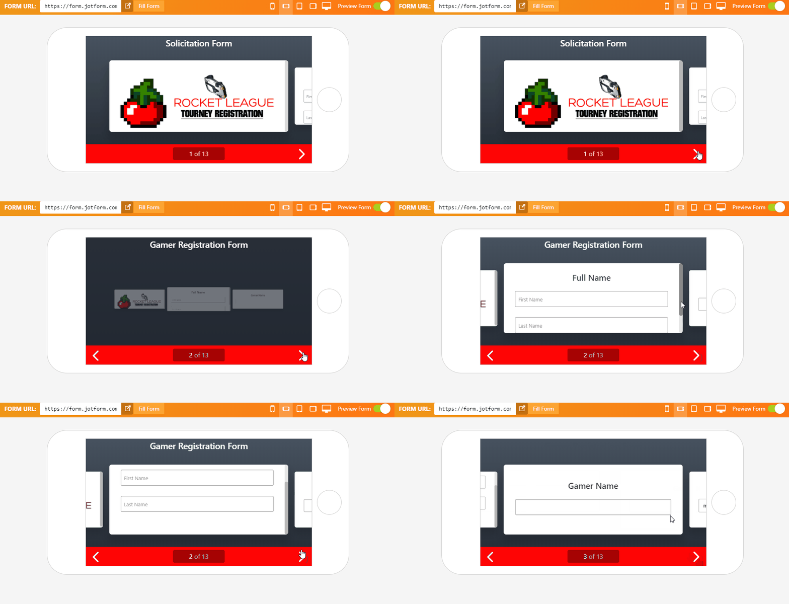
As always (and i’m not just saying that, have you tried this thing?) I really had a great time going through the different options and settings introduced in JotForm Cards. A lot of the tools and interfaces resembled their main product, but you could feel that this was geared towards simplicity and creating really nice looking, mobile friendly, step by step forms with little effort – and they executed this feeling well.
I’ve said this before but I have tried a lot of these form building services and I still feel like JotForm gives you the best deal. Again though don’t take our word for it this thing is free to give it a spin and even keep using, and you should, because it’s great. That’s why we are giving JotForms new “Cards” service a solid 8.5 out of 10.
We feel like there is no easier way to create step by step forms for your business – so get started using them today to increase your conversions!
Have you tried JotForm Cards? Let us know your experience below! Share any helpful tips or opinions in the comments below! Thanks for Reading!
JotForm Cards Review
-
Features - 8/108/10
-
Usability - 9/109/10
-
Design - 8.5/108.5/10
Summary
JotForm’s new Cards offering is super easy to use, and any marketer or business owner trying to create simple – mobile ready responsive forms for their business or event will find this product refreshing.
While there are always options and customizations that could make the product better, there is a lot here – and most users will be plenty happy to build forms quickly and easily that will engage their users, and keep them focused enough to reach the submission button!





In terms of functionality, this looks good, but the interface design is a bit outdated and inconvenient. Another more beautiful and simple alternative is stepFORM, with a visual editor, a bunch of elements and sending not only to email, but also to CRM and various services via webhooks.