Building an online store takes time, patience, and know how. It’s a challenge that will be rewarding when done right. It’s not like throwing a switch or pushing a button on a regular website.
If you’re building a website to sell a product, you are entering the world of e-commerce. Your website will be available to the world, but when they buy, the site must process their order, handle their currency, and deliver the item or items. Bom Gamer writing for Medium says, “When you are shopping online, you would never have to deal with the frustration in crowded stores.” So, you must build your online store with that in mind.
Here are 5 design tips to remember:

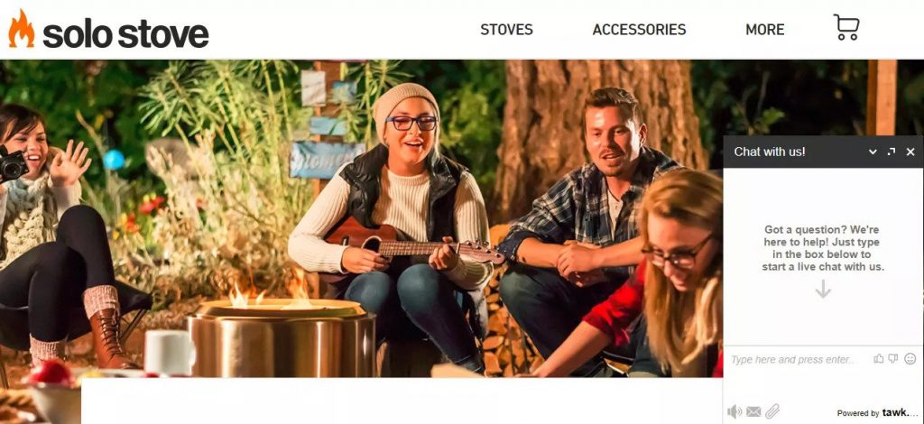
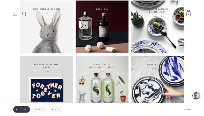
12 inspiring ecommerce website designs
It may seem like working backward, but with an online store, you are in the business of creating a customer experience. You must make the experience more than a financial transaction, so these tips focus on developing that experience. The tips should help you work with your website builders:
- Make checkout simple. Customers are online to save time, so you must remove any hurdles to an easy checkout. Lengthy registration is one such barrier. Your site should allow a “guest” checkout where shoppers can submit their name, address, and credit card without creating a shopper profile.
- Keep it visual. Most shoppers first notice the picture. They are looking for something they recognize or something catching their attention. The most successful sites display the items from different angles with shoppers’ option to zoom in.
- Select the details. You cannot afford to waste space, so you should minimize the words. However, you must provide the information the customer needs. So, you must invent ways to kill two birds with one stone. For example, when you provide color samples, you don’t have to exhaust space with descriptive words. If you build in details like size, weight, style, and so on and position those at the same place on every page, you can simplify the shopping.
- Pick and compare. It’s not easy to “sell up” online. You can’t ask, “Do you want fries with that?” But, you can link the customer’s selection with images of related items. You can also display the product with like items at different price levels. Include a checklist of benefits and features to help the shopper see the difference.
- Sell the benefits. Any sales proposition works best when you pitch the benefits over the features. Any image and text should emphasize the benefits. The text should emphasize comfortable, easy, fun, fitting, useful, and so on. Operating and sizing details are important, but they should not lead the content.

2019 Ecommerce Best Practices (17-Point Checklist Included)
Get it right, and do it soon!
CNBC.com reported, “In February [2019], online sales narrowly beat general merchandise stores, including department stores, warehouse clubs, and supercenters.” If your business is built around the sale of products, you must opt to create a presence as an online store. You’ll find e-commerce a matter of survival.


