Is your website taking a long time to load? Get it up to speed with these 7 easy ways to improve website navigation..
When you head off on an adventure, a compass rose can help you navigate new terrain. In the same way, strong website navigation can help new visitors (and potential customers) explore your website.
According to Fit Small Business, 64 percent of small business owners currently have a website. However, that website won’t help your customers if the page structure feels confusing.
With these seven tips for easy navigation, you can make it easier for visitors to find what they’re looking for.
Instead of confusing your customers, make it easier for them to navigate (and convert) with these tips!
1. Help the Hypertext

The Rules for Modern Navigation
For starters, your hypertext should stand out from body copy. Otherwise, website visitors won’t know it’s clickable content.
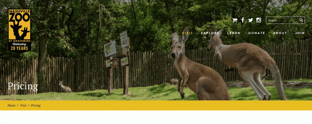
To improve your website navigation, make sure the hypertext stands out.
You can format the text with a different color, underline, or bold stroke. Make sure this differentiation is obvious before visitors hover over the links.
You can even turn your header navigation link into buttons. That way, you have an easy-to-navigate website that improves user experience, too.
2. Kick Out Clutter
According to this research, one in four website users failed to find the page content they were looking for.
A cluttered navigation bar that’s filled with links can leave visitors confused. Instead, divide and conquer. Organize content based on categories by using sub-menus to your advantage.
3. Separate Sidebars

10 SITES DOING VERTICAL NAVIGATION RIGHT
Make sure sidebars stand out from the rest of the page, too.
Format the sidebar with a color that stands apart from the website’s background. Add white space so it’s easy to read, too.
4. Keep It Simple
Add clever design components elsewhere. For an easy-to-navigate website, keep it simple. Use titles that are clear and recognizable, such as “About Us” or “Contact.”
That way, visitors know exactly where they’re headed.
5. Don’t Forget the Footer

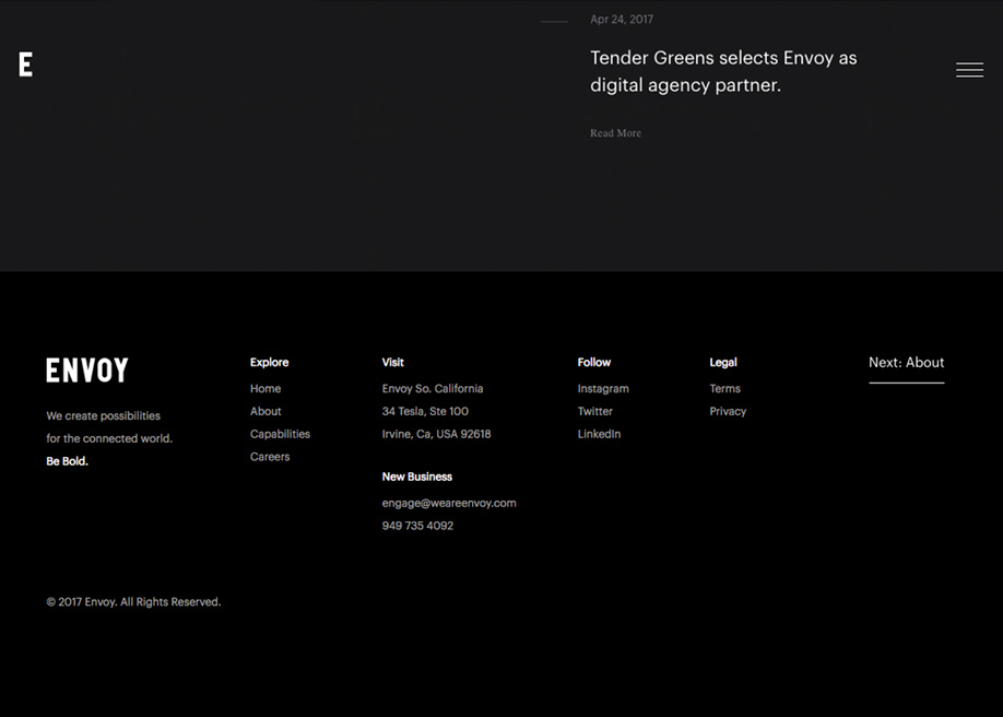
15 Excellent creative website Footers
Make use of footer space by adding navigation there as well. That way, website visitors don’t have to scroll all the way up the page to navigate.
You can also use the footer to expand on the header navigation.
Include additional links that encourage people to explore. That way, your website navigation is doing its job.
6. Make It Mobile
A bulk of your website visitors are on their mobile phones. If your website isn’t mobile-friendly, website navigation is going to get complicated.
Make sure you’re using a responsive design. The text should remain legible regardless of the device.
You might need to use a hamburger menu, too.
7. Consider Business Goals

Strategic Design: 6 Steps For Building Successful Websites
Make sure the website navigation prioritizes conversions and sales.
Choose pages that balance curiosity while still directing visitors through the sales funnel. Don’t forget a strong CTA!
If you’re still having a difficult time competing online, consider Review Management Tools. With these tools, you can achieve your goals and navigate your business towards successful growth!
The Compass Rose: 7 Easy Ways to Improve Website Navigation
With these seven ways to improve your website navigation, your customers won’t need a compass rose to get around. Instead, they’ll find what they’re looking for without struggling through your site.
Dive into our Archives to discover more strategies for better business growth.


