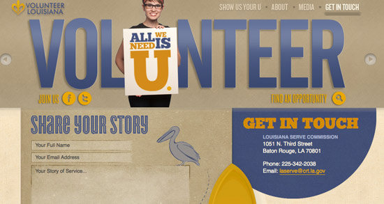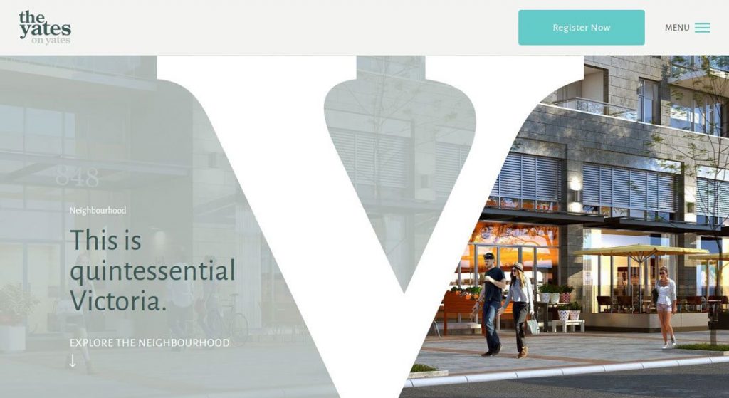
If you’re not familiar with the website design strategy of “above the fold” than it’s important to understand why your website header design means everything.
When designing a website, what you put above the fold is key. You want to make sure that your website header, and what’s directly below it really grabs and holds your reader’s attention. Keep reading to learn more about how to design an effective and attention-grabbing website header.
How To Design A Website Header

3 Elements to Consider When Designing A Website Header Image
Your website’s header is one of the most valuable parts of your website. The header is what runs across the top of your web page, and continues to appear on almost every page of your website.
You want to make sure your header makes your site instantly recognizable while promoting your brand. For most businesses, a header is a great place to effectively and efficiently communicate exactly what your business does.
The design of your header can vary based on what your website is promoting. There are also design websites and programs that can help you out. As well as apps like this best free online twitch banners maker app.
Branding A Person

How To Build A Personal Brand In Three Steps
If your website is promoting a person such as a celebrity or even a spokesperson for a brand, you’ll want the header to connect the visitor to that person immediately. To do this, you’ll want to make sure that the picture of the person you’re branding is happy and smiling.
Even if the visitor has never met this person, seeing this face over and over will make your visitor feel like they already know this person. If your website is branding a person, you’ll want to include your logo, that photo, name, and title in your header.
Branding A Business
When you’re branding a business, your website’s header is less likely to make or break your company’s success. Actually, in many cases, the best strategy is to make your header smaller and bring your content higher up on the page.
Sometimes you might not even want to use a header at all, as your logo won’t convince someone to hire you. When you design a website header for a business, keep it simple only including your tagline and logo. You want your heard area to be small.
If you’re going to add any images to your header’s design, don’t overdo it. Keep your logo simple with one main hero image that is relevant to what your website and business is all about.
Branding A Thing
If you’re branding a thing like a product, event, program or service, then you may want to create a logo. Your logo should be the core offering. When you’re designing a website header for a product, think about including the logo of the item you’re promoting, a tagline, short description, and photo if needed.
If you’re designing a header for an event or program, make sure the images used are able to communicate the vibe of the program or event.
Design Your Header

7 Tips for Creating a Website Header That Wows
Now that you know how to design a website header, it’s time to work on yours. Make sure your header fits whatever person, business or thing your website is promoting.


