Do you have a website, but you don’t feel like your business is gaining much from it? You may want to consider optimizing your landing page. By optimizing your landing page, you’ll be increasing the amount of conversions you get from visitors.
Following these tips for landing page optimization can be just what you need to get the most out of your PPC campaign management and get more conversions.
Heat and scroll maps

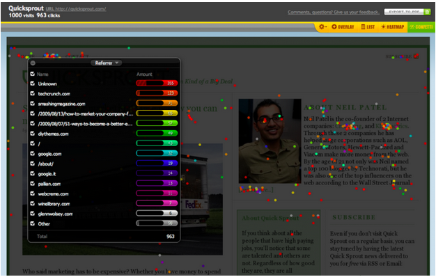
Understanding Simple Heat Maps for Smarter UI Design
To know what’s not working on your website before you make changes, try using heat and scroll maps
Heat maps show what spots on your site people are clicking on the most. By using a heat map, you can get a better understanding of how people behave on your website. You might find that people are drawn more to the unimportant parts, so you’re able to change it.
Similar to a heat map, a scroll map shows you what section of your page people spend the most amount of time on. Your problem might be that people come to your landing page, and never feel compelled to scroll all the way down. Knowing where people are spending the least amount of time on your site can tell you where to make changes.
A/B Testing
Once you’ve done your initial testing with heat and scroll maps, continue to do A/B testing. Doing individual changes makes it easier for you to see what a difference different colors or phrases can make. By doing A/B testing, you’ll be able to know what works best for you.
Simplify the design

19 of the Best Landing Page Design Examples You Need to See in 2019
Keeping landing pages simple can make it easier for visitors on your site to find the information they’re looking for. Eliminating clutter will prevent someone from getting distracted or overwhelmed. If you keep your design simple, you can also make it easier for you to draw your visitors’ attention to what you want them to see.
Add clear call to action buttons
No calls to action can make visitors confused about what to do next. On the other hand, having too many can leave them overwhelmed about which to choose. Creating a goal of what you want to get out of a call to action and only include ones that are necessary for that page. The language in the call to action should be clear, as well.
Include social proof

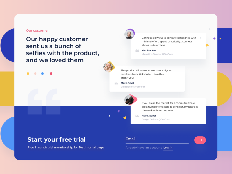
Testimonial Social Proof Design Inspiration
Adding referrals from your current customers and clients is a great way to get people to convert. Seeing other people recommend your service and product will help you appear more credible. It’s natural for us to want to trust something when we see that multiple other people recommend it to us. Rating, reviews, and endorsements from other experts can all help you gain new customers.


