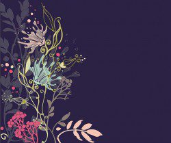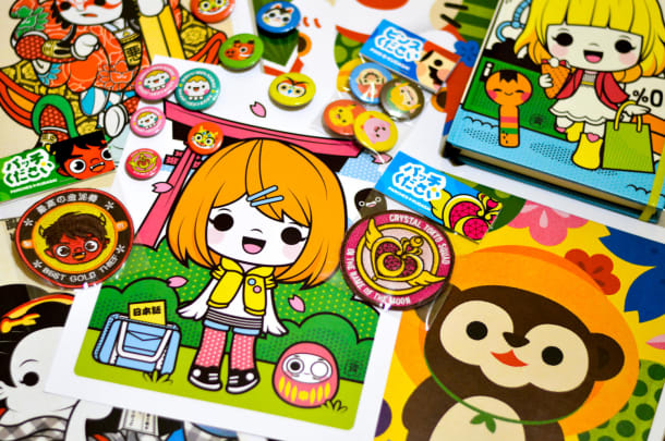
Today’s Japanese graphic designs incorporate traditional elements like dynamic colors and floral patterns with modern artistry full of fun and cuteness. If you want to try some new graphic ideas, here are some of the key Japanese design trends you could follow.
Embrace Bright and Vivid Colors
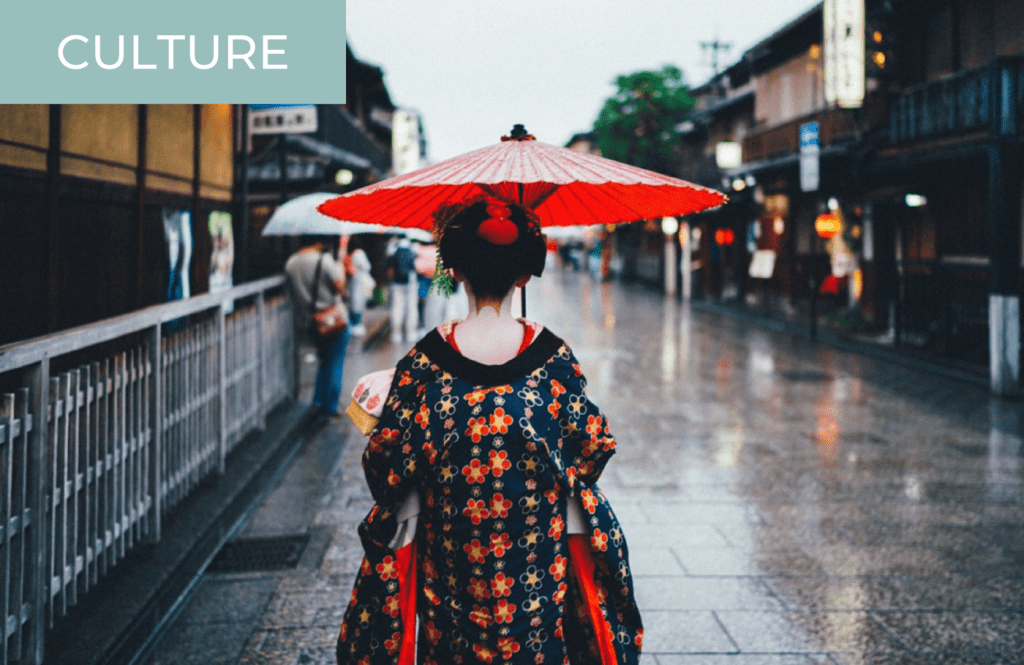
If you have ever visited Japanese neighborhoods, you will have spotted how much the people of Japan love to use bright and vivid colors. That passion for color has crossed over to graphic design trends. You could try using traditional Japanese design combinations like red, gold, and black. Or you could try mixing up a lot more than the usual two or three colors you would normally limit yourself to in your graphic designs and try the modern Japanese approach of combining a wide variety of different colors.
For example, if you look at an online Japanese casino, such as Casumo live, you will see how different vibrant colors can be used together. Primary colors like red and yellow are combined with the more dominant color of purple to give an air of vividness and sophistication. Indeed, many designers utilize color in their designs to make images and posters teem with vibrancy. So, try experimenting with color to see what you can come up with.
Adopt Cutesy-cutesy Cuteness

The phenomenon of Hello Kitty illustrates just how much cute culture, known as “kawaii” in Japan, is used in Japanese culture. Indeed, cute culture infiltrates every part of Japanese design, from television shows and cereal packaging to store fronts and billboards. However, cute culture is still not widely used by designers outside of the country. So, try embracing playfulness and cuteness in your graphic imagery. You can find free animal Clipart by Vectorfair that you can use in your graphic designs to appeal to your audience and show approachability in your overall aesthetic.
Experiment with Floral Patterns
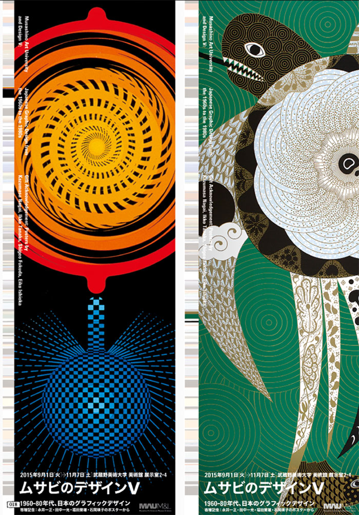
You will often see ornamental cherry blossom trees used as an inspiration in Japanese graphic design, as well as other floral patterns. Floriography, the study of flowers, is an important part of Japanese culture, and specific flowers and their colors are associated with certain ideas and feelings. For instance, Japanese graphic designers often use red to convey passionate love, while pink flowers signify curing diseases and the color of white symbolizes virtue. So, floral designs are often used in Japanese graphic design as a symbolic and decorative approach. See what design inspirations you can come up with based on Japanese flowers and their symbolism.
Incorporate Circles
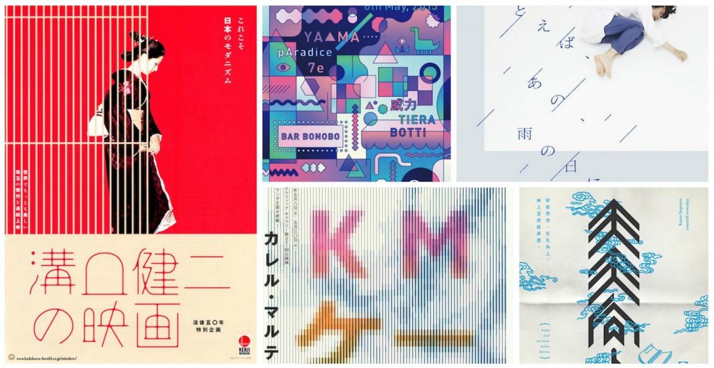
In Japan, circles represent balance and harmony. Circles are a recurring design element widely used in Japan. You can bring balance into your graphic design by taking inspiration from Japan’s circle designs. If you want to blatantly incorporate Japanese design elements into your own designs, consider using the Mon. The motif is commonly used in Japan. It is kind of the equivalent of the coats of arms in Europe. Typically, the Mon is contained within a circle with symmetrical design elements. The Mon relies on abstract geometric shapes more than realistic depictions of figurative items.
Create Customized Typeface
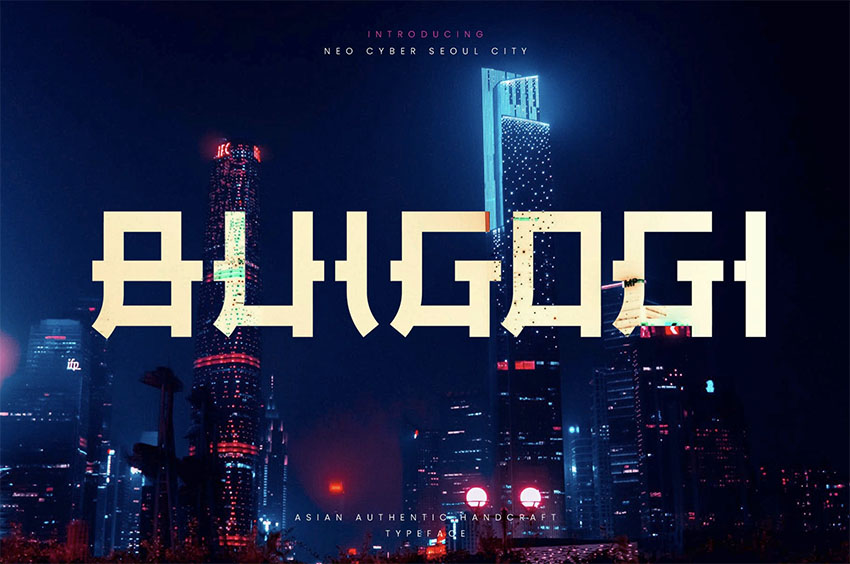
In the west, graphic designers typically use readymade fonts for typography. After all, in today’s brave new digital world, you can find endless fonts online to select the perfect one for your design project. But Japanese designers love to customize their typography. The prevalence of custom typography in Japan was at first a practical consideration. The Japanese character system is complex, so it is actually easier for Japanese designers to draw individual complicated characters than to create entire new fonts. You do not have to master how to draw Japanese characters, though. Instead, use them as an inspiration to come up with customized typefaces that are completely unique.
Use Minimalistic Aesthetics
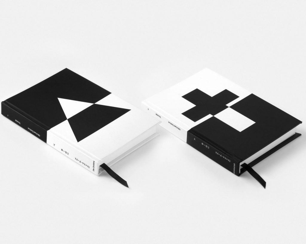
One of the distinctive features portrayed in Japanese graphic design is the minimalistic approach it often takes. This is particularly noticeable in Japanese homes, where there’s often as little furniture and decorations as possible. In fact, minimalism has been popular since the early 20th century.
Many Japanese designers believe that “less is more,” therefore, they tend to remove unessential elements to create a more pragmatic design. Thus, when creating your own design, lessen the unnecessary elements and focus on the primary ones. Using simple lines, leaving lots of negative space or white space, including limited colors (nude hues are preferable), and adding basic shapes can help you achieve a minimalistic design.
Consider Calligraphy
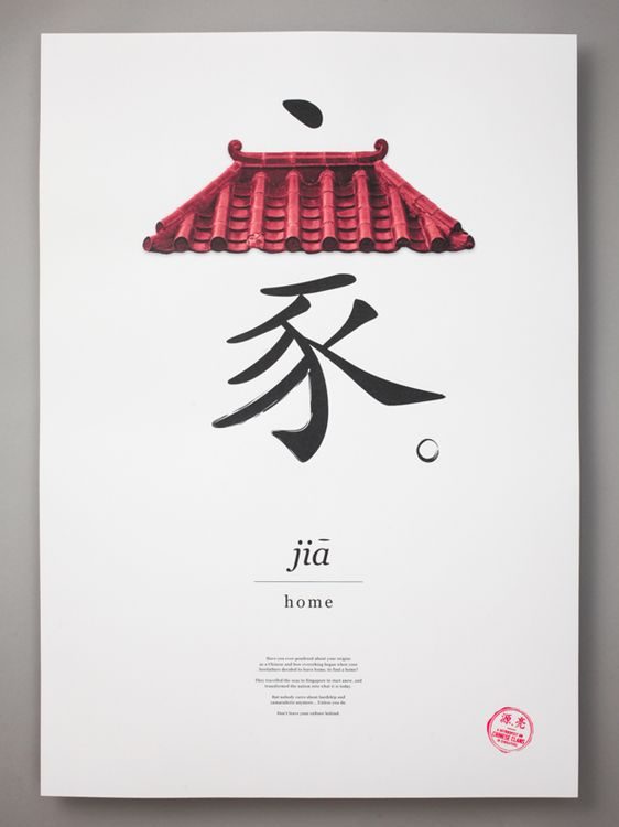
No matter how much Japanese culture embraces change, most citizens still take pride in their cultural traditions. For many, this means finding ways to infuse their traditions with modern designs. An example of this is calligraphy, called “shodou” in Japanese, which plays an important role in Japanese culture.
As many Japanese children are taught calligraphy from the first grade, and some have even achieved the mastery level at the craft, it is common in Japanese graphic design. Thus, incorporating calligraphy may help you add a new aesthetic to your design.
Bottom Line
There is a great deal of artistry in the Japanese method of design. If you want to try some new graphic ideas based on the most popular Japanese approaches, embrace bright and vivid colors, adopt cuteness, experiment with floral patterns, incorporate circles, create a customized typeface, use minimalistic designs, and try calligraphy.

