Technology is ever-evolving and so do the world of web development & design. With the recent most web standards such as HTML 5 and CSS3, dynamic and eye-catching effects have emerged. One popular example is the parallax effect which has transformed web design into something more creative and appealing. It has certainly become one of the renowned trends lately.
What is the Parallax Effect?
The parallax effect in web design creates an incredible 3D browsing effect as you scroll up, down, or across the page. It’s a captivating pattern to keep the users interested and improve their overall experience. It is referred to as a kind of optical illusion. This special effect can be achieved by slowing down the rate at which the contextual layer moves as compared to the foreground. You will get a unified user experience whether browsing through the website or mobile application.
You are more likely to be looking for a website development service in your city to find out some of the best website options available. Let’s take a look at some of the best parallax websites to get a better idea!
How to Enable Parallax
The Parallax effect is usually something that needs to be supported by the theme that you have chosen for your website. If your theme has not been developed with the parallax effect in mind, it’s going to be quite hard to enable it. However, because parallax is a web design trend that has been around for some time, many popular themes already support this effect. For example, many Astra child themes (which you can see here in these examples on CollectiveRay) already support the parallax effect. It would be usually the best option to switch to a theme that supports this effect.
1. Alex Dram
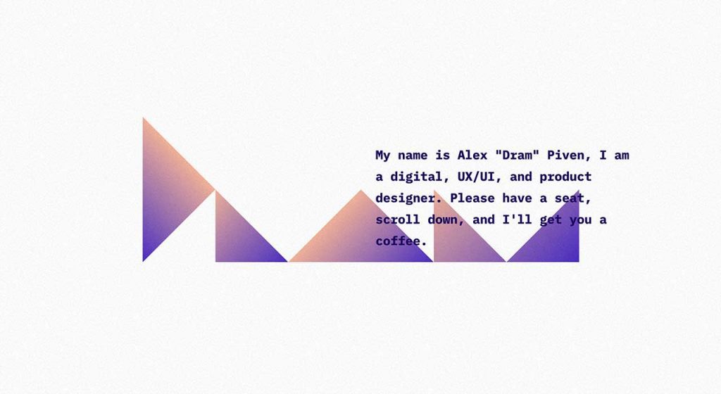
As soon as you land on Alex Dram’s UX/UI portfolio, you are welcomed with an elegant assortment of purple triangles. With simply a little movement down the screen, these shapes are transformed into arrow-like configuration directed right into the planetary-like. The use of parallax scrolling in this website design walks you through the journey of the galaxy. You will find the visual move at varying speeds. This piece of artwork offers a fanatic spaced-out atmosphere.
2. Cyclemon
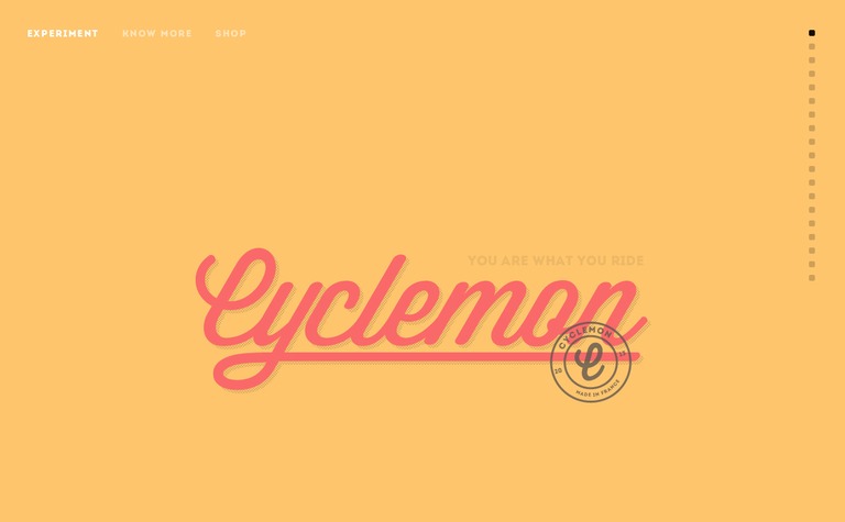
Cyclemon is a venture by two popular French designers to spot the 100th anniversary of the Tour de France. The perception behind designing the page is that the bike of an individual is the reflection of his personality. In other words, you are what you ride. Users can scroll down the page to come across different bike designs and the associated perceptions regarding their personality types. At the end of the page, you can head over a link and design your bike. Isn’t it interesting?
3. Puma Mobium
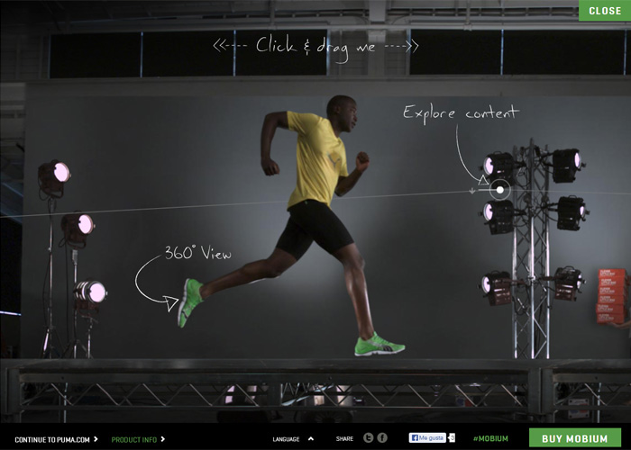
The Puma Mobium is a premium running shoe exclusively designed for professional and passionate runners. The website integrates horizontals scrolling. It is focused on a runner who runs across the entire studio page. Users can click and drag the runner for an enhanced understanding of the features. The parallax effect specifically pairs with the product highlighting the movement or action.
4. Mercedes Benz A-Class
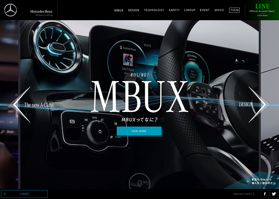
The popular Mercedes Benz website informs visitors regarding the latest A-class cars. The parallax effect is used in a way to let the users look inside the car and see how it drives down the street. As you scroll the page, it seamlessly pairs with the idea of driving a car. The 3D effects and illusion of movement offer an immersive and unforgettable experience to the user.
5. OnCorps AI
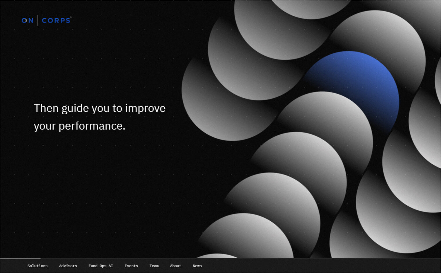
The unexpected visuals and compelling direction will make you fall in love with this website. As soon as you land on the page, you will come across a distributed flock of dots transforming into a bell curve. It’s an excellent representation of their work and what they do with data. As you scroll down, you will further see amazing animations, floating shapes, and out-of-the-box parallax effects.
6. Timeslot
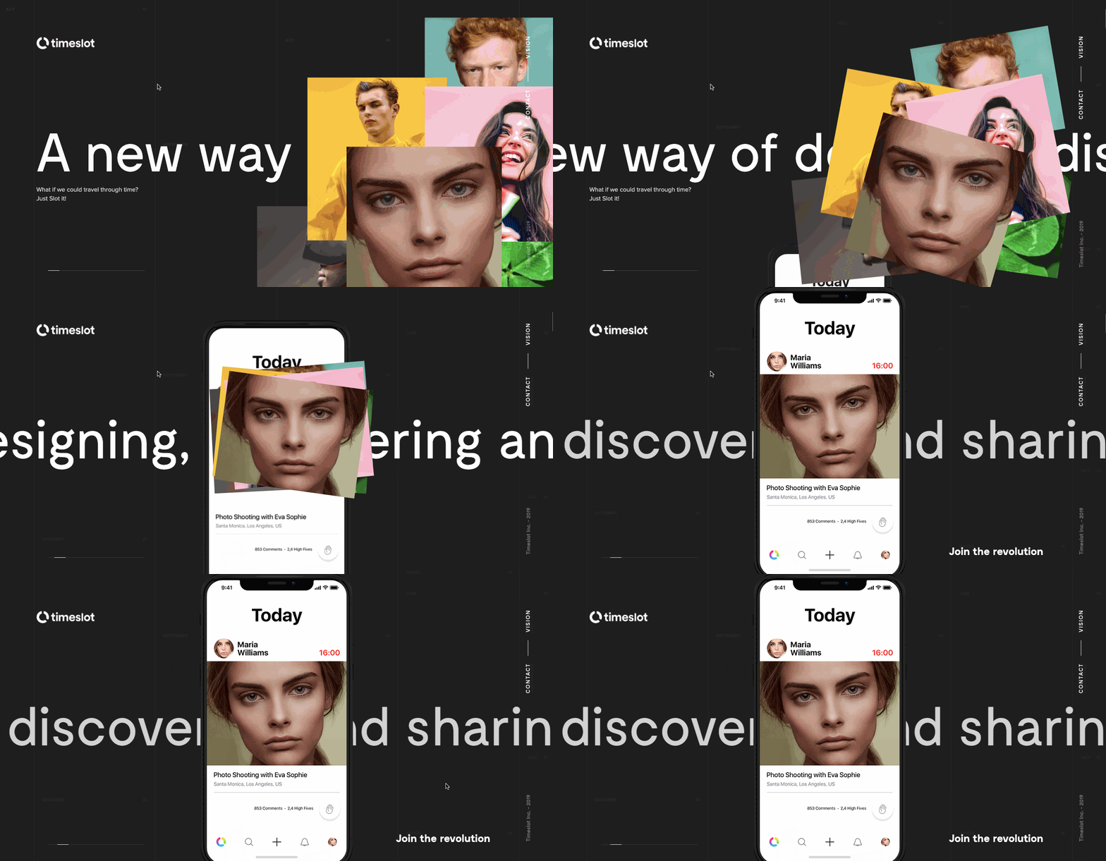
Timeslot has come up with a thought-provoking approach encouraging people to share their calendars, make plans, and connect with friends. The key concept is to bring people together and share experiences. The parallax effect is used to elucidate the story of how this application works. You will find a layered mass of people’s photos. By scrolling down, these individuals are further dragged together. The powerful visuals are the fanatic representation of metaphor to explain the overall idea of connecting people.
7. Neueform

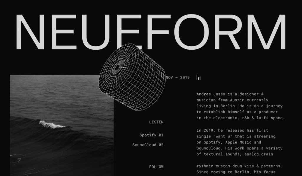
When we talk about tiny movements, it is no exaggeration to say that they can incredibly make a difference. The creative parallax at the very top touches a cylinder-shaped grid. This little effect allows the shape to jump from the screen. The website is an ideal example that parallax effects don’t need to be overdone always. At times, simplicity and minimalism are all you need to make your website stand out.
8. ESPN
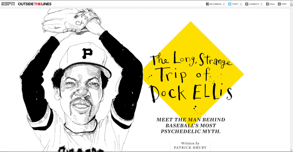
This interesting design uses a parallax effect to beautifully set up visual storytelling. It provides a sense of depth with the multiple incrusted elements – one example is the illustration of Dock. As you scroll down, you will see the different elements separating the screen areas into quotations and text. The design is further accompanied by the black & white photographs of the baseball player.
9. Playful
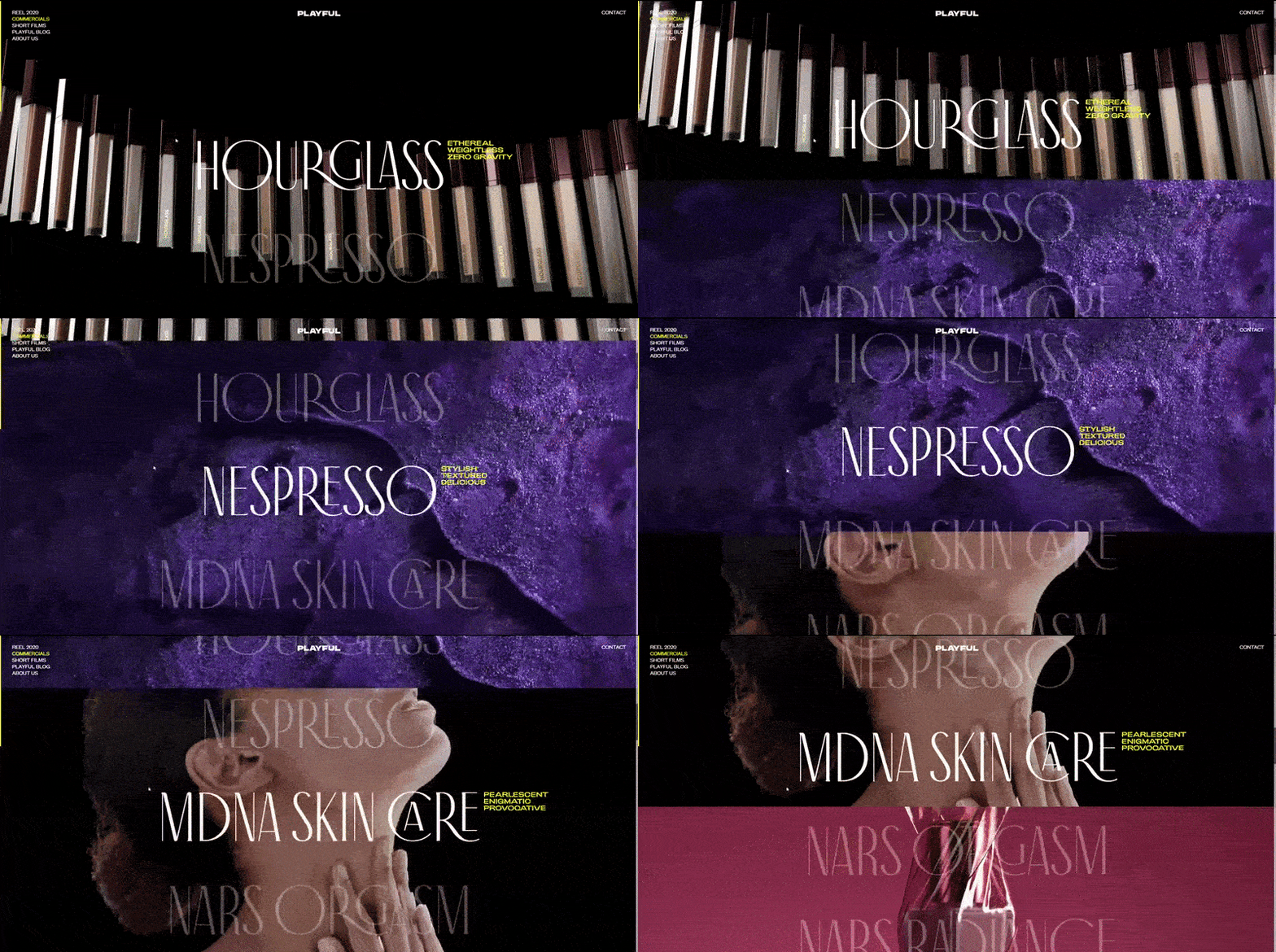
Overwhelming background photos in the horizontal sub-division take up the entire screen similar to as film glides on a reel. The beautiful emerging theme impeccably incorporates fashion and product design. The classic parallax effects let you scroll at different speeds and play with some interesting images. The constancy in the color of typography and style keeps the theme focused and interesting.
10. Werkstatt
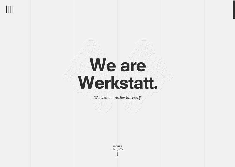
Being a popular fashion house, Werkstatt boasts wide-ranging clients such as Adidas, Kenzo, Nespresso, and much more. You will see the picture-perfect integration of development & design for a great user experience. You will find it quite interesting when browsing through the projects with a relatively simple parallax effect. Further, the dynamic animation elements make the user experience more fun.
Why Work With An Expert?
Hiring an expert can help you implement the best web design strategies in your website and other marketing strategies you want to implement involving graphics and illustrations to generate more conversions. Here are the business benefits of hiring an expert to create a stunning web design for your website:
- Save Effort and Time: You can save plenty of time researching and trying to perfect a parallax or any design for your website if you hire a professional who is more experienced in handling the task. Hence, you can dedicate your time and effort to other important tasks.
- Focus On Your Business: If you want to focus merely on your business core and cut the chase of learning web designing, then it’s a good idea to entrust your web design to professionals, like FatCat Studios. It’s a good idea to choose an agency for all your graphic needs, including print and graphic design, web design, writing, copyediting, and digital and social media advertising.
- Excellent Outcomes: Working with a web design agency can guarantee the best outcomes because they have the right tools, strategies, and people to handle the work. You don’t have to settle in average work if you can hire an agency that can set your website at greater heights of success.
Final Thoughts
Parallax scrolling is a prevalent design technique and has received immense popularity for many good reasons. The illusion of movement helps in engaging website users and boost the overall experience. The awesome 3D design concept lets you scroll up and down the page at varying speeds. The photos on different layers move at different speeds allowing in-depth visual representation. Get inspired by the above listed startling websites. Want to get an attention-grabbing website for your business? Don’t delay and consult Logozila right away!


