
If you’re improving your web design, imagine you’re a visitor to your site. Within five seconds of landing on your website, could a visitor determine what it is that your company does? Can they easily navigate to different parts of the site? Is your bounce rate high?
A website can’t succeed if it only excels in limited aspects, like only having great design or great content. A successful website needs to have a design that feeds into your website’s user experience, functionality and complements your content. You should also think about accessibility, with a service like AudioEye.
Your website must clearly communicate what you do, why you do it, and who you do it for. It’s easy to get distracted by how good your business is, and then forget to make sure you’re addressing the core concerns your audience has.
Here are the best website tips to make sure you’re going in the right direction with your redesign, and to make sure that you aren’t turning visitors away.
Have A Plan

Don’t just start designing your website. To make sure that your website is meeting the needs of your visitor, you need to spend time on mapping out your buyer’s journey from the first time they land on your website to the moment that they become a customer.
Think about what pages they are going to view, what content they will read, and what offers they might convert on. Understanding how your user journeys around your site will help you to nurture leads through the sales funnel.
Design your website for the next step, not the final step. Make sure you answer the questions a user has in the right order. Take what you already know about your customer base and research how they went from site visitor to customer. Use this data to map out a strategy.
Remove Some Things From Your Website
There are certain elements on a website that detract from the value and message that you are trying to convey. Complicated animations, overly long content, and images that look like bad stock photography are some of the things you should remove.
An audience has an average attention span of eight seconds, so you need to create a first impression quickly that gets your main points across. This can be done with short, powerful sections of content and icons and photographs that are applicable, sectioned off with clear and concise headlines.
If you can get these elements right, go back through your content and remove any ambiguous terminology or overly technical jargon. All this does is confuse your users and make your content more complex.
Avoid over-used terms like next-generation, flexible, robust, groundbreaking, and innovative. These terms are used by thousands of companies, and won’t make your content any more appealing.
Include Social Share And Follow Buttons
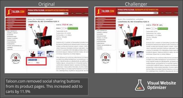
Producing great content and strong offers will only go so far if you aren’t giving your visitors the option to share what you’re doing.
If your website doesn’t currently have any social share buttons, you could potentially be missing out on a lot of traffic from social media that would be generated by people who already visit your site or read your blog.
Social share buttons are small buttons on the top or bottom of blog posts. The buttons are the icons of different social media platforms, which allow users to share content directly on their social media channels.
The buttons are a way of encouraging social sharing without being pushy.
Implement Calls-To-Action
When a visitor lands on your site, do they know what they should do next? They won’t know which pages they should visit or what actions to take if you don’t give them some kind of direction.
A call-to-action button is one of the best elements that guide a user to the next step they should take on a page. Most of us know we should do this, but it can be hard to accurately guide a user through your website.
It’s all too easy to spam your website with the most bottom-of-the-funnel call-to-action without properly nurturing your users with other calls-to-action that are the top or middle of the funnel.
To see if your site does this, read through your pages on your website. Are you finding most pages, including your blog posts, that only have a call-to-action for a demo or a trial consultation? If so, then you need an update.
Add in calls-to-action that offers materials to learn more or to solve pain points.
Once a user has identified your company as one that offers solutions to pain points, they will feel much more comfortable about researching your services to see if you can make these solutions a reality.
Examples of calls-to-action that you can use are ‘click here for more information’, ‘download our sample’, ‘sign up for the webinar’, or ‘watch the video’.
Use The Right Images
Not every image will fit with the type of message that you are trying to get across to your audience.
There are lots of images that you can choose from, even some for free. There’s really no excuse for filling your website with cheesy, stock-looking photographs.
Just because you can find an image on a stock photo website, that doesn’t mean the image will look genuine or build trust in your company. You want to use pictures that show the real people who work at your company and your real office.
If real photographs aren’t an option, choose your stock photos carefully to bring more realism to your brand. Make sure all images you use properly match who your company is and what your content is about. If you are looking for an affordable way to get stock photos you should keep an eye on online graphic design bundles which are often discounted and contain a ton of additional designer resources for a great value.
Navigation
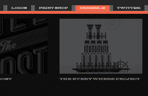
When you design your website, navigation is key. Navigation is the map that shows users the core places they can visit on your site.
There’s nothing more annoying than a site with disorganized or confusing navigation. When you’re improving the navigation of your website, it’s essential to make sure that a site user can easily find out what they’re looking for.
A lean navbar is a good idea and should include streamlined content, navigation hierarchy, and responsive design. This also means the navigation won’t change much on mobile devices.
If a user can’t find what they’re looking for, they won’t have a reason to stay on your website. Instead, they will almost definitely bounce and find a competitor who offers them a better site experience.
Let Your Visitors Scroll On Your Homepage
Above the fold is old news. Don’t shy away from designing a longer homepage. You can create a seamless experience by including three to five sections that will help to direct new and recurring users to the proper areas of your site.
There are lots of options for these sections, but there are some crucial elements that include:
- Value proposition
- Intro video
- Overview of services
- Product features
- About Us
- Testimonials
- Case studies/success stories
- Resources
Don’t Be Afraid Of White Space
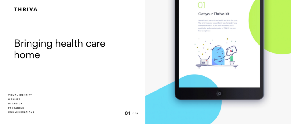
Whitespace is an essential element of web design that will help you to break up your pages and improve readability.
White space is sometimes called negative space and refers to the areas around elements on a page that are left empty and without content or other visual items.
Extra space seems like a waste, but it’s actually what makes a page readable and prioritizes content. It can also play an important part in the process of design and the positioning of website design elements.
If you know your pages lack white space, review the page, and strip out any elements or content that aren’t needed for the purpose of the page. Make sure that all your content is grouped so users can tell where they belong on the page.
Mobile Optimization
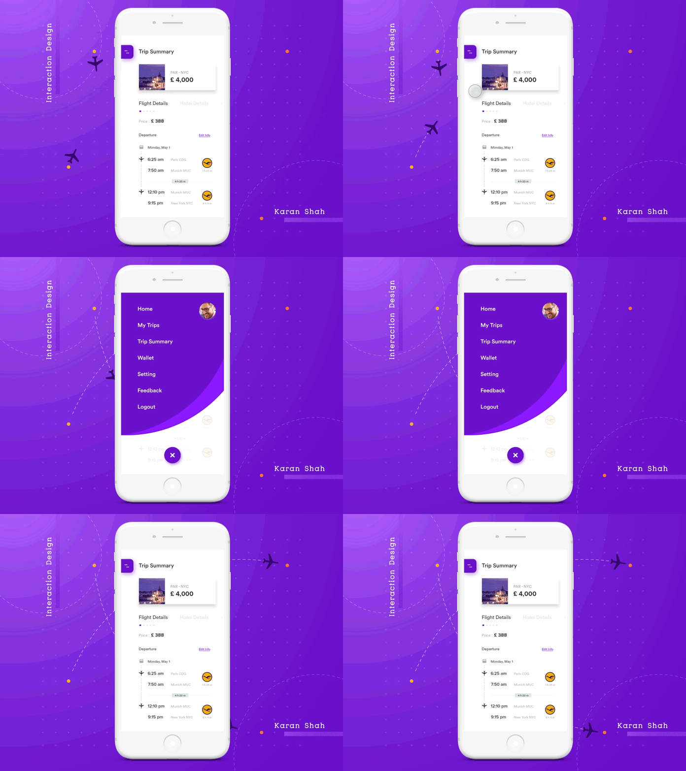
You shouldn’t forget about optimizing your site for mobile. Most internet users own a smartphone, and most of those users are unlikely to go back to a website if they had trouble accessing it on a mobile device. Many will go to a competitor’s website instead.
You need to tailor the site to fit the needs and wants of those who visit your site. Think about why someone would access your site on a mobile. What things would they be looking for? Would their experience currency let them do those things without difficulty?
Get Found

If you want to build a strong online presence, then you need to build a website that can be found.
Start by developing an SEO strategy that takes into consideration the search terms that your buyer personas and target audience would be searching for.
This strategy should include content that is relevant to the needs of your site visitors. You can do this with e-books, videos, articles, and blogs.
Make sure you don’t get distracted by all the endless options that you could try to rank for. Identify the best keywords that your audience is actually searching for, so you attract the right visitors and not ones who will never convert to your product or your offers.


