An eCommerce store depends on good web design just as much—if not more than—any other website. Imagine visiting a website to make a purchase, and the site is clunky, hard to navigate. You’d probably go somewhere else, right? What if you couldn’t navigate the site at all on your mobile device because it was slow and didn’t fit right on your screen? All of these problems can cause customers to turn away, and can also be solved with a simple web design change.
Here, we’ll take a closer look at why eCommerce stores need to understand the importance of good web design. Even if you’ve been at this for years, you can always learn something new, so read on!
Fast Loading Times
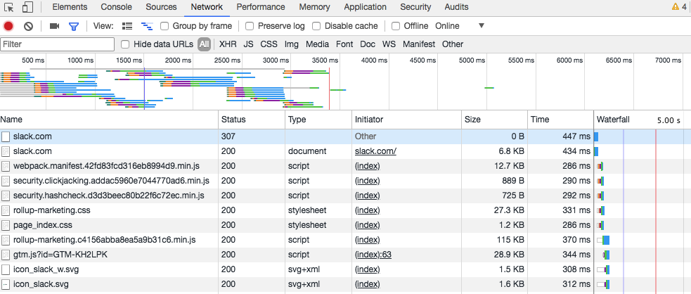
We’ve all had experiences with websites that don’t load. It’s incredibly frustrating when you’re trying to access content or purchase something to have a site that doesn’t want to load or just loads slowly. Most websites will load in a few milliseconds given a good connection, but a clunky, poorly-designed site will take at least a few seconds, if not a few minutes to load. Who has three minutes to sit and wait for a single page to load?
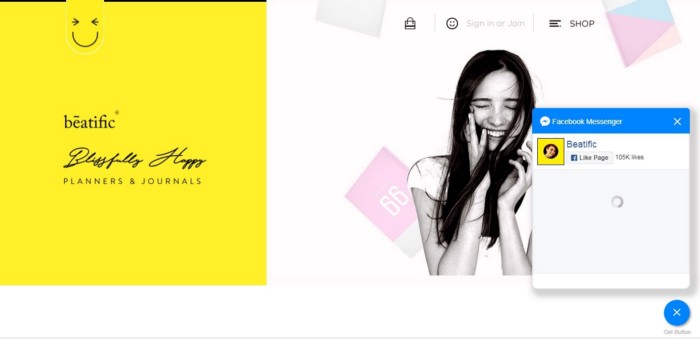
Sites like ours (hopefully) are a good example of superior web design. The site loads quickly, looks aesthetically-pleasing, and makes you curious about the products on it. It’s also optimized for mobile, so on-the-go users can still order merchandise or view the blog without any issues. This is what an eCommerce site should look and feel like.
The faster your loading times are, the better. Your users will be happier and your sales will be higher. Optimizing your site is incredibly important, especially when most people access the web via their phone or mobile device. About 52% of all web traffic is mobile!
Easy Navigation
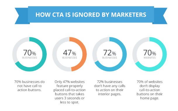
Have you ever visited a site that was difficult to navigate? You can’t find the search bar, the pull-down menu doesn’t link to where it’s supposed to, and you’re having trouble locating anything you’re looking for. This can become frustrating after just a few seconds, and most people tend to tune out within that time period if they can’t find what they’re looking for.
Your site should be easy to navigate and clear to new users. Some sites prefer a side-scrolling or down-scrolling design, where everything is on one page. Others utilize a pull-down menu or something similar to help users locate the pages they need.
An eCommerce site works best with a menu. Verma Farms has a great website where they sell CBD gummies and oils, and has a simple menu at the top of the first page. You can find anything you’re looking for on the site there, and there’s even a search bar for specific searches.
A search bar should always be a component of your eCommerce site. Some users won’t want to spend time getting a feel for your site, and will want to get right to it. Providing a search bar is something of a shortcut for those users, and can help even familiar users find new products or pages.
Aesthetically-Pleasing
Within the first second of visiting your eCommerce site, your user has already made a decision about whether or not they like it. This is where the aesthetics of the site come in. Many businesses get caught up in the aesthetics of a site, but it’s important to remember that it’s not all about looks; though they do play an important part in the conversion process.
A website that looks and feels good will attract more users and make paying customers out of new visitors. An attractive website can even help sway the purchase decision of an uncertain user.
Separates You From Competitors

The competition will always be trying to stay one step ahead of you, but one of the easiest ways to separate yourself is by improving your website design. When you have a good, functional website to work with, your customers will almost always choose your site over one that runs slowly, looks poorly-made, or doesn’t function well. Separate your brand from the competition by adopting a policy of excellence in everything that you do—even the design of your website. You’re going to want to hire an expert designer for that.
Even though website builders like Wix are powerful tools, you’ll still never get the amount of customization that a designer can offer your site.
Wrap-Up
To wrap things up, remember that good website design is what separates you from competitors, improves conversion rates, and keeps mobile users interested in your site. Aesthetics aren’t everything, but a good balance of good looks and functionality can do a lot for your website and your sales.


