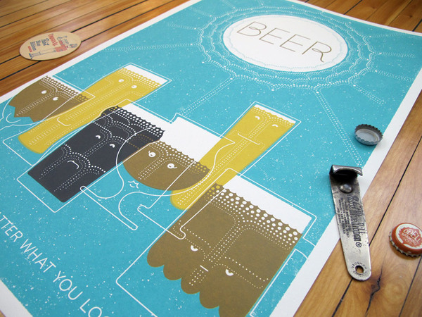
If you’re running a small business, don’t neglect your advertising! Even the smallest company or store needs to get the word out about their products and services. Many businesses focus on implementing successful social media marketing strategies, but one surefire way to connect with local audiences is to produce memorable posters and put them around town. But unless you have a designer on staff, you might be unsure about how to produce and post your posters. Discover four creative ways to use posters to promote your business to get you started!
Quality, Not (Necessarily) Quantity

Running off posters can be fun, and you probably think that the more you print and place, the better. However, that’s not always the case. Figure out where your customers and potential clients congregate. Next, consider the best possible place for poster placement in that area and whether you’re allowed to post there. This process should give you an idea of the sort of print run you need. When you print in bulk, it’s still necessary to take care to produce quality prints.
Consider What Size Works
When you think about the places where you plan to put your posters, think about how people will see them. Specifically, calculate the distance the viewer will be from the poster itself. On average, the text on your poster needs to be large enough to catch the eye and be readable from several feet away. If you want to grab the attention of people driving by, the font will need to be much larger. Look at nearby posters and advertisements as well and realize that you’re competing for attention with them too.
Keep in mind that bigger isn’t necessarily better. A striking design with a powerful message on the same scale as your competition’s advertisements works better than a larger but ho-hum poster.
Simple Colors

Big, garish, and loud will get attention, but probably not the attention you want. Keep things simple in your design and color scheme. Using every color in the spectrum will make your poster look murky and confusing from a distance and is unlikely to invite viewers. Instead, use two or three colors for the majority of the poster. This restraint ensures the colors won’t clash and will provide better contrast, making your message more readable and easier on the eyes. If you don’t already have a color palette connected with your brand, decide on one and support your messaging by repeating those colors in your posters (and other forms of advertising).
Create a Story
Here’s the last of our creative ways to use posters to promote your business: plan on producing more posters in the future to establish a “story” in the viewers’ minds. Make them look forward to the next “installment.” Explain who you are and what you offer, then follow it up with promotions for discounts and sales. Think of posters as conversations with current and potential customers and look for ways to keep the dialogue going.


